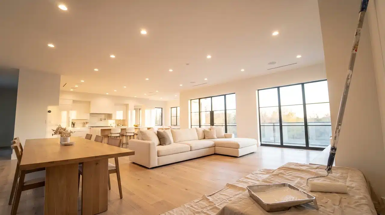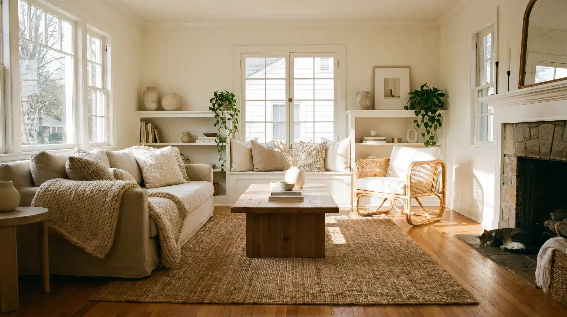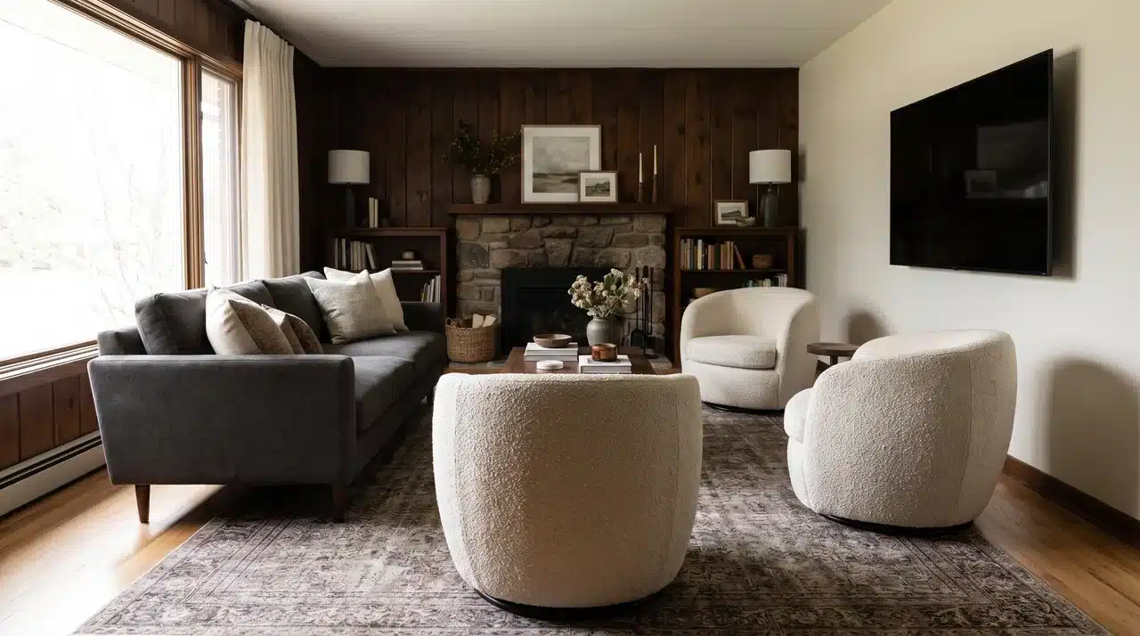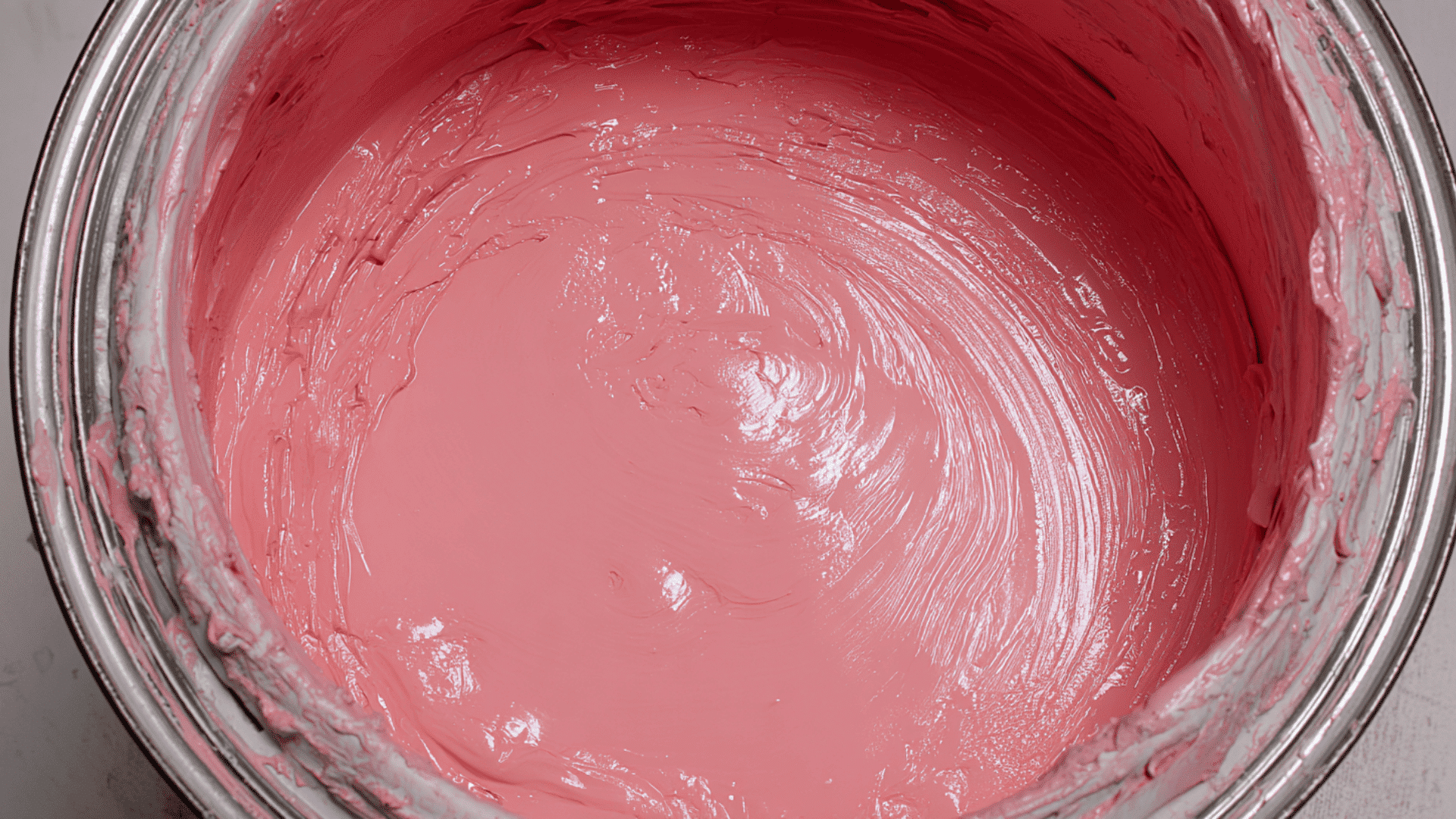



Choosing Sherwin-Williams Alabaster (SW 7008) can feel like an easy win when you want a warm white that stays calm and steady in most rooms.
I’ve seen how this shade works in different spaces, and small changes in lighting or nearby colors can shift it in ways that surprise people.
Today, I’ll walk you through how it behaves, which colors support it, and where it works best in a home.
You’ll also see tips for trim, full-home palettes, and common mistakes to avoid so you feel sure about using it. Let’s start with what makes this color unique.
Understanding Sherwin-Williams Alabaster (SW 7008)
Sherwin-Williams Alabaster (SW 7008) is a warm white that feels soft and welcoming. It brightens a room without looking sharp, heavy, or overly creamy.
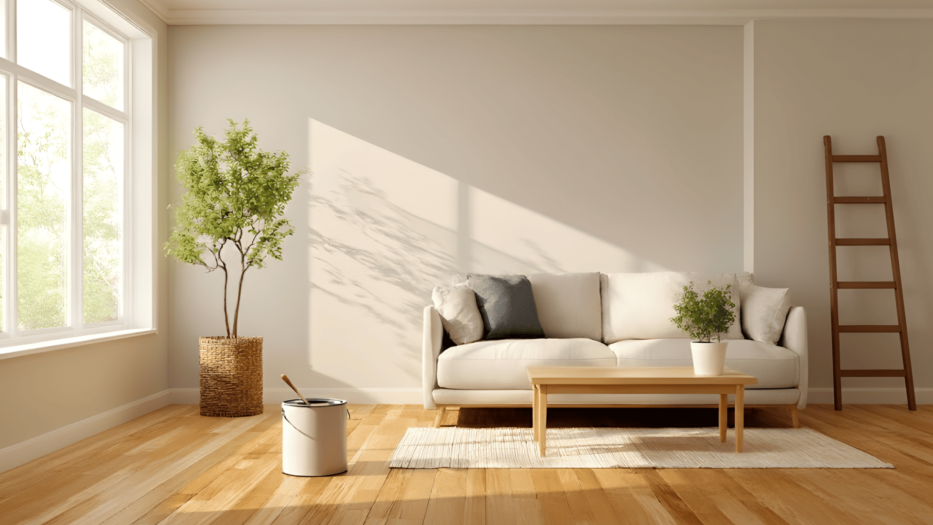
With an LRV of 82, it reflects plenty of light and helps make small or dark rooms feel more open. It looks its best in warm lighting, like south-facing rooms or spaces lit with gentle warm bulbs.
Here are a few situations where the color can shift:
- North-facing rooms
- Spaces with strong yellow bulbs
- Rooms with deep afternoon light
- When paired with cool icy grays
These shifts are normal for warm whites. Small changes in lighting or trim color usually smooth things out
Best SW Alabaster Coordinating Colors
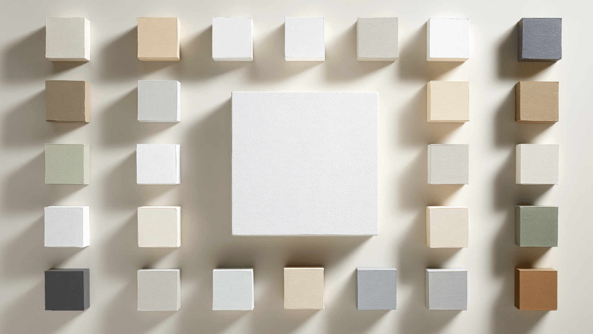
Here are the coordinating colors that bring out Alabaster’s soft, balanced look. These shades will add depth while keeping its warm, clean glow.
Soft Neutral Shades
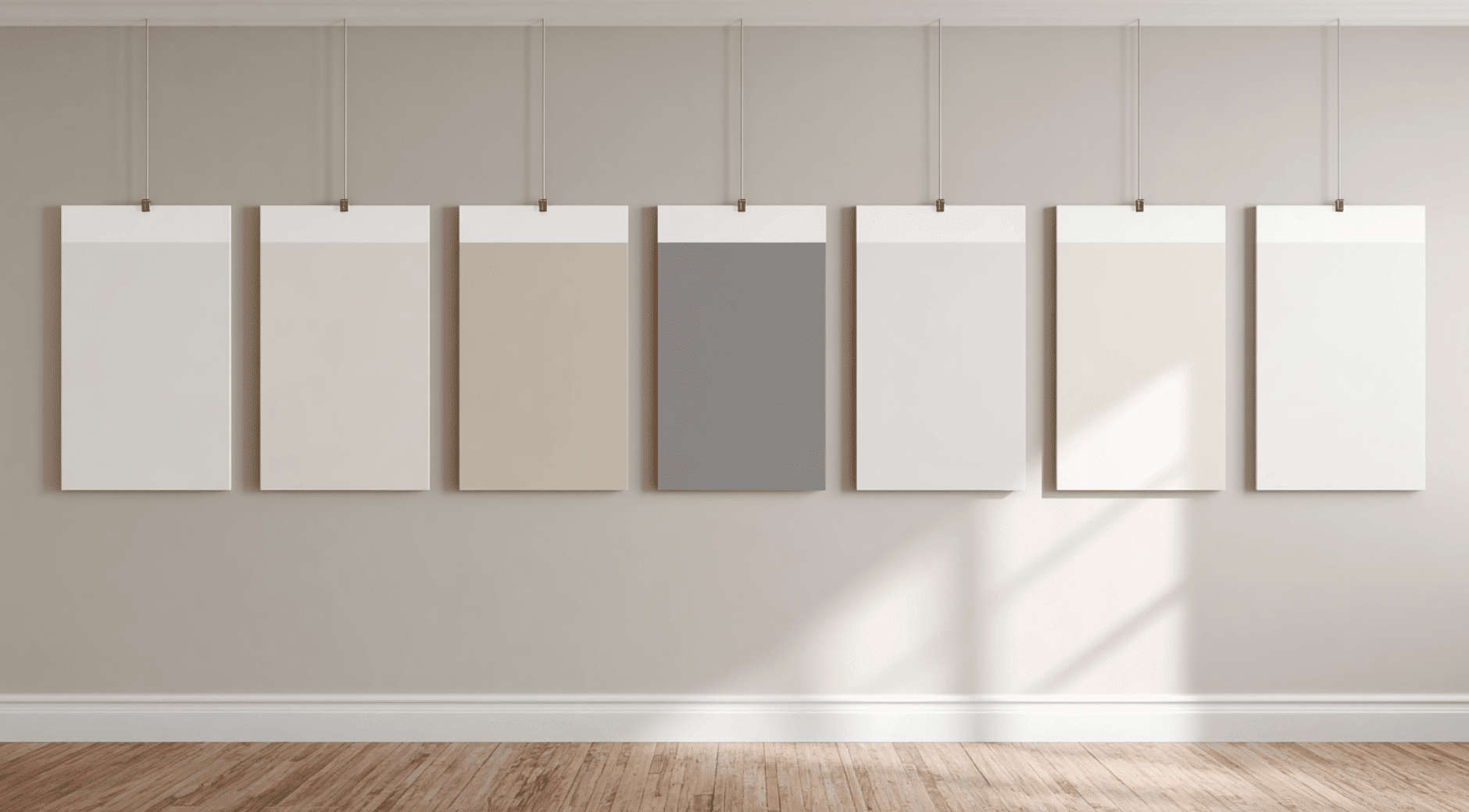
1. Accessible Beige (SW 7036)
Accessible Beige (SW 7036) is a warm beige with soft gray undertones and an LRV of 58, so it adds gentle depth next to Alabaster’s bright warmth.
It looks best in rooms with natural light, where it shows a smooth, calming warmth. This color pairs well with Alabaster because both share soft, earthy undertones that feel balanced and inviting.
2. Townhall Tan (SW 7690)
Townhall Tan (SW 7690) is a warm, cozy tan with soft golden undertones and an LRV around 44, giving it noticeable depth without feeling heavy.
It looks rich in warm light and more muted in cooler light. This shade pairs well with Alabaster because its earthy warmth creates a smooth, natural contrast that still feels calm and grounded.
3. Repose Gray (SW 7015)
Repose Gray (SW 7015) is a light gray with mild warm undertones and an LRV of 58, making it bright enough to pair well with Alabaster.
It shifts slightly cooler in north-facing light and warmer in sunny rooms. Its balanced undertone helps it blend cleanly with Alabaster, adding gentle contrast without clashing.
4. Mindful Gray (SW 7016)
Mindful Gray (SW 7016) is a calm mid-tone gray with warm, subtle green undertones and an LRV of 48. It looks richer in low light and softer in bright spaces.
This grounding shade pairs nicely with Alabaster because it adds depth and stability, helping Alabaster’s warm, airy white stand out without overwhelming the room
5. Peppercorn (SW 7674)
Peppercorn (SW 7674) is a deep charcoal gray with a rich, moody look and an LRV of 10, which creates bold contrast next to Alabaster.
It appears softer in bright light and more dramatic in low light. This shade pairs beautifully with Alabaster because the crisp contrast makes Alabaster’s warm white look cleaner and brighter.
6. Worldly Gray (SW 7043)
Worldly Gray (SW 7043) is a warm greige with soft green undertones and an LRV of 57. It stays warm in natural light and looks slightly cooler in shaded rooms.
This balanced, modern color pairs well with Alabaster because both share gentle earthy tones, creating a smooth, cohesive palette that feels calm and stylish.
7. Crushed Ice (SW 7647)
Crushed Ice (SW 7647) is a soft, airy greige with faint cool undertones and an LRV of 66, making it brighter than many greiges.
It looks cleaner in strong sunlight and slightly cooler in dim or north-facing rooms. It coordinates well with Alabaster because its subtle color adds light contrast without taking away from Alabaster’s warm glow.
8. Balanced Beige (SW 7037)
Balanced Beige (SW 7037) is a warm beige-greige with earthy undertones and an LRV of 46, giving it soft depth without feeling heavy.
It looks warm in sunlight and slightly muted in cooler rooms. This shade pairs well with Alabaster because the warm undertones connect smoothly, creating a calm, grounded look that still feels light and inviting.
9. Mega Greige (SW 7031)
Mega Greige (SW 7031) is a medium greige with warm, rich undertones and an LRV of 37. It feels cozy and grounded, especially in rooms with soft natural light.
The depth of Mega Greige works well with Alabaster because it adds contrast while still keeping the palette warm and cohesive, creating a timeless, balanced pairing.
10. Perfect Greige (SW 6073)
Perfect Greige (SW 6073) is a warm taupe-greige with subtle red-brown undertones and an LRV of42. It shifts warmer in afternoon light and more muted in shade.
This color complements Alabaster by adding a soft, elegant depth that doesn’t overpower. Together, they create a warm, classic palette that feels comfortable and sophisticated.
Earthy Natural Tones
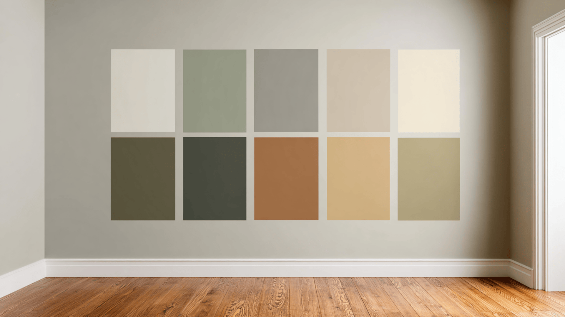
11. Evergreen Fog (SW 9130)
Evergreen Fog (SW 9130) is a muted green with soft gray undertones and an LRV of 30. It feels calm and balanced, especially in natural light.
The color looks richer in low light and soothing in bright spaces. It pairs beautifully with Alabaster (SW 7008) because the gentle green tone adds natural depth while letting Alabaster’s warm white stay bright and clean.
12. Retreat (SW 6207)
Retreat (SW 6207) is a deeper, moody green with cool gray undertones and an LRV of 21. It looks bold in dim light and softer in bright rooms.
This color brings grounding energy to a palette. It coordinates well with Alabaster (SW 7008) because the warm white lifts the richness of Retreat, creating a cozy, balanced look that feels steady and inviting.
13. Urbane Bronze (SW 7048)
Urbane Bronze (SW 7048) is a rich bronze-gray with warm brown undertones and an LRV of 8, making it dramatically dark.
It appears warm and earthy in sunlight and deep and modern in low light. Paired with Alabaster (SW 7008), it creates a strong, stylish contrast.
14. Dakota Wheat (SW 9023)
Dakota Wheat (SW 9023) is a warm natural tan with golden undertones and an LRV around45. It looks warm and sunlit in bright rooms and cozier in lower light.
This shade enhances Alabaster’s (SW 7008) creamy softness, creating an earthy, comfortable palette. Together, they form a natural, welcoming look that feels warm without being overwhelming.
Top Colors That Pair Well With Alabaster
| Color Name | LRV | Undertone | Why It Works With Alabaster |
|---|---|---|---|
| Accessible Beige | 58 | Warm beige, soft gray | Shares soft, earthy tones; adds gentle depth |
| Townhall Tan | ~44 | Warm tan, golden tones | Warm contrast that stays calm and grounded |
| Repose Gray | 58 | Warm gray | Balanced undertone adds soft contrast |
| Mindful Gray | 48 | Warm gray with green touch | Adds stable depth that highlights Alabaster |
| Peppercorn | 10 | Deep charcoal | Strong contrast makes Alabaster look brighter |
| Worldly Gray | 57 | Warm greige, soft green | Shares earthy tones for a calm, modern look |
| Crushed Ice | 66 | Light greige, cool hint | Soft contrast that keeps rooms bright |
| Light & Medium Taupes | 40–55 | Warm brown–gray blends | Quiet warmth adds subtle, classic depth |
| Evergreen Fog | 30 | Muted green, soft gray | Adds depth while keeping Alabaster bright |
| Retreat | 21 | Deep green, cool gray | A shade that pairs well with warm white |
| Urbane Bronze | 8 | Bronze gray, warm brown | Bold contrast softened by Alabaster |
| Dakota Wheat | ~45 | Warm tan, golden tones | Enhances Alabaster’s natural softness |
These shades all support SW Alabaster by adding the right mix of warmth, depth, and balance.
Best White Trim Colors for Alabaster
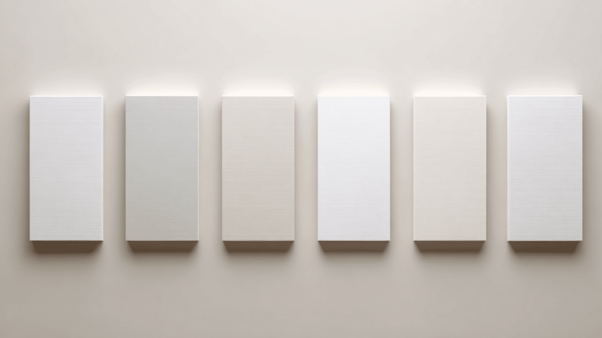
Choosing the right trim white can change how Alabaster looks in your space. The key is matching undertones and picking the amount of contrast you want.
1. Pure White (SW 7005)
Pure White (SW 7005) is a clean, neutral white with soft undertones and an LRV of 84, so it stays bright without feeling cold.
It works well in most lighting because it doesn’t lean too warm or too cool. This balance makes it a great match for Alabaster (SW 7008), giving the trim a crisp outline while keeping the room soft and inviting.
2. Extra White (SW 7006)
Extra White (SW 7006) is a bright, cool white with an LRV of 86, which gives it a sharp, modern look. It appears crisper in sunny rooms and slightly cooler in dim lighting.
This shade pairs well with Alabaster (SW 7008) for a strong contrast. The cool tone makes Alabaster look warmer and creamier, creating a clean, fresh pairing.
3. High Reflective White (SW 7757)
High Reflective White (SW 7757) is the brightest Sherwin-Williams white, with an LRV of 93, making it extremely clear and clean.
It looks especially bright in natural light and very crisp under artificial lighting. Paired with Alabaster (SW 7008), it creates a bold contrast while still feeling fresh.
This trim choice works well in modern spaces that need maximum brightness and clarity.
4. Snowbound (SW 7004)
Snowbound (SW 7004) is a soft white with gentle pink-violet undertones and an LRV of 83, giving it a warm, smooth look.
It appears soft in natural light and slightly warmer in afternoon sun. This shade pairs well with Alabaster (SW 7008) for a subtle, blended transition.
It works best in bedrooms, living rooms, and cozy areas where warmth matters.
5. White Snow (SW 9541)
White Snow (SW 9541) is a warm white with faint beige undertones and an LRV of 87, so it stays bright while still feeling soft.
It looks warm and clean in most lighting, especially in spaces with wood tones or warm floors. This shade coordinates well with Alabaster (SW 7008) because both share gentle warmth, creating a smooth, easy trim-to-wall blend.
Alabaster vs. Other Sherwin-Williams Warm Whites
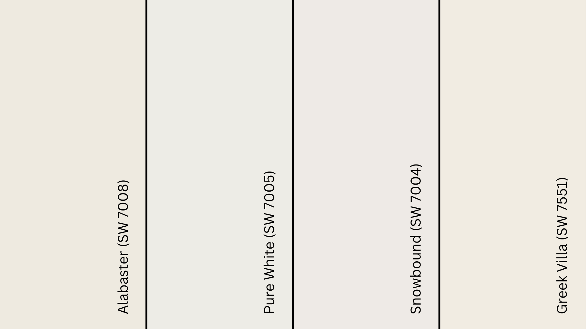
| Color | Undertone | Depth / LRV | How It Looks | When to Choose |
|---|---|---|---|---|
| Alabaster (SW 7008) | Warm cream with soft beige | LRV 82 – warm soft white | Creamy, gentle, warm | When you want a warm white that isn’t too yellow |
| Pure White (SW 7005) | Neutral, slight softness | LRV 84 – brighter, cleaner | Crisp and clean | When you want a sharper, less creamy white |
| Snowbound (SW 7004) | Soft pink-violet | LRV 83 – slightly cooler | Clean with a cool tint | When you want a cooler warm white |
| Greek Villa (SW 7551) | Warm with mild cream | LRV 84 – brighter than Alabaster | Fresh, warm, light | When you want a warm white that’s less creamy |
Each of these whites offers a slightly different level of warmth and brightness. Knowing these small shifts helps you pick the one that best fits your lighting and style.
Places to Use and Avoid SW Alabaster
Alabaster works well in many spaces, but lighting and nearby colors can change how it looks. These quick notes make it easier to see where it shines and where it needs more care:
Where to Use Alabaster:
- Kitchens: Works well on walls or cabinets and looks bright with warm wood or soft lighting.
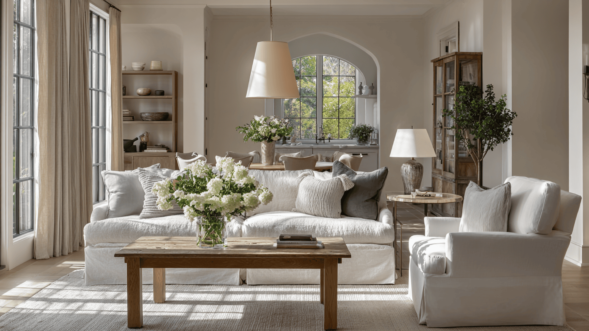
- Living rooms: Creates a calm, airy look and blends easily with neutral decor.
- Bedrooms: Feels soft and cozy, especially in warm natural light.
- Bathrooms: Stay clean and warm with the right bulbs and pair well with stone or tile.
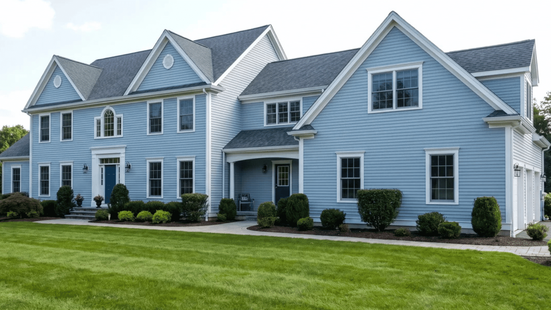
- Exterior siding: Reads as a soft, clean white outside and pairs nicely with dark trims.
Where to Avoid or Use Carefully:
- Cool, north-facing rooms: Alabaster can look dull or slightly yellow in low, cool light.
- Spaces with strong warm bulbs: Extra-warm lighting can push the creaminess too far.
- Rooms with icy gray decor: Cool grays can make Alabaster look more yellow.
How to Build a Full-Home Alabaster Color Scheme
- Pick your neutral base: Choose the main neutral that connects your spaces, like a soft gray, greige, or warm beige.
- Choose warm or cool direction: Decide whether your home will lean warm (earthy tones) or cool (soft greens, muted blues).
- Select accent colors: Pick 1–3 accent shades for cabinets, doors, or feature walls to add depth or contrast.
- Choose your trim white: Crisp whites add contrast; softer whites blend in. Pick the tone that fits your lighting.
- Choose flooring and wood tones: Light, warm woods make Alabaster feel cozy; cooler or gray floors can make it look creamier.
These simple steps help you build a palette that flows well from room to room while keeping Alabaster looking its best.
Wrapping Up
Alabaster (SW 7008) by Sherwin-Williams is a great pick when you want a warm white that feels calm, steady, and easy to use.
It works with many styles and brings a welcoming look to most rooms, especially when the lighting and nearby colors support it.
This breakdown gives you a better idea of how the color behaves and how you can use it with confidence.
If you’re planning an update, try sampling it on a few walls and see how it changes throughout the day. It’s the simplest way to know if it fits your home.