
Home » Paint Reviews
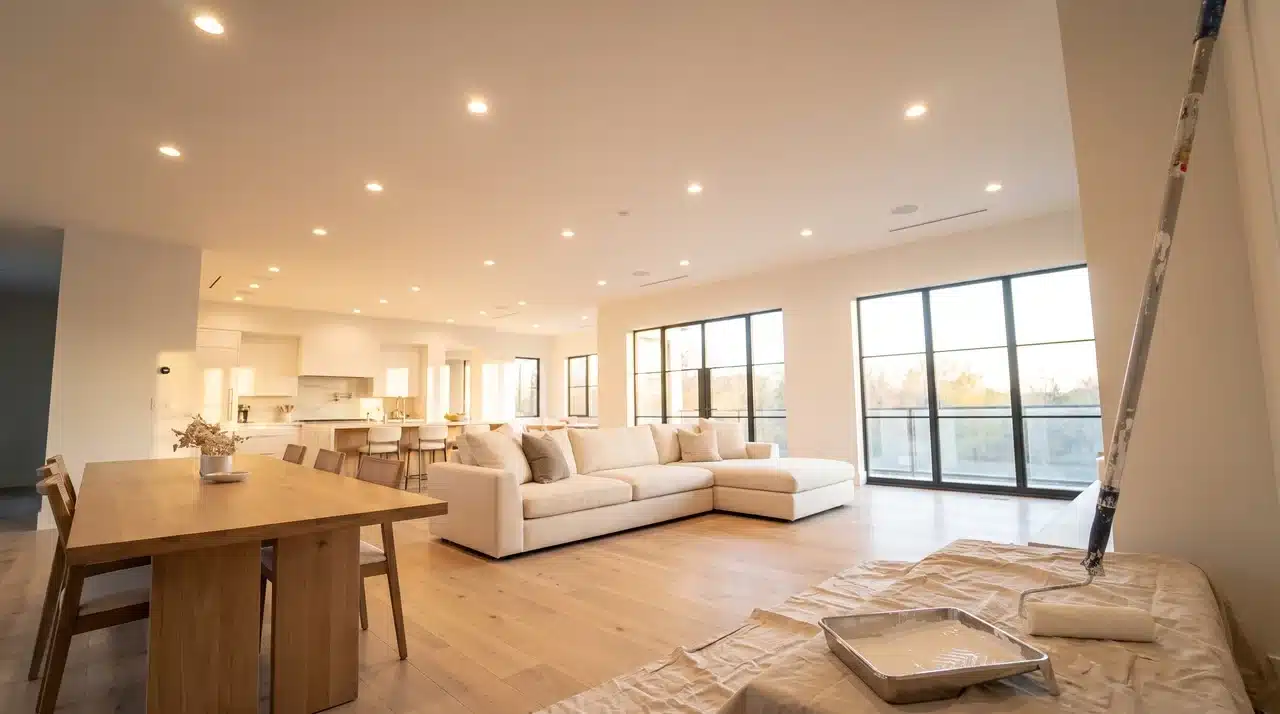
A ceiling can make a room feel polished, or it can expose every roller mark and small surface flaw. If you choose the wrong
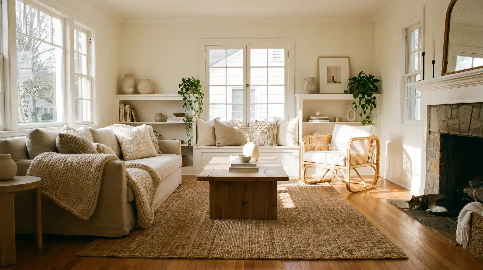
Warm white paint colors can make a room feel soft, bright, and welcoming, but choosing the right one is not always simple. A shade that looks perfect on a store card can turn yellow, flat, or too creamy once it
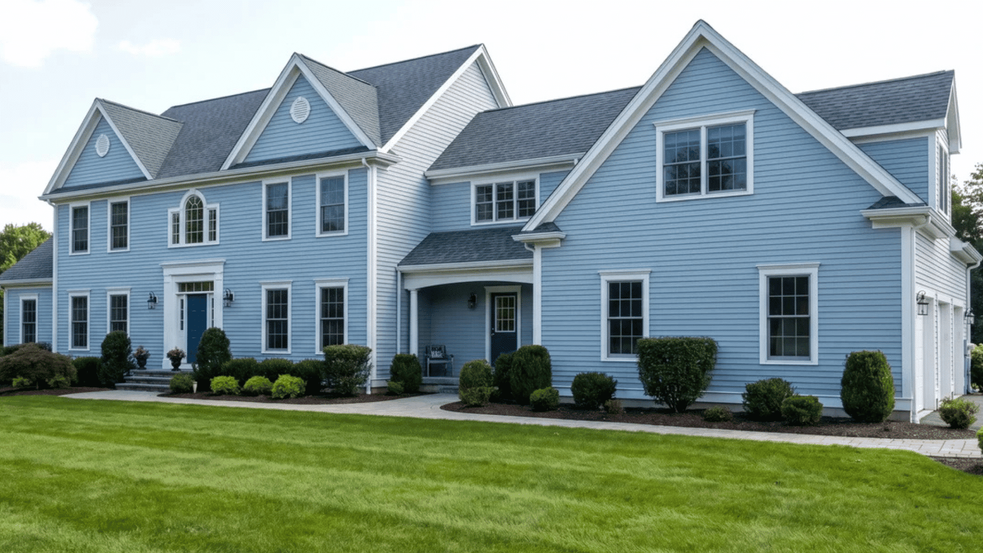
Choosing exterior paint sounds simple until you start comparing formulas, finishes, siding materials, and weather conditions. A paint that performs well on shaded wood siding may not hold up as well on stucco exposed to intense afternoon sun. That is why finding the best exterior paint means looking beyond brand names alone. You need a coating that suits your home’s surface, climate, moisture exposure, and maintenance expectations. I have narrowed the options to reliable exterior paints for different budgets and conditions, including strong choices for sun, rain, humidity, and temperature swings. You will also see how paint type, sheen, primer, and preparation affect how long the finish lasts. What Makes Exterior Paint Perform Well? A good exterior paint needs to do more than provide an even color. It must remain bonded to the surface while dealing with sunlight, rain, humidity, temperature changes, and normal expansion and contraction. For most residential exteriors, high-quality 100% acrylic or acrylic latex formulas are strong choices because they combine flexibility with moisture and UV resistance. Look for paint that offers good adhesion, color retention, mildew resistance, and protection against cracking, peeling, and blistering. Sun-exposed walls also benefit from strong fade and chalk resistance. However, no single formula is ideal for every house. Wood needs flexibility and moisture management, while masonry may require a more breathable coating. The same sun, rain, and temperature swings also shape which wood holds up outdoors longest, whether it’s siding or a piece of patio furniture. The right choice ultimately depends on both the surface and the environment around the home. Best Exterior House Paints by Surface and Climate The 10 best exterior house paints are easier to compare when the surface, weather exposure, and project budget are considered together. Each option below includes a short overview followed by practical details […]
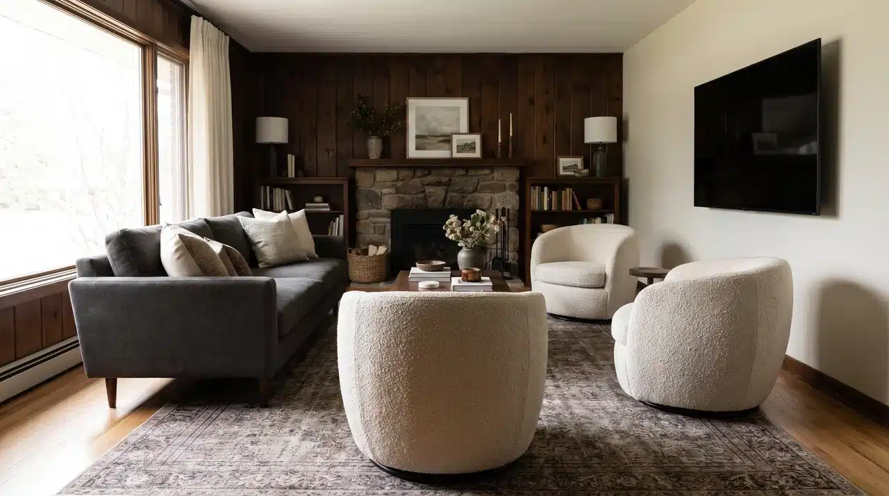
A paint color can look perfect on a small chip and completely different once it covers a full wall. That happens because your room changes the color. Floors, furniture, windows, trim, bulbs, and shadows all affect what you actually see. Understanding how to choose a paint color starts with looking at the room first, not the sample card. The right shade should work with what is already there and still look good in morning light, afternoon sun, and evening lamps. I will walk you through the simple steps that help you test colors properly, match undertones, and choose paint that feels right in your actual space. What is the Right Starting Point Before Looking at Colors? Before you look at paint colors, look at what is already staying in the room. The floor, countertops, cabinetry, tile, and large furniture usually matter more than the color you like on a sample card. These fixed elements already have undertones, and your paint needs to work with them. Warm finishes tend to pull yellow, brown, beige, or pink. Cool finishes usually lean gray, blue, green, or taupe. That is the real starting point for choosing a paint color. If your floor has a warm undertone and you choose a cool gray wall color, the room can feel disconnected even if both colors look good on their own. Hold a plain white card beside your fixed finishes and look for the subtle color shift. Does the wood look golden? Does the tile lean blue-gray? Does the sofa pull beige, green, or pink? If you’re working around wood floors specifically, our guide on matching wall color to hardwood floors walks through the most common pairings. Those answers narrow your paint choices faster than any color trend guide will. Start with what is permanent, then choose […]
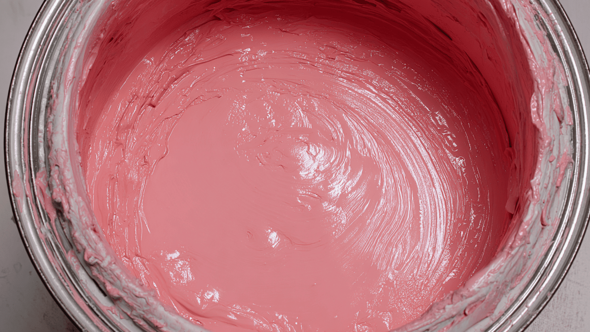
Whenever you walk into any paint store, you’ll face a wall of finish options that all sound the same. But flat vs. satin paint? That’s the decision that’ll make or break your project. I’ve watched people spend hours picking the perfect color, then grab the wrong finish and regret it within weeks. The sheen you choose affects how your walls handle daily life, how often you’ll repaint, and whether that color actually looks good in your space. This isn’t about trendy versus traditional; it’s about matching paint performance to real-world conditions. I’ll walk you through how these finishes actually behave, where each one shines, and the costly mistakes that trip up even experienced DIYers. What is Flat Paint? Flat paint is the go-to choice when you want zero shine. It soaks up light instead of bouncing it back, giving walls a soft, matte look that feels almost velvety to the touch. Flat paint works like magic on older walls. Those bumps, cracks, and uneven spots? They practically disappear under this finish. The lack of sheen means light doesn’t highlight every little flaw. The finish is completely matte: no gloss, no reflection. When light hits it, the surface stays dull and uniform. This creates a smooth appearance that feels understated and classic. Your walls become a soft backdrop rather than a reflective surface. What is Satin Paint? Satin paint sits right in the middle of the sheen spectrum. It has a soft, subtle glow that’s noticeable but not overpowering. Think of it as a gentle pearl finish that catches light without being shiny. I’ve used satin paint in busy areas of my home, and it holds up remarkably well. The slight sheen gives walls a polished look while still feeling warm and inviting. When light hits it, you’ll see a delicate […]
Painting the interior of your house is one of the easiest ways to give your home a new feel without major renovations. A fresh coat of paint can change the entire mood of a space, making it brighter, cozier, or more modern. In this blog, I’ll walk you through average costs, simple ways to estimate your own painting budget, and helpful tips to save money and make sure you get the best results for your home. Why Interior House Painting Matters Painting the inside of your home is one of the easiest ways to refresh your space. It makes rooms look brighter, cleaner, and more modern. Over time, walls collect dust, marks, and scuffs. A new coat of paint can instantly make them look new again. Fresh paint also protects walls from moisture, dirt, and wear. It can seal small cracks, reduce damage, and make cleaning easier. Average Cost to Paint the Interior of a House Painting the inside of your home can come with a wide price range. The cost depends on the size of your home, the rooms you paint, and the amount of prep work needed. Most homeowners pay between $2,000 and $10,500 to paint the inside of a house. This usually comes out to $2–$6 per square foot for standard jobs. National Average Cost: National average cost: $3,000–$10,500 Cost per sq ft: $2–$6 Cost per room: $300–$1,500 Cost per wall: $50–$150 These numbers help you see where your project might land before getting quotes. Interior Painting Cost by Home Size Home Size (Sq Ft) Low End High End 500 sq ft $1,000 $2,500 800 sq ft $1,600 $3,800 1,000 sq ft $2,000 $5,000 1,500 sq ft $3,000 $7,500 2,000 sq ft $4,000 $10,000 Cost Breakdown by Area Area Typical Cost Range Walls $1–$3 per sq ft […]
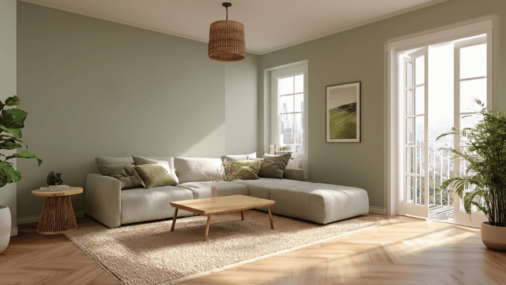
Sage is one of those colors people often hear about but can’t fully picture, and most people get confused. If you’ve ever asked yourself what color is sage or why it shows up everywhere in design, you’re in the right place. Sage has a calm, gentle look that makes it easy to use, but there’s a lot more to it than just being a soft green. Today, in this blog, I’ll walk you through its shades, how it behaves in different spaces, and the colors that pair beautifully with it. What Color is Sage? Sage is a soft and muted color that feels natural and easy on the eyes. It mixes with green and gray in a way that makes it calm, subtle, and very versatile. Sage is a green-gray color with an earthy and gentle feel. It looks soft, dusty, and slightly faded, like dried sage leaves. It’s not bright or bold. Instead, it gives off a calm and quiet look. Saga has a few common variations, like classic saga, light saga, and deep saga. Each shade has its color value. These values can shift slightly depending on the shade or brand, but they give a clear idea of how sage looks in different tones. Sage feels calming because it reminds us of nature. Green connects to plants and quiet outdoor spaces, while gray softens the color and makes it gentle. This mix keeps sage from looking too bright or too intense. It stays neutral, grounded, and easy to live with, which is why people love using it in rooms where they want peace and balance. Sage Color Variations The color sage has many shades that range from light and airy to deep and earthy. 1. Light Sage Light sage is a pale green with soft gray undertones. It […]
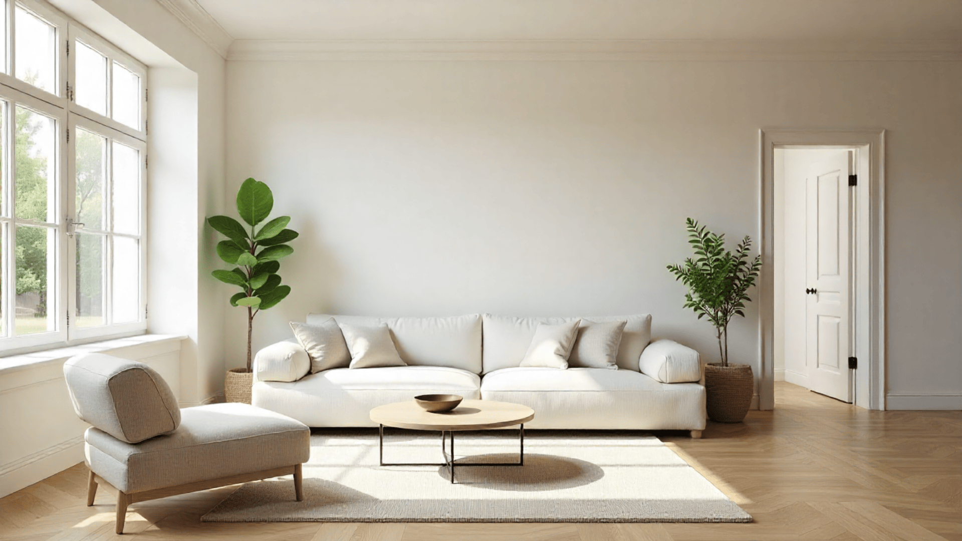
Choosing the right paint style can completely change how a room feels, and one trend that keeps showing up is painting walls and trim the same color. I’ve tried this look in a few spaces, and the difference surprised me. It creates a smooth, calm backdrop that feels more modern without trying too hard. In this blog, I’ll walk you through when this style works, when it doesn’t, and how to choose the right colors and sheens. If you’ve ever thought about whether one-color rooms actually look good in real life, this guide will help you decide with confidence. Why Painting Walls and Trim the Same Color is Popular Painting your walls and trim the same color is part of a trend called color drenching, where one shade covers the whole room. This creates a clean, connected look that feels simple and modern. Designers like it because it removes sharp lines and helps the space feel more balanced. Using one color can also change how you see the room. It can make ceilings look higher, walls seem longer, and small spaces feel more open. The look hides small flaws, highlights furniture, and works well in tight rooms. But it can also feel flat, hide details, and be harder to change later. When Color Drenching Works and When It Doesn’t This style can work well in many homes, but it isn’t the best choice for every room. Here’s a quick way to see if painting your walls and trim the same color suits your space: When This Look Works When You Want Something Else You want a modern, minimalist look You have ornate trim you want to highlight Your room is small You prefer traditional or contrasting décor Your trim is simple Your room lacks natural light You love bold colors […]

Get the latest home decor tips, DIY ideas, and design inspiration delivered straight to your inbox.