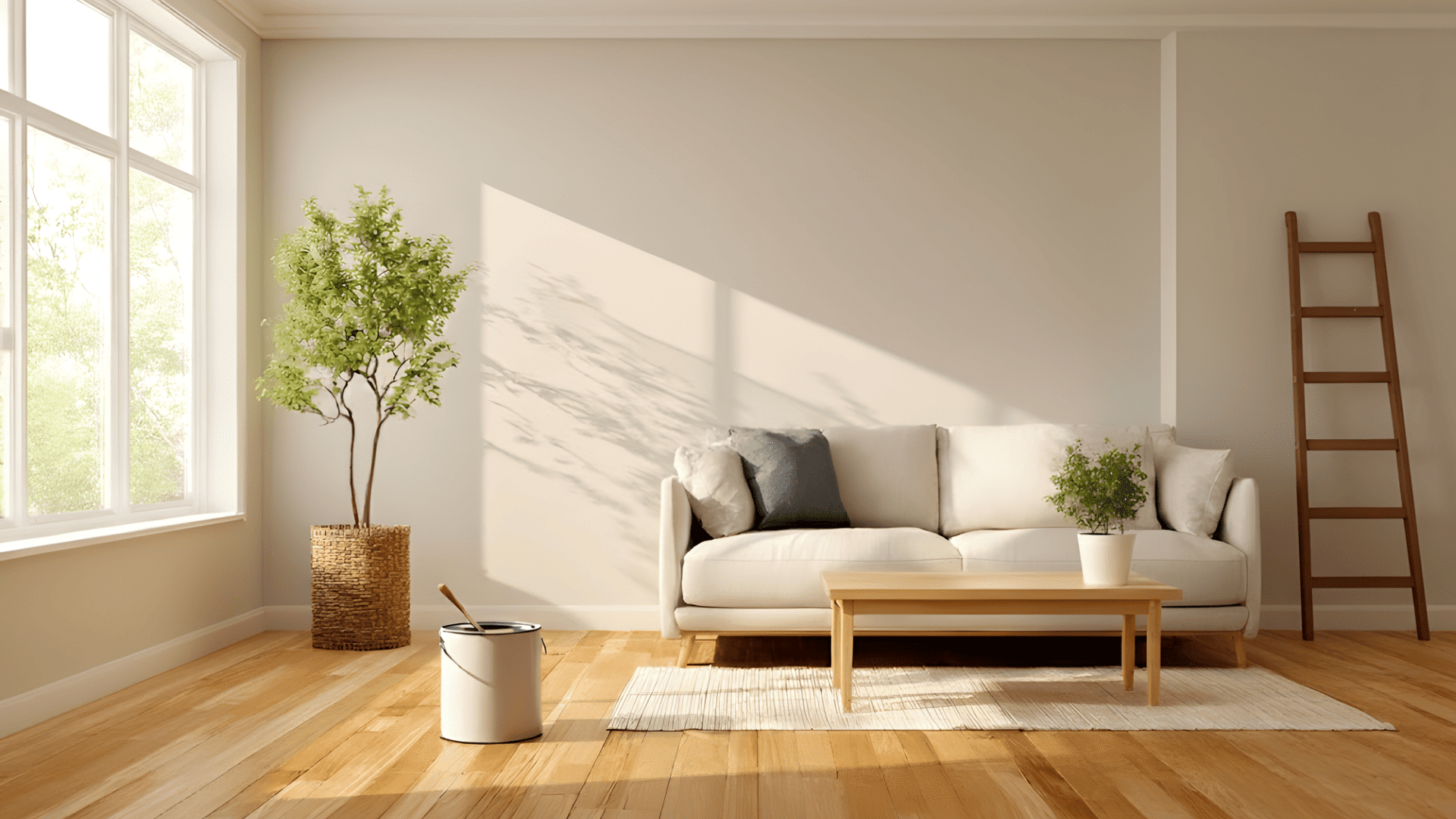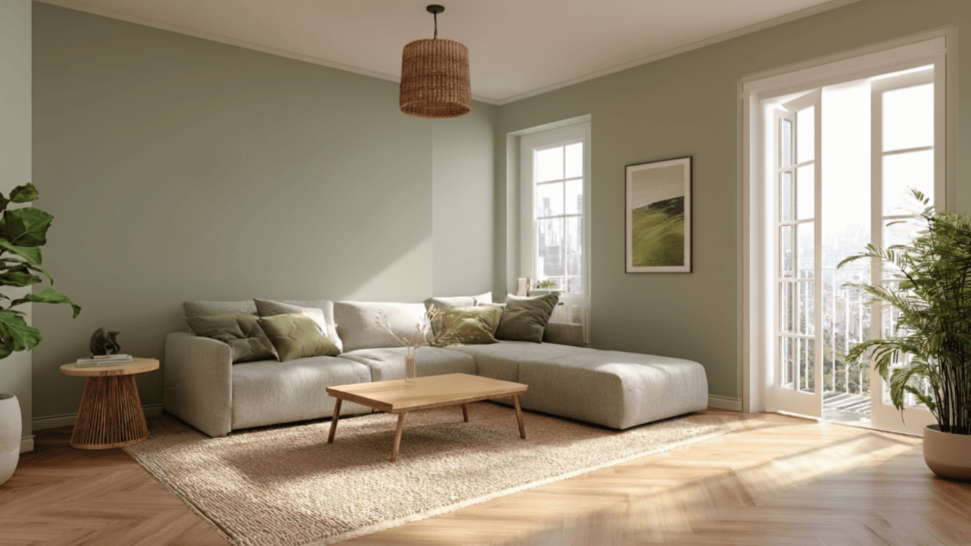
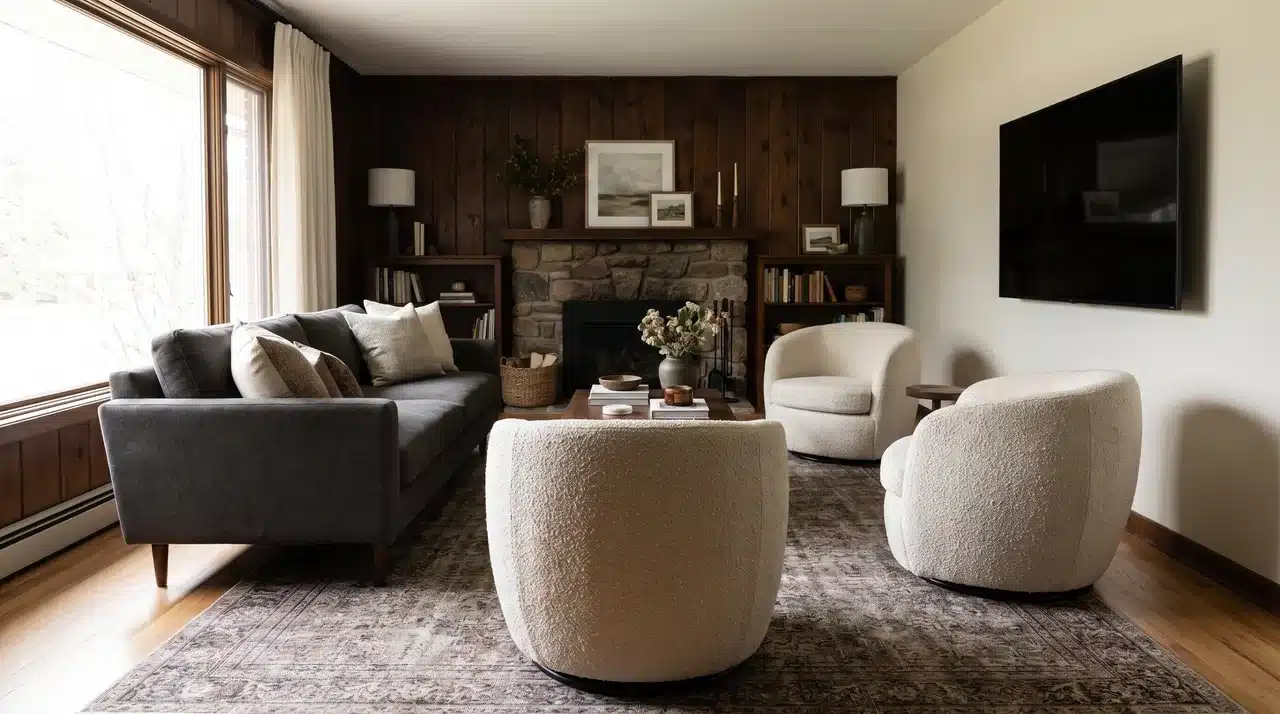


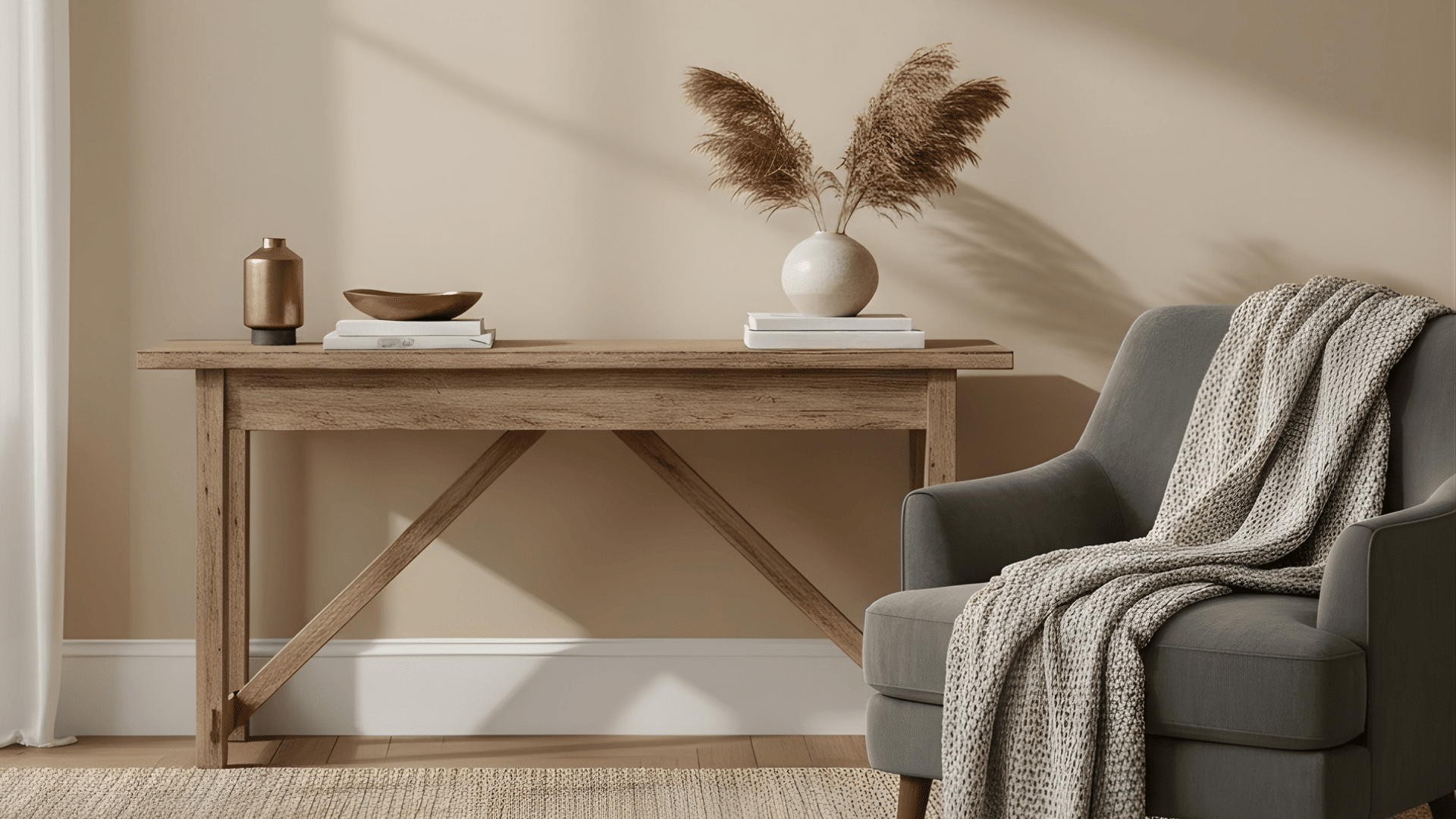
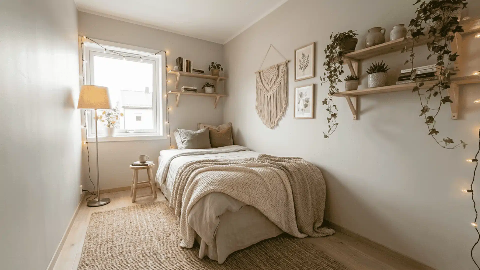
A paint color can look perfect on a small chip and completely different once it covers a full wall.
That happens because your room changes the color. Floors, furniture, windows, trim, bulbs, and shadows all affect what you actually see.
Understanding how to choose a paint color starts with looking at the room first, not the sample card.
The right shade should work with what is already there and still look good in morning light, afternoon sun, and evening lamps.
I will walk you through the simple steps that help you test colors properly, match undertones, and choose paint that feels right in your actual space.
What is the Right Starting Point Before Looking at Colors?
Before you look at paint colors, look at what is already staying in the room.
The floor, countertops, cabinetry, tile, and large furniture usually matter more than the color you like on a sample card. These fixed elements already have undertones, and your paint needs to work with them.
Warm finishes tend to pull yellow, brown, beige, or pink. Cool finishes usually lean gray, blue, green, or taupe. That is the real starting point for choosing a paint color.
If your floor has a warm undertone and you choose a cool gray wall color, the room can feel disconnected even if both colors look good on their own.
Hold a plain white card beside your fixed finishes and look for the subtle color shift.
Does the wood look golden? Does the tile lean blue-gray? Does the sofa pull beige, green, or pink?
If you’re working around wood floors specifically, our guide on matching wall color to hardwood floors walks through the most common pairings.
Those answers narrow your paint choices faster than any color trend guide will. Start with what is permanent, then choose paint that supports it. The best wall color is not always the prettiest chip.
It is the one that makes everything already in the room feel intentional.
How Does Lighting Change the Color You Actually See on the Wall?
Lighting changes paint because color reacts to it surroundings. The same shade can look soft in daylight, heavier in shadow, and colder once artificial light comes on.
When choosing paint, think about the room’s real lighting conditions rather than judging the color in one bright moment. A good paint color should hold up as light changes.
Natural Light by Room Orientation
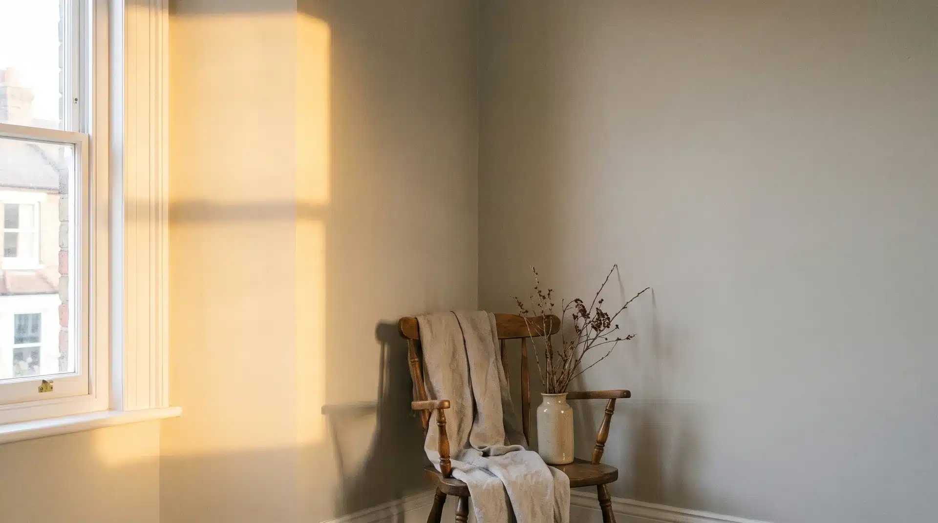
How a room reads depends heavily on which direction its windows face:
- North-facing rooms: Receive cool, indirect light all day. Any cool undertone in your paint gets amplified, so warmer paints tend to hold better here.
- South-facing rooms: Handle deeper, more saturated tones without feeling heavy.
- East-facing rooms: Bright in the morning and cooler by afternoon, so test your color at both times.
- West-facing rooms: Sit in cooler morning light before warming significantly in the evening. If you spend evenings in that room, test your color specifically at that time.
Artificial Light and Undertone Shift
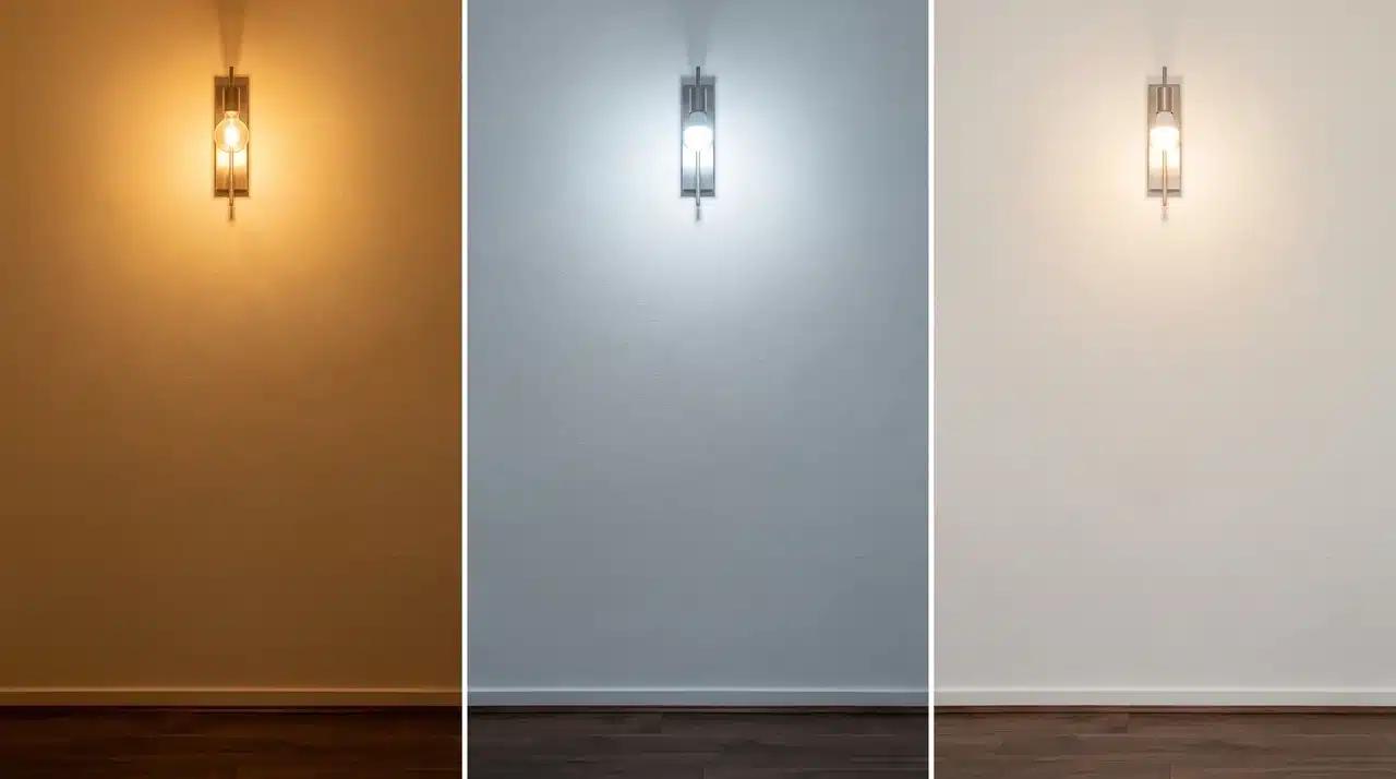
Bulb type shifts a paint’s undertone just as much as the sun does:
- Incandescent bulbs: Push yellow and amber into everything, making warm undertones read noticeably warmer once switched on.
- Cool white LEDs: Amplify blue and gray tones instead.
- Warm white LEDs: Generally more forgiving across a range of undertones.
These shifts also compound; six bulbs across four walls change the color far more than one bulb on one wall.
If the room gets used mostly in the evenings, that is the condition you are actually painting for. Test samples under those lights at that time.
How Do You Use the 60/30/10 Rule to Build a Color Palette?
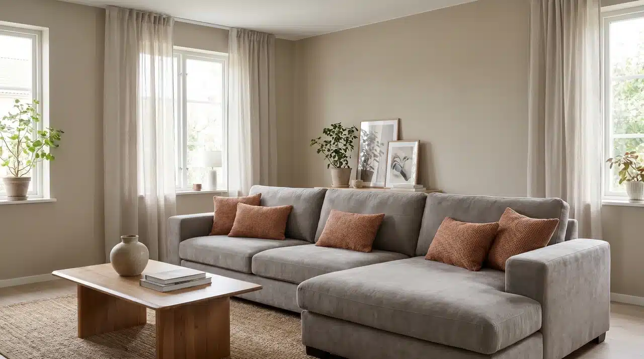
The 60/30/10 rule helps you think about a room as a color system rather than a set of separate decisions. It doesn’t tell you which colors to pick, but it does tell you how much of each to use.
The ratio works like this: 60% of the room carries the dominant color, 30% carries a secondary color, and 10% goes to accents.
- Walls as the 60%: Your wall color sets the room’s overall tone. It needs to be a shade you can live with at scale, not just one that looks appealing on a small chip.
- Large furniture as the 30%: A sofa, large rug, or statement armchair already in the room functions as your 30%, quietly dictating what wall color will actually work alongside it.
- Accents as the 10%: This is where you can take more risk with color. The small surface area means a bold choice adds energy without overwhelming the room.
- Open plan spaces: When two rooms share a sightline, their dominant colors interact constantly. The 60% in one space needs to sit comfortably next to the 60% in the other.
If furniture is already in place, it has made the 30% decision for you. Your wall color needs to work around that reality, not the other way around.
The ceiling belongs inside the 60% zone alongside the walls. A ceiling that shares the dominant color family keeps the room feeling complete rather than cut off at the top.
If you like the look of a room painted almost entirely in one shade, our color drenching ideas guide shows how that approach handles the 60% zone.
How Do You Test Paint Colors So That What You See Is What You Get?
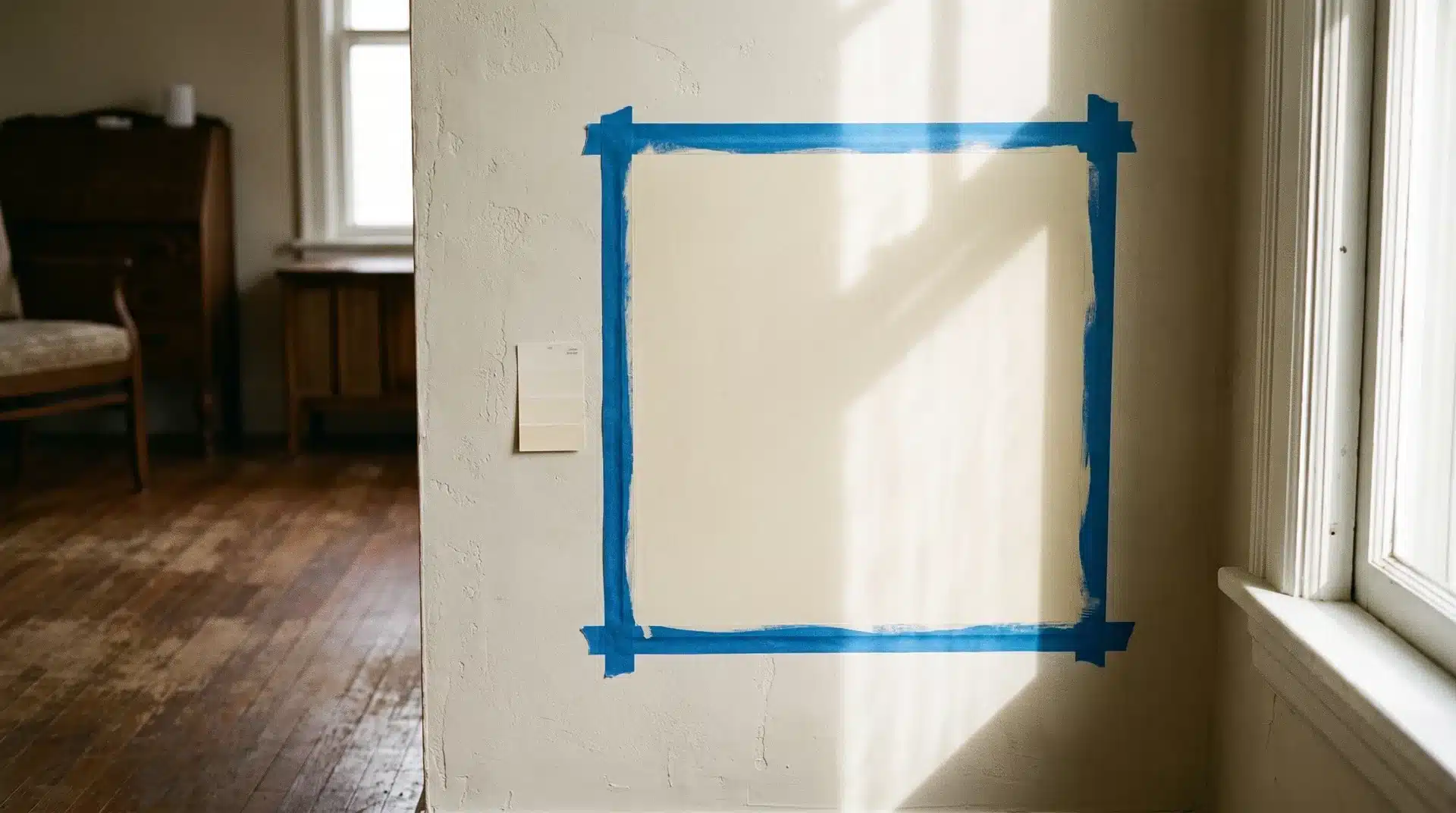
Test paint colors with a large sample in your actual room across a full day of light, not with a small chip evaluated once under store lighting.
That single change fixes most of the surprises people run into after painting. The problem is rarely the color itself. It is the conditions under which most people evaluate it before committing.
What Size Sample Actually Works
Paint chips are evaluated under store lighting, held against a white background, sized smaller than your hand. None of those conditions exist in your actual room.
- Small paint chips from the store: The white border makes the color appear lighter and cleaner than it will on a full wall surrounded by flooring and furniture.
- Painted A3 boards or large card sheets: These give enough surface area to see how the undertone behaves without the distortion a small chip creates. Move them around the room freely.
- Peel-and-stick sample sheets: These go directly onto the wall without painting, removing the white-border problem entirely and placing the color exactly where it will live.
The size threshold that works reliably is around 12 inches square. Below that, you are still guessing more than you are testing.
How Long and Where to Observe the Sample
Putting a sample up and checking it once is not a test. Light changes significantly over the course of a day and your sample needs to sit through all of it before you decide.
- Morning light: Shows how the color reads in cooler, softer conditions.
- Afternoon light: Natural light is strongest here. Do not let a good afternoon reading be your only data point.
- Evening under artificial light: Turn on every light you actually use in that room and look at the sample properly.
- Different wall positions: Move the board to at least two walls, one in direct light and one in shadow.
I tell clients the same thing every time: the sample that looks perfect at 2 p.m. is not the one you have to live with at 7 p.m. Give it a full day before deciding.
A color that holds up across all three lighting conditions is one you can commit to with confidence.
How Do You Keep Paint Colors Consistent Across Rooms?
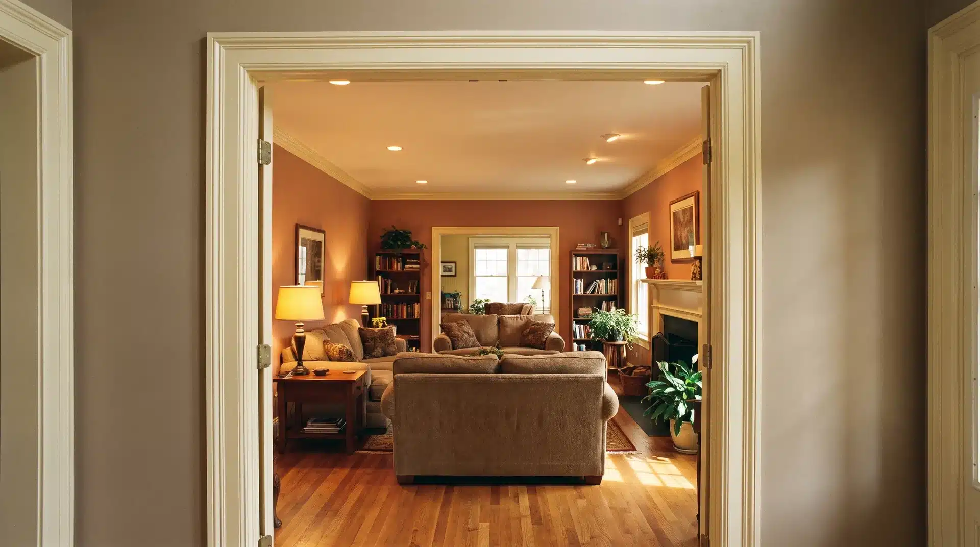
Keep paint colors consistent across rooms by anchoring shared spaces with one neutral, matching undertones from room to room, and saving your boldest colors for rooms with a door to close them off.
Color decisions made room by room without considering the whole house often create jarring transitions between spaces. Start with the rooms people see together.
Spaces connected by doorways, open walls, or shared sightlines need colors that sit comfortably next to each other, not just colors that work individually.
- Anchor with one neutral: Choose a neutral color for halls, trims, or main shared spaces. It gives the rest of the home a visual base that other rooms can work off without clashing. If you’re pairing walls and trim in that shared space, this roundup of wall and trim color combinations is a good place to start.
- Match undertones across rooms: Nearby rooms do not need to share the same color, but they should share a similar undertone. Warm and cool shifts between adjacent spaces clash quickly and are hard to unsee once you notice them.
- Reserve stronger colors for closed rooms: A door visually separates a bold color from the rest of the house. Without that separation, a strong color in one room pulls against everything around it.
- Repeat small color details: Rugs, art, cushions, and accessories that echo colors from nearby rooms create a sense of connection without making every space look identical.
Consistent paint across a home does not mean every room matches. It means each color feels like it belongs to the same house.
Conclusion
Learning how to choose a paint color becomes easier when you stop judging shades on their own.
The best color is the one that works with your floors, furniture, trim, lighting, and the way you actually use the room. A sample that looks good only once, in one spot, is not enough.
Test a large sample across different walls and check it in morning, afternoon, and evening light before buying the full tin. Also keep nearby rooms in mind so the whole home feels connected.
Start with one room, study what is already fixed, and let the right paint color prove itself before you commit.
Frequently Asked Questions
Should I Choose Paint Colors Before or After Buying Furniture?
After, if you have any choice in the matter. Furniture undertones are harder to change than paint, so let your fixed pieces lead the decision. If furniture is already in place, pull its dominant undertone first and treat that as the constraint guiding your paint choice, rather than picking a wall color on its own.
Why Does My Paint Color Look Different on the Wall Than on the Chip?
Chips are small, framed by a white border, and judged under store lighting, none of which match your room. Wall color also reacts to the floor, furniture, and trim around it, and shifts through the day as natural and artificial light change temperature. A large sample tested in place shows the real color.
What is the Safest Paint Color if I Cannot Decide?
A warm white or greige with a neutral undertone works across the widest range of rooms. The key is matching that undertone to your fixed finishes rather than defaulting to a stark white, which can pull cooler or warmer than expected once it meets your actual light.
Does Ceiling Color Matter When Choosing Wall Paint?
It does, more than most people expect. A ceiling with a pink or yellow undertone casts a subtle tint onto the walls below it, especially in smaller rooms where the two surfaces sit close together. Matching the ceiling to the wall color family keeps that unintended cast from throwing off the room.