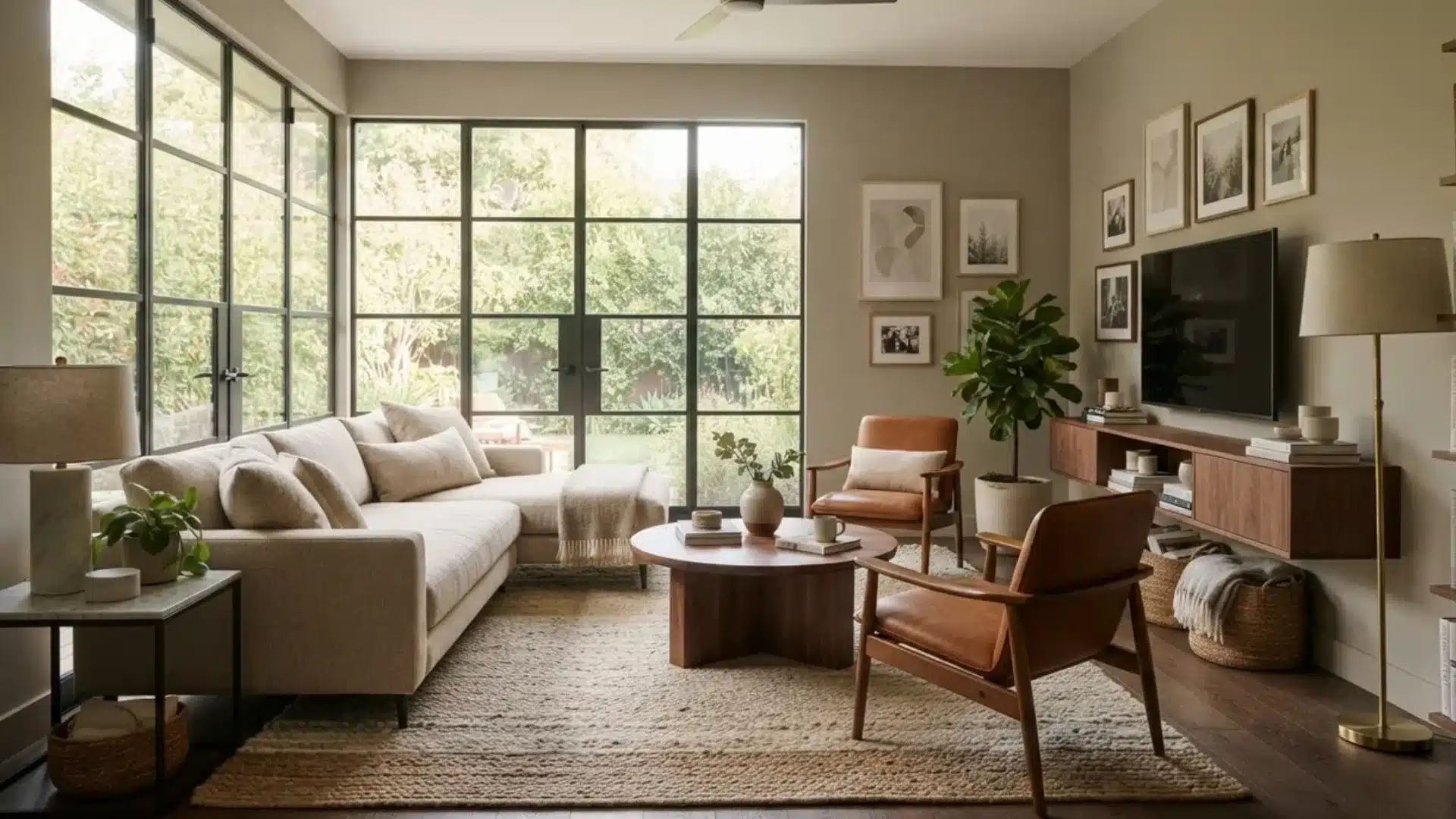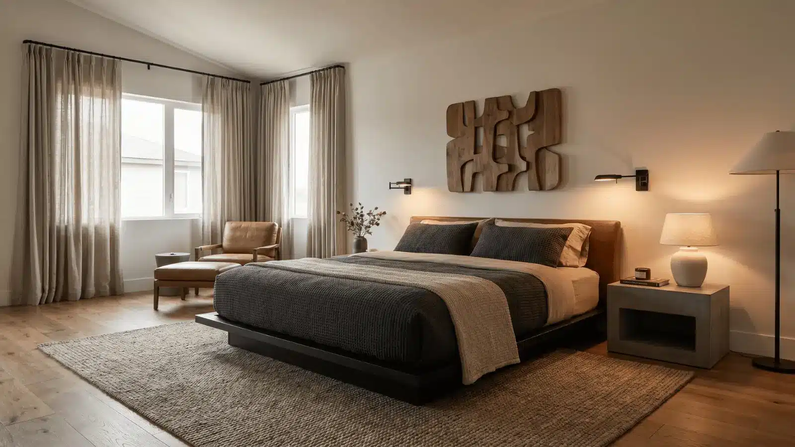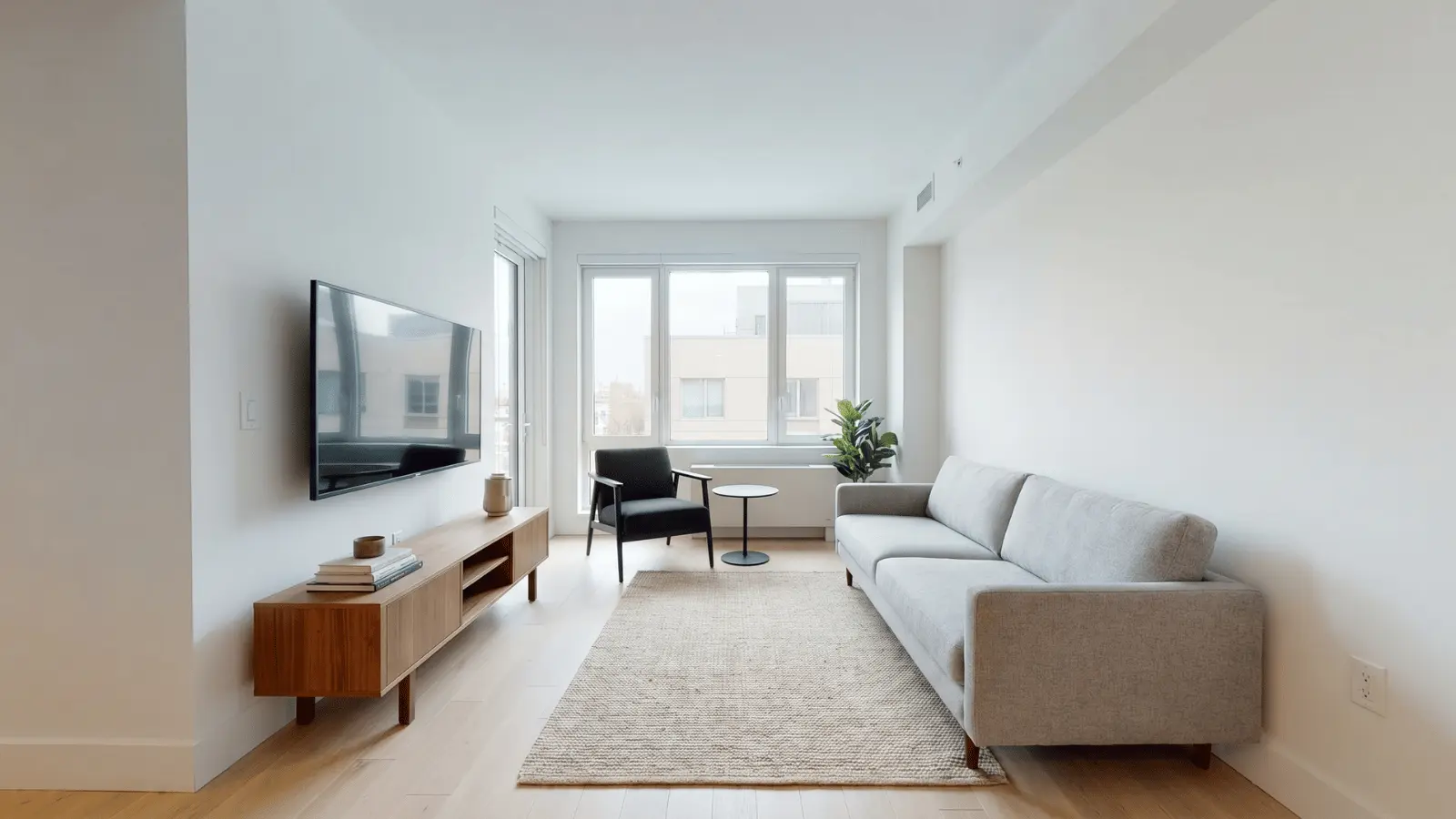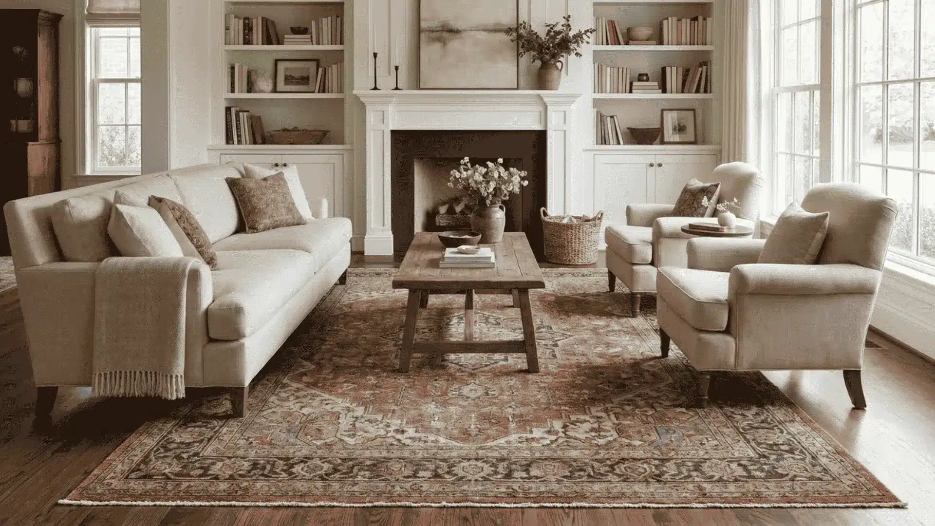


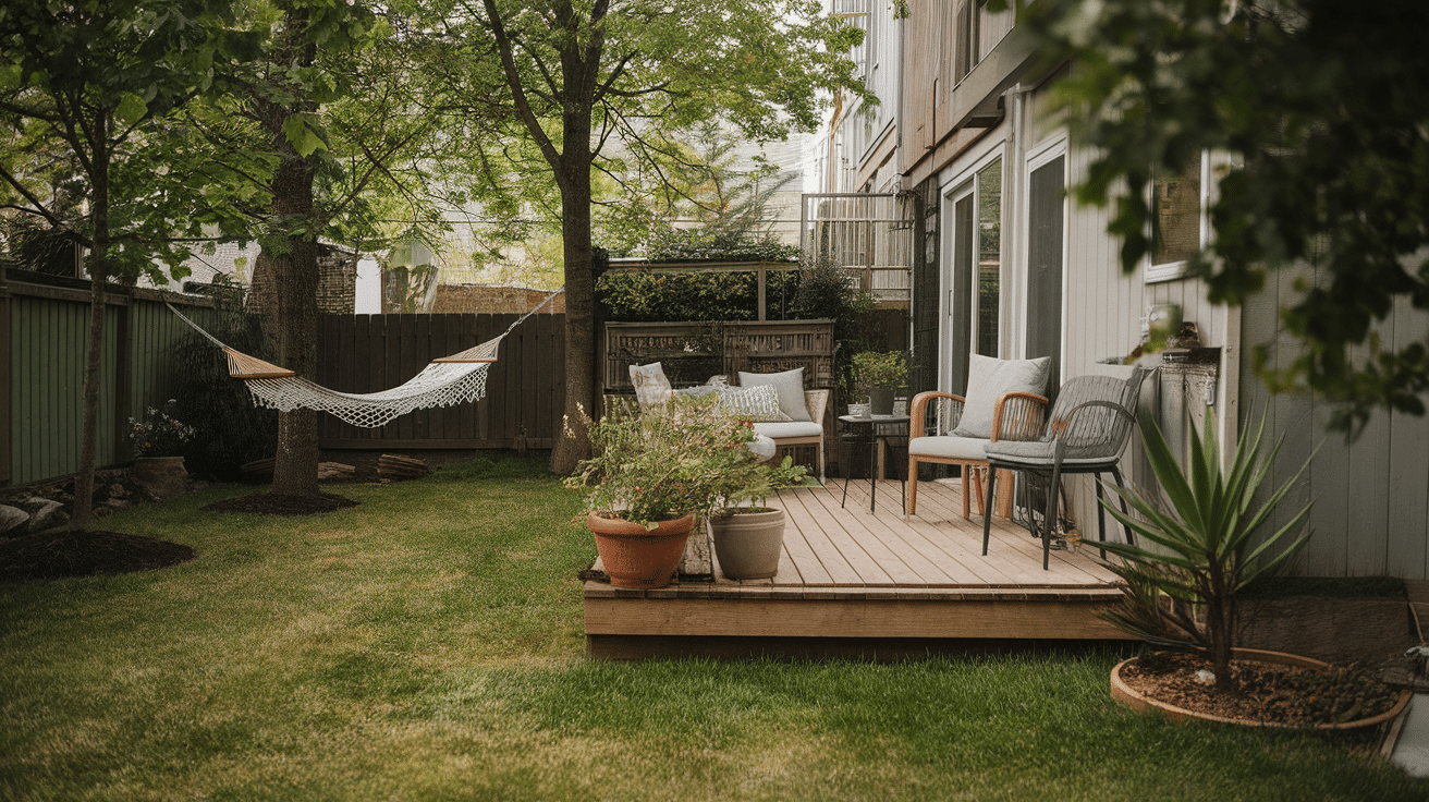
Choosing wall colors becomes much easier when you understand how light hardwood floors change the way paint shows up in a room.
The wood’s undertone plays a bigger role than most people expect, and it can shift a color warmer, cooler, or even slightly darker.
Today, I’ll walk you through how to read your floor’s undertone, how to pair it with the right shades, and the color families that usually work best.
You’ll also see how different styles use color and the simple testing steps before making a final choice.
Understanding Wood Flooring Undertones
The wood floor’s undertone changes how every color looks in your home, so it’s the first thing to check before choosing paint or decor.
| Wood Type | Typical Undertone | Notes |
|---|---|---|
| Maple | Warm or Neutral | Has a subtle yellow warmth. Light stains can bring out neutral beige tones. |
| Birch | Warm | Naturally golden with hints of red or orange. Warmth increases with darker stains. |
| White Oak | Neutral to Cool | Shows gray-beige (greige) tones. Very versatile for most color palettes. |
| Pine | Warm | Strong yellow or orange warmth. Knots often deepen the golden look. |
| Ash | Cool | Pale with gray undertones. Works well in modern or airy spaces. |
How To Identify Warm, Cool, and Neutral Undertones
- Place a plain white sheet of paper on the floor to reveal hidden tones.
- If you see yellow, orange, or red, the undertone is warm.
- If your floor leans gray, taupe, or beige, the undertone is cool or neutral.
- Check different spots in the room because light changes how undertones look.
Understanding your floor’s undertone makes it much easier to pick colors that feel balanced, calm, and intentional in your space.
How to Match Wall Color with Light Hardwood Floors
Choosing a wall color that works with light hardwood floors is all about balance. The right shade should complement the wood’s natural undertone, enhance the room’s lighting, and support your overall design style.
- Identify the undertone first: Warm floors pair best with warm shades, while cool-toned wood works better with cool or muted colors.
- Choose contrast or harmony: Decide whether you want the walls to blend softly with the floor or create a bold contrast.
- Pay attention to lighting: Natural and artificial light can shift paint undertones, so always test colors in different conditions.
- Match color to your style: Minimalist rooms benefit from soft neutrals, while modern or dramatic spaces can handle deep tones.
- Test before finalizing: Use peel-and-stick samples or large boards to see how the paint looks beside the wood at different times of day.
With these simple guidelines in mind, you’ll be able to narrow down choices quickly and confidently choose a wall color that enhances your beautiful light hardwood floors.
Best Wall Colors for Light Wood Floors
Light wood floors work with many wall colors, but the right shade can make the room feel brighter, calmer, or more balanced.
1. Whites & Off-Whites (Most Popular Choice)
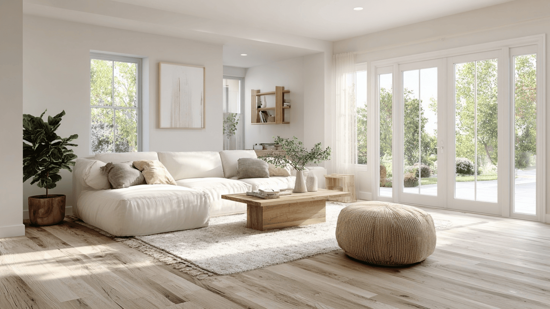
Whites and off-whites create the cleanest and most open look with light wood floors. Shades like Sherwin-Williams Alabaster (SW 7008) and Benjamin Moore Chantilly Lace (OC-65) keep the room bright and simple.
They also help the wood stand out without adding visual weight. This makes them perfect for modern, airy, and minimalist rooms with lots of natural light.
2. Grays & Greiges
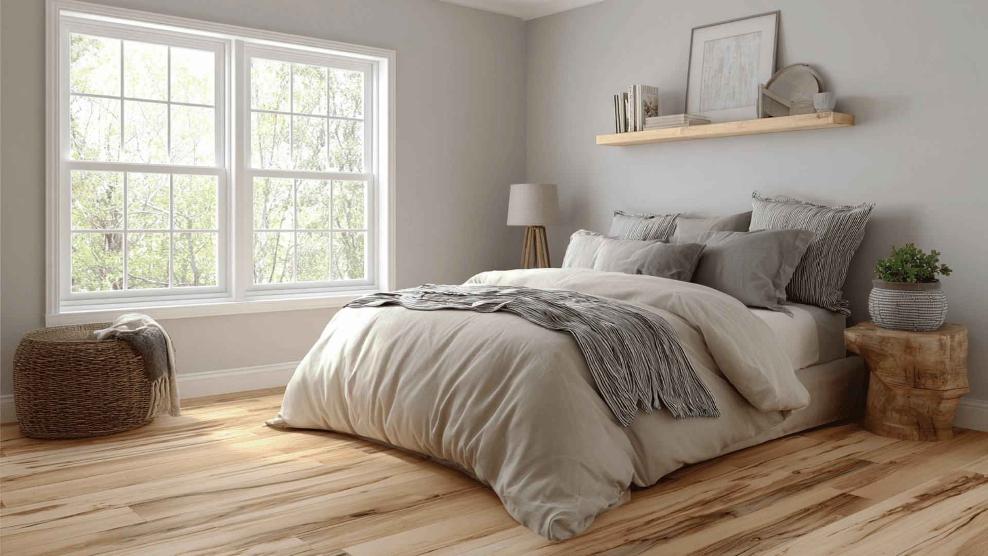
Grays and greiges pair well with cool or neutral light wood floors because they add soft depth without feeling heavy. Colors like Benjamin Moore Classic Gray (OC-23) and Sherwin-Williams Repose Gray (SW 7015) stay calm and balanced in any room.
They help reduce the warmth of the wood and create a clean, relaxed look that works in bedrooms, living rooms, and open spaces.
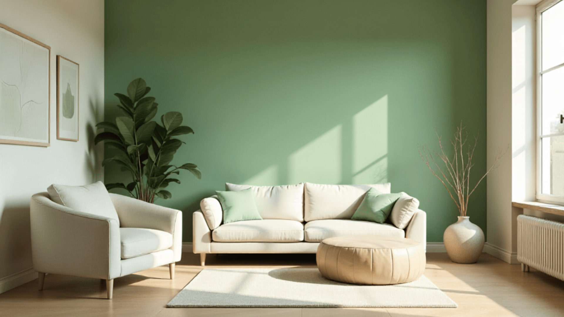
3. Sage Greens & Earthy Greens
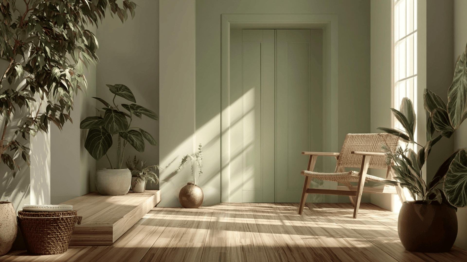
Sage and earthy greens are top choices in many design forums because they bring a natural, peaceful feel to a room. Shades like Sherwin-Williams Evergreen Fog (SW 9130) and Benjamin Moore Soft Fern (2144-40) mix beautifully with warm or neutral wood floors.
These colors add gentle warmth and a grounded look, making them ideal for spaces where you want a calm, nature-inspired mood.
4. Soft Blues & Pastels
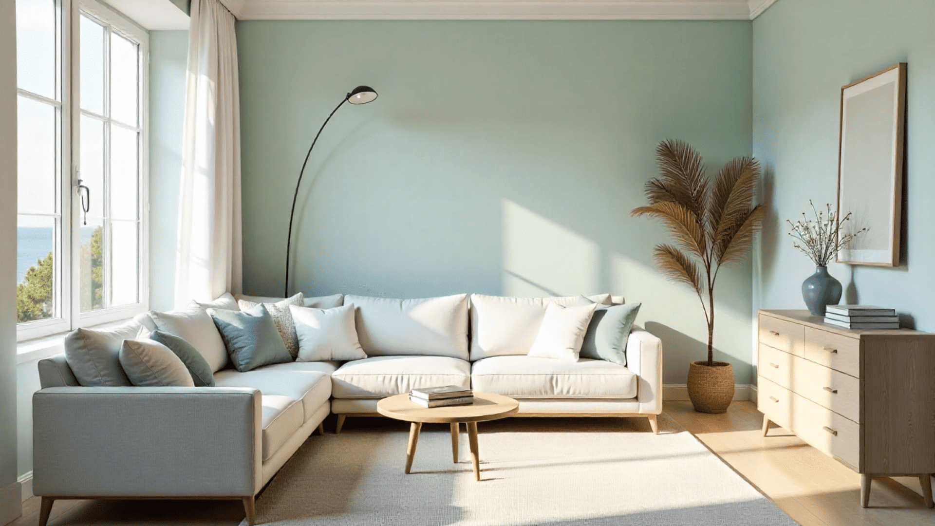
Soft blues and muted pastels create a breezy, light feel that pairs well with pale wood. Try colors like Sherwin-Williams Sea Salt (SW 6204) or Benjamin Moore Palladian Blue (HC-144) to brighten the space.
They’re great for coastal or relaxed rooms where you want to feel calm and airy. Pastels also add just enough color to make the room feel fresh without overpowering it.
5. Warm Neutrals
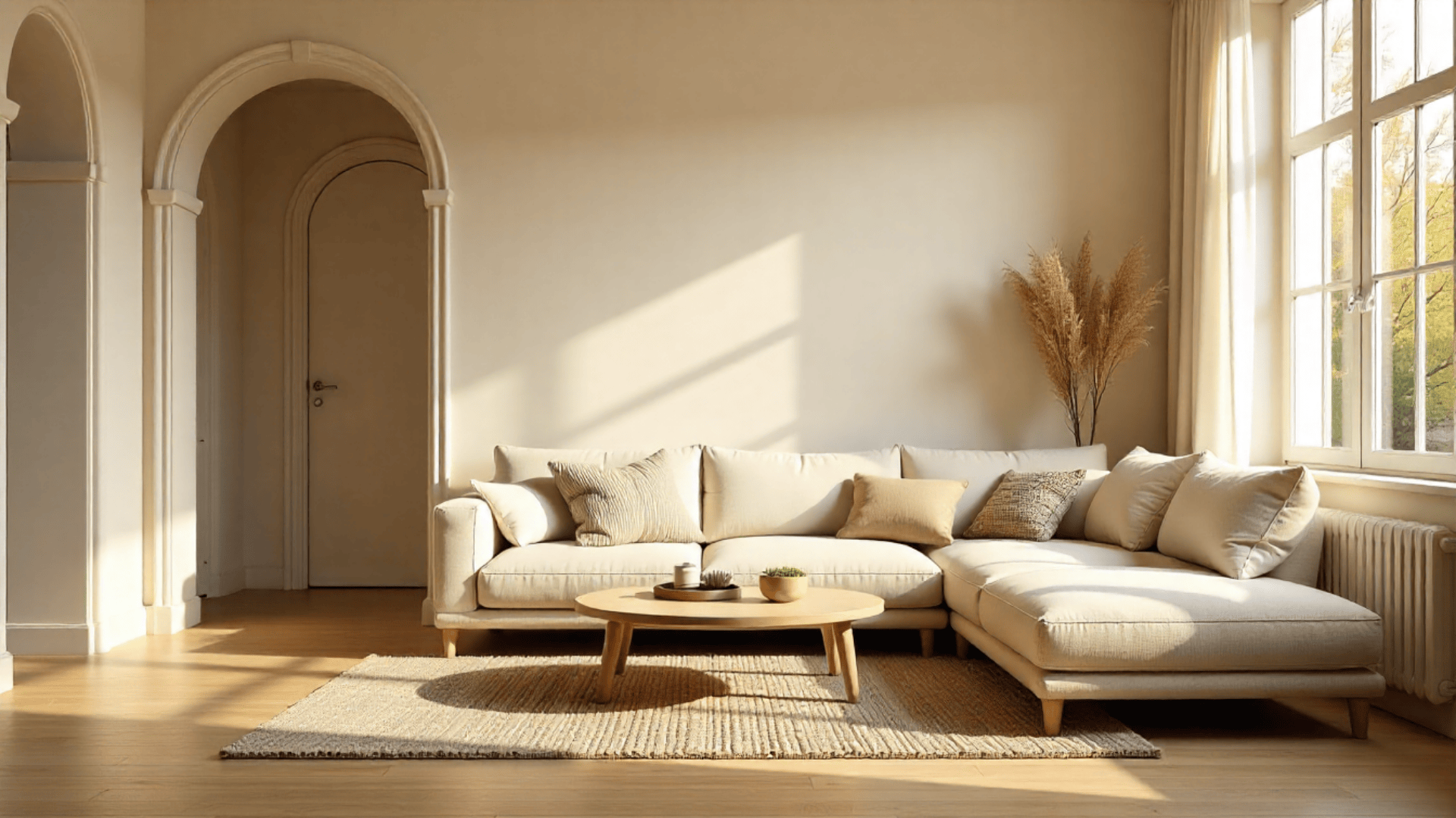
Warm neutrals like beige and cream work best with light wood floors that have golden or warm undertones. Options such as Benjamin Moore Ballet White (OC-9) and Sherwin-Williams Accessible Beige (SW 7036) create a soft, cozy glow.
They blend smoothly with the wood’s natural warmth and are perfect for living rooms, hallways, and other spaces where you want a welcoming atmosphere.
6. Dark Colors for Contrast
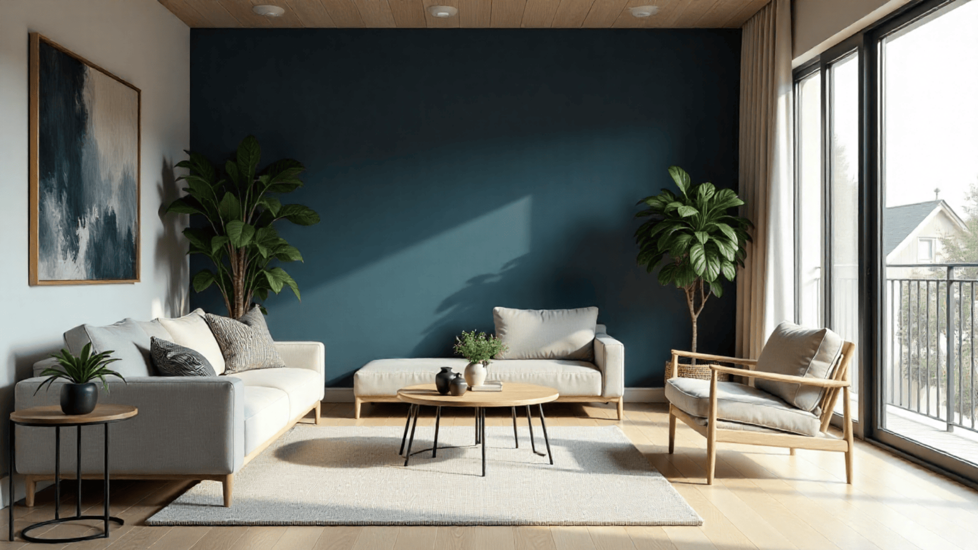
Dark colors like navy, charcoal, and deep green create bold contrast against light wood floors. Shades like Sherwin-Williams Naval (SW 6244) and Sherwin-Williams Still Water (SW 6223) create a rich, dramatic look
Dark walls work well as accent walls or in large rooms with plenty of natural light. They help define the space and give it a richer, more stylish look without feeling too heavy.
Matching Wall Color to Room Style
Choosing the right wall color becomes simpler when you match it with your room style. This helps your space feel natural, calm, and true to your taste.
1. Scandinavian
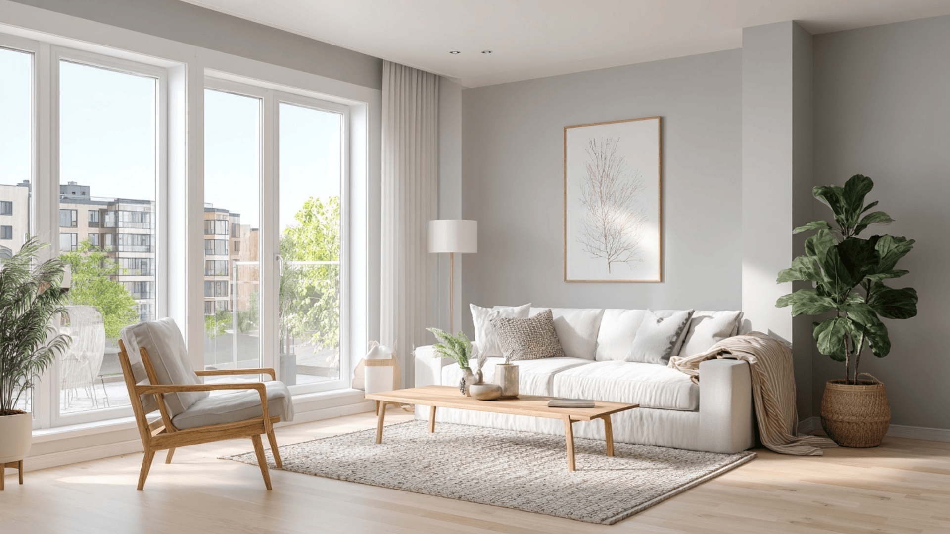
Scandinavian style focuses on lightness and simplicity. Wall colors like Benjamin Moore Chantilly Lace (OC-65), Sherwin-Williams Alabaster (SW 7008), and Benjamin Moore Classic Gray (OC-23) keep the space bright and clean.
These shades pair well with natural textures and light wood, creating an airy, calm environment without feeling stark.
2. Modern
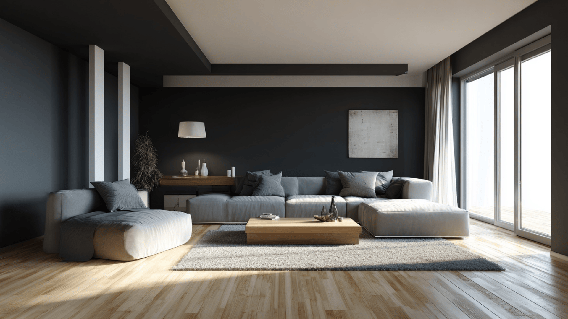
Modern interiors rely on bold contrast and clean lines. Using deep hues like Sherwin-Williams Iron Ore (SW 7069) or Benjamin Moore Black Beauty (2128-10) adds structure and creates visual drama.
Pairing these with crisp white, such as Benjamin Moore Chantilly Lace (OC-65), keeps the room sharp, balanced, and intentionally styled.
3. Coastal
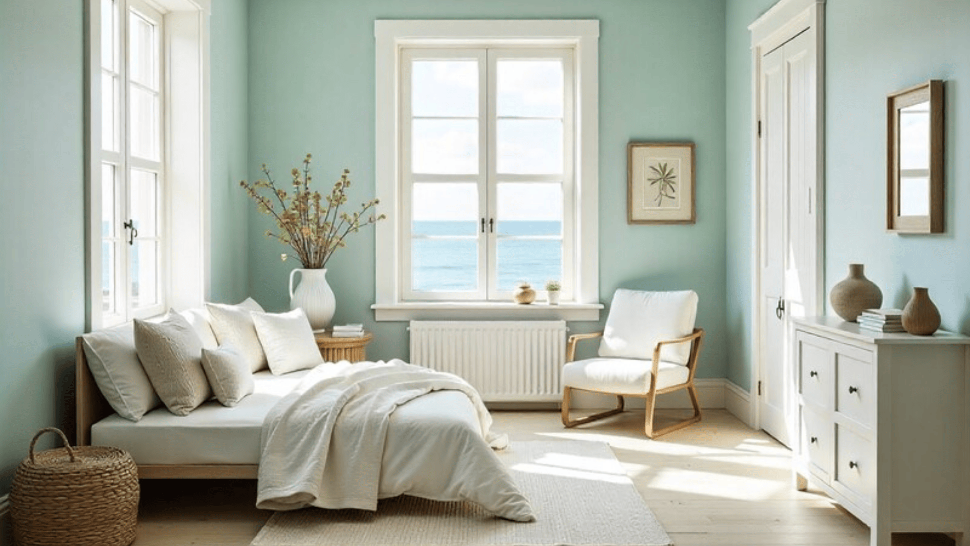
Coastal style draws inspiration from ocean tones and natural light. Shades like Sherwin-Williams Sea Salt (SW 6204) or Benjamin Moore Woodlawn Blue (HC-147) introduce soft, relaxing color.
Sherwin-Williams Pure White (SW 7005) keeps the space open and breezy. Together, they create a fresh, uplifting coastal feel suited to light wood floors.
4. Farmhouse
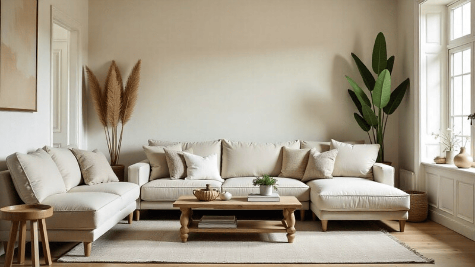
Farmhouse style works well with warm neutrals that feel inviting. Colors like Sherwin-Williams Creamy (SW 7012) add softness, while Sherwin-Williams Agreeable Gray (SW 7029) creates a balanced, versatile backdrop.
A warmer tone, such as Benjamin Moore Muslin (OC-12), enhances wood tones and adds comfort without overwhelming the room.
5. Japandi
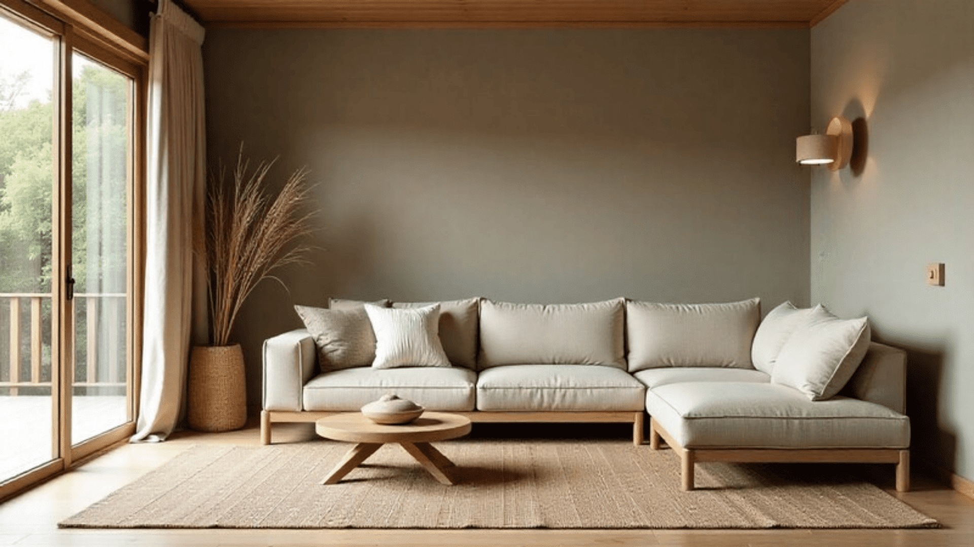
Japandi style combines simplicity with warmth, using muted, nature-inspired tones. Soft neutrals like Benjamin Moore Edgecomb Gray (HC-173, LRV 63) and Sherwin-Williams Repose Gray (SW 7015, LRV 58) create a calm, grounded feel.
For slightly more warmth, Benjamin Moore Natural Linen (OC-91, LRV 69) pairs seamlessly with minimal decor and organic materials.
Color-Matching Approaches Designers Use
Designers rarely choose paint randomly; they use intentional color relationships to create balance, contrast, or visual harmony.
| Approach | How It Works | Room Example | Real Paint Examples |
|---|---|---|---|
| Analogous Colors | Uses 2–3 colors next to each other on the color wheel for a calm, cohesive look | Soft green walls, muted teal textiles, broad blue accents | Benjamin Moore Soft Fern, Sherwin-Williams Sea Salt, Benjamin Moore Hale Navy |
| Complementary Colors | Uses opposite colors (like blue and orange) for energetic, balanced contrast | Slate blue walls with warm tan or burnt-orange decor | Benjamin Moore Normandy, Sherwin-Williams Copper Harbor, Benjamin Moore White Dove (to balance) |
| High-Contrast Walls | Uses light + dark pairings to create bold definition and a modern feel | Charcoal feature wall with crisp white trim and pale wood flooring | Sherwin-Williams Iron Ore, Benjamin Moore Chantilly Lace, Sherwin-Williams Agreeable Gray (as a soft neutral connector) |
These examples make it easy to pick the approach that fits your style, whether you want calm colors, bold contrast, or a modern high-impact look.
How to Test Wall Colors Properly
- Where to Place Swatches: Put swatches on different walls, especially near the floor, so you can see how the color looks next to the wood. Use larger swatches to spot undertones clearly.
- Testing in Daylight vs. Night: Check colors in natural light and in evening light. Daylight shows the true undertone, while night lighting can warm or cool the shade.
- Using Peel-and-Stick Samples: Peel-and-stick samples give a bigger, more accurate view of the color. Move them around the room to see how the shade reacts in different areas and lighting.
These simple steps help you choose a wall color that looks right at every time of day and matches your light wood floors with confidence.
Common Mistakes to Avoid
Small mistakes can make your wall color clash with light wood floors. These points help you choose colors that look clean and balanced.
- Mixing Warm and Cool Accidentally: Warm floors paired with cool wall colors can look uneven if you don’t plan it. Always check your floor’s undertone first so the wall color supports it instead of clashing.
- Choosing Walls Too Close in Tone: When the wall color is almost the same tone as the floor, everything blends together. Light wood floors need some contrast, so choose a shade that’s a few steps lighter or darker.
- Ignoring Light Direction: Light changes color more than most people expect. North-facing rooms make colors look cooler, while south-facing rooms warm them up. Test samples on multiple walls to see the real color.
- Copying Pinterest Without Testing: Online photos don’t match your lighting or your wood undertone. Always test paint in your own room so you get the actual look, not just what worked in someone else’s home.
- Using Brown Walls: Brown walls can overpower light wood and make the room feel heavy. If you want warmth, choose soft beiges or creams for a lighter, cleaner match.
Conclusion
Choosing the right wall color becomes much easier when you understand how light hardwood floors influence the way every shade appears.
Once you know the undertone, it’s simpler to sort through colors and focus on the ones that bring balance to your space.
What matters most is how the paint looks in your own lighting, next to your own wood, and at different times of day. When you compare a few samples side by side, the best choice usually stands out quickly.
If you’re ready to begin, grab a couple of test swatches and start exploring shades that support your home’s look and feel.