
Home » Paint Reviews » Page 2
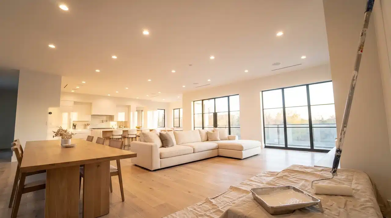
A ceiling can make a room feel polished, or it can expose every roller mark and small surface flaw. If you choose the wrong
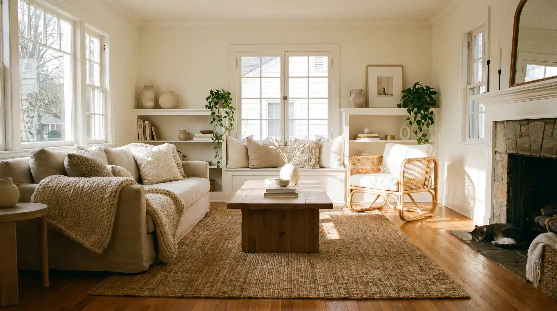
Warm white paint colors can make a room feel soft, bright, and welcoming, but choosing the right one is not always simple. A shade that looks perfect on a store card can turn yellow, flat, or too creamy once it
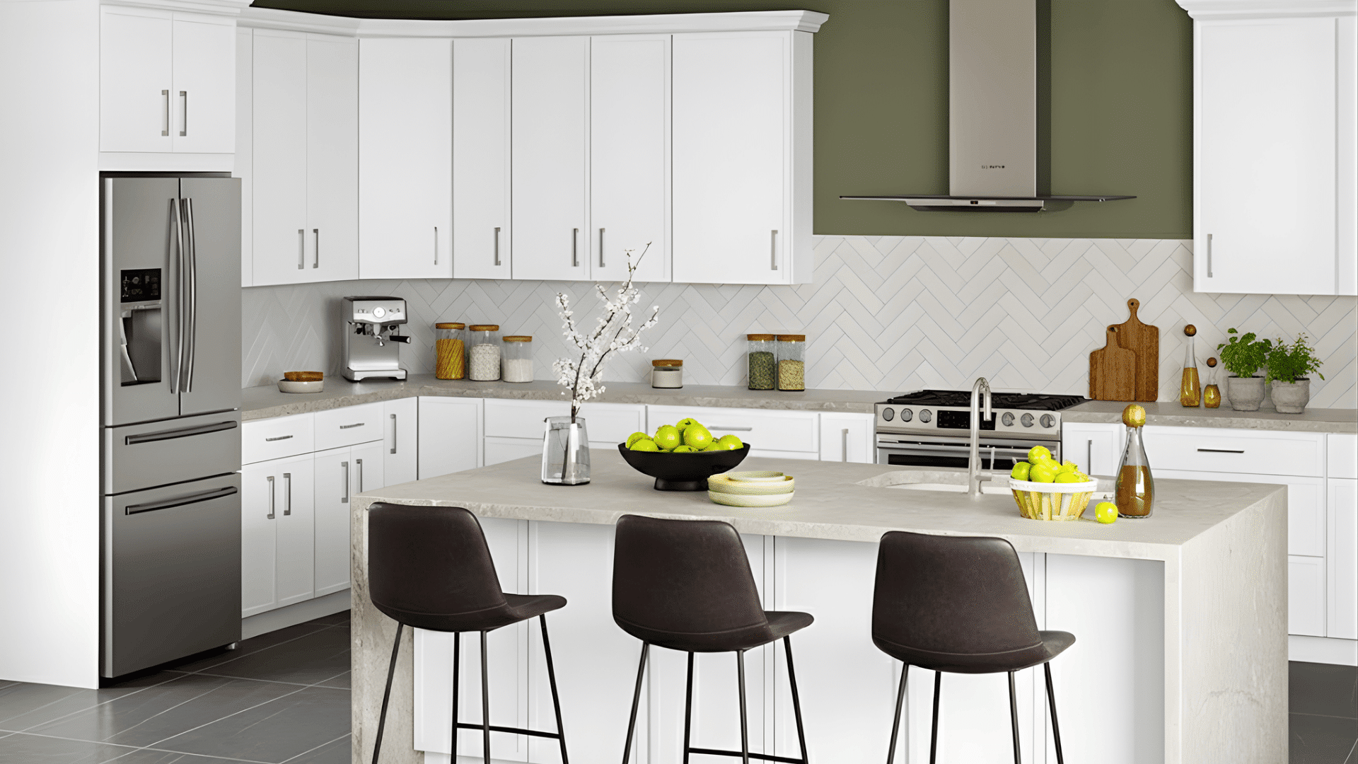
Choosing the right kitchen paint colors to go with white cabinets can feel exciting, but also a bit overwhelming. With so many choices, it’s hard to know which shade will make your space stand out. The good news is you don’t need to be a designer to get it right. After reading this, you’ll find simple ideas and easy tips to help you pick colors that feel just right for your kitchen. Whether you’re updating your space or starting fresh, you’ll find inspiration to make your kitchen warm, bright, and uniquely yours. How to Choose the Right Shade for Your Kitchen The right wall color depends on the light, the materials, and the undertones. When these align, your kitchen looks balanced and natural. Consider Natural Light and Direction South-facing kitchens: Get warm light. Use cool shades like soft gray, sage green, or pale blue. North-facing kitchens: Get cool light. Choose warm tones like beige, creamy white, or peach. Warm bulbs enhance reds and yellows. Cool LEDs bring out blues and grays. Always test paint samples at different times of day to see how light changes the color. Match With Countertops, Floors, and Backsplash White Quartz: Sage Green or Light Gray Marble: Soft Beige or Warm Greige Butcher Block: Creamy White or Olive Green Granite (Gray or Black): Warm Taupe or Soft Blue Concrete: Warm White or Muted Green If surfaces are bold, keep walls soft. If surfaces are plain, add color for contrast. Understand Undertones Cool undertones (blue, gray, green) suit crisp whites and silver finishes. Warm undertones (yellow, red, pink) suit creamy whites and gold or brass accents. Compare paint samples side by side and pick colors from the same undertone family; warm with warm, cool with cool; for a cohesive look. Top Kitchen Paint Colors that Go with […]
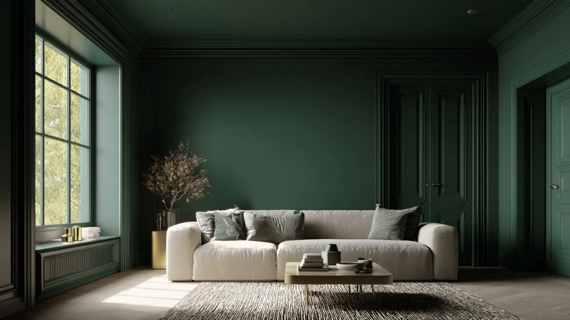
Color drenching is one of those design ideas that can change the entire mood of a room using just one color. I love how a single shade can shift the atmosphere so effortlessly. It gives a room a completely new energy without needing complicated design steps. Today, through this blog, I will let you know what makes this trend so famous. If you’re excited about trying something bold without overthinking it, this guide will help you find color drenching with confidence and maybe even inspire your next makeover. What is Color Drenching? Color drenching is a painting style where you use one main color across the whole room—walls, ceiling, trim, doors, and sometimes furniture. This creates a smooth, unified look that feels calm and wrapped in color. It can be done in two ways: monochrome, where everything is the exact same color, or tone-on-tone, where you use softer or deeper shades of the same color. Why it matters in design: Creates a soft, unified space with fewer visual breaks. Highlights architectural details by focusing on shape, not contrast. Adds drama without clutter. Works with any style, from modern to cottage to maximalist. This is why color drenching has become such a standout design trend Color Drenching Ideas for Every Room Color drenching can change the mood of a space fast, and the color you choose sets the tone. These ideas give you different ways to use one shade across walls, ceilings, trim, and doors. 1. Moody Navy Bedroom A navy-drenched bedroom creates a deep, calm atmosphere that helps you unwind at the end of the day. The dark tone wraps the room in a cocoon-like feel that works well with soft bedding and warm lighting. Navy also hides shadows, which makes the space look smooth and even, giving the whole […]
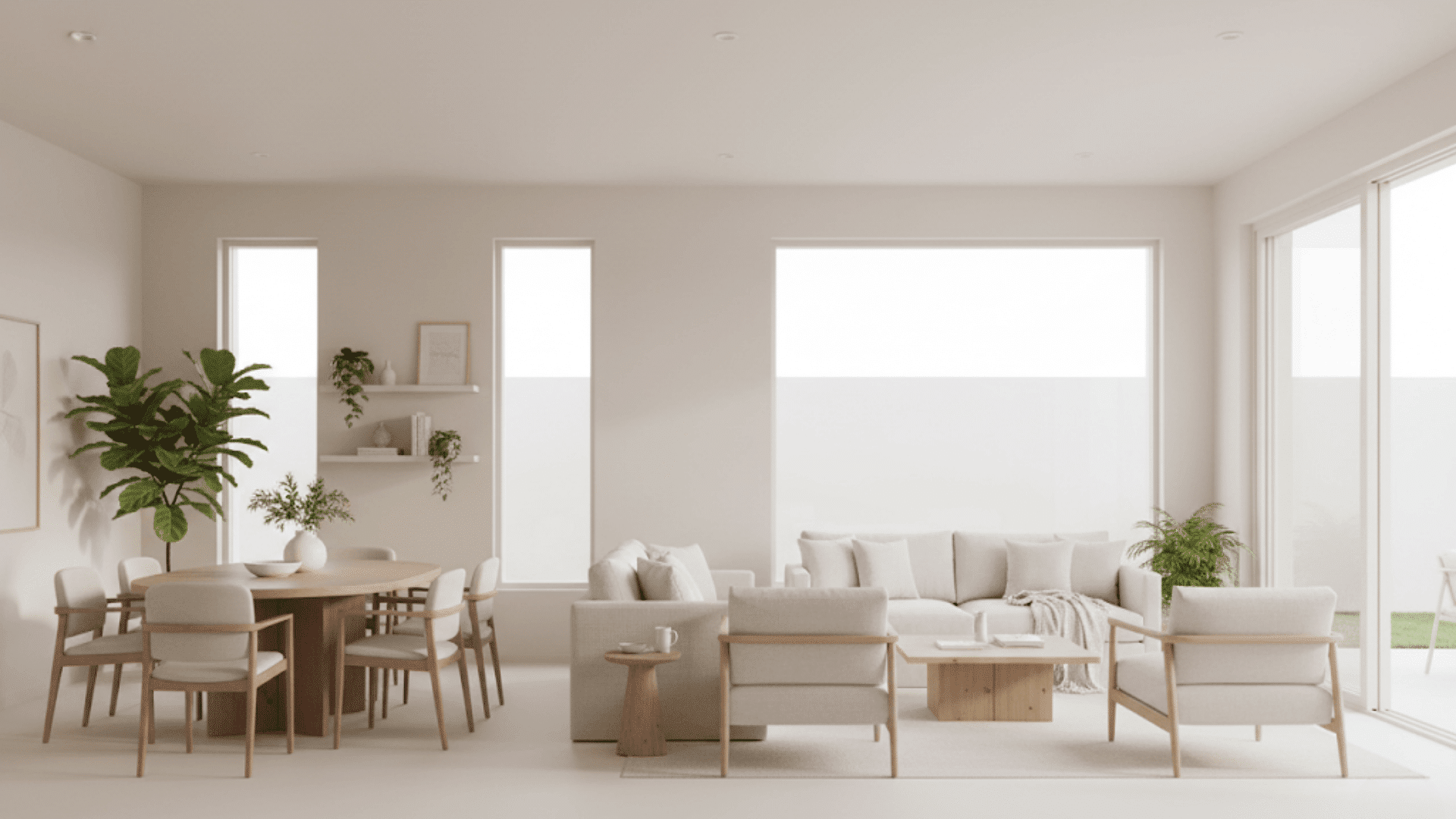
When you first look at Oyster White (SW 7637), it might seem like another off-white, but it’s far from plain. This soft, warm neutral has a quiet versatility that works beautifully in different lighting and design styles. I’ve seen it create balance in open spaces and add calm to rooms that need a gentle backdrop. Today, I’ll walk you through how Oyster White looks in real homes, what colors pair best with it, how it compares to other whites, and the finishes that bring out its best side. Let’s start by understanding why it’s such a favorite for designers and homeowners alike. What Color is Oyster White? Oyster White from Sherwin-Williams is an off-white paint that sits between beige and gray. It’s not a bright, stark white; it has a soft, calming warmth that makes spaces feel easy to live in. With an LRV (Light Reflectance Value) of 72, it reflects a fair amount of light, keeping rooms bright without looking washed out. In my experience, that makes it a great choice if you want something that feels airy but still grounded. It leans warm, but not too creamy. Depending on your lighting, it can look more beige in the afternoon sun or slightly gray in cooler light. That balance is what makes Oyster White such a flexible neutral for both interiors and exteriors. Undertones Explained Oyster White has subtle green-beige undertones that give it a natural, earthy feel. You might not notice the green right away, it’s soft and shows up mainly in certain lights. As I see it, lighting plays the biggest role in how this color behaves: Bright daylight: Looks lighter and slightly warmer, almost creamy beige. Artificial light: Can shift toward a muted gray or soft greige. If you’re testing it at home, I suggest looking […]
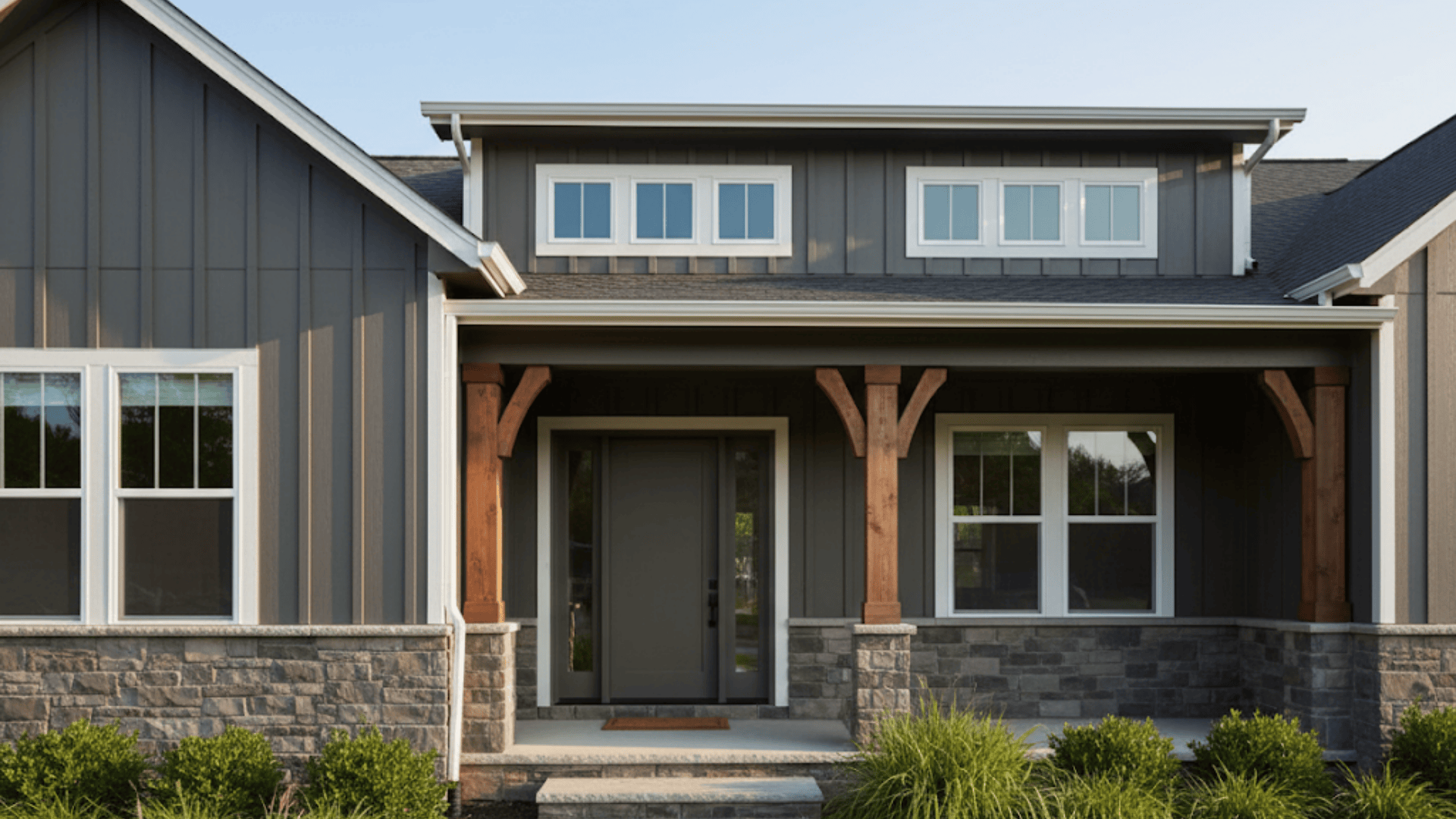
When you’re thinking about giving your home a refresh, few colors feel as grounded and versatile as Urbane Bronze exterior. This deep, nature-inspired shade adds warmth, contrast, and class to your home, regardless of where it leans. I’ve seen it instantly elevate exteriors with just the right balance of depth and comfort. Today, I’ll walk you through everything from how the color behaves in light to the best pairings, finish tips, and style ideas that make it shine. By the end, you’ll know exactly how to use Urbane Bronze to bring out your home’s best features. Let’s start by understanding what makes this shade so unique. What is Urbane Bronze (SW 7048)? Urbane Bronze by Sherwin-Williams is a deep, dark brown-gray shade with a touch of green. It’s often called a “greige,” sitting between gray and beige, with warmth that feels earthy and grounded. With a Light Reflectance Value (LRV) of 8, it’s a low-reflective color, meaning it absorbs more light than it reflects. In simple terms, Urbane Bronze looks rich and dramatic, especially on exteriors with good natural light. Sherwin-Williams named it their 2021 Color of the Year for good reason. It gives off a calm, rooted feeling that connects your home to nature. It has that earthy, grounded vibe that fits right in with today’s modern designs. I’ve seen it look incredible next to wood accents, stone walls, and metal details. Another reason people love it? It’s low-maintenance. The darker tone hides dust and weather marks better than lighter shades, keeping your home looking clean and polished longer. Urbane Bronze Paint: Exterior Applications Urbane Bronze can work beautifully across different parts of your home’s exterior. Let’s look at where it truly shines and how to use it for the best effect. Siding If you use Urbane Bronze as […]
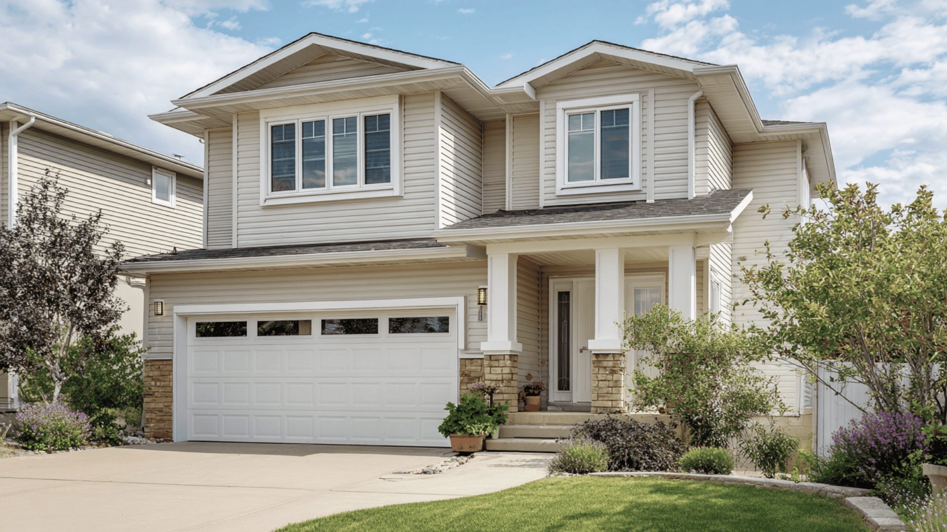
A fresh coat of paint can completely change how your home looks and feels. But before you pick up a brush or call a painter, you need to understand the real cost to paint exterior of house. Prices vary widely depending on your home’s size, materials, and the quality of paint you choose. Here, I’ll break down what influences pricing, how to estimate costs, and simple ways to save without cutting corners. You’ll also learn when to repaint, what products last longest, and whether DIY is truly worth it. Let’s start with what most homeowners want to know first. Average Cost to Paint a House Exterior Prices can vary a lot depending on your home size, siding, and where you live, but there’s a clear national average you can use to plan. On average, painting a house exterior costs between $1.50 and $4.00 per square foot. That means most homeowners spend around $3,000 to $7,000 for a typical house. Typical Total Cost by Home Size Home Size (sq ft) Estimated Cost Range 1,000 sq ft $1,500 – $4,000 1,500 sq ft $2,500 – $5,500 2,000 sq ft $3,000 – $7,000 3,000 sq ft $4,500 – $10,000 4,000 sq ft $6,000 – $12,000+ These numbers include paint, supplies, and labor for a standard exterior paint job. Where you live plays a big role in the total cost. I’ve noticed prices are higher in big cities and coastal regions because of labor rates and climate factors. United States: Midwest: $1.50–$3.00 per sq ft South: $1.75–$3.50 per sq ft Northeast: $2.50–$4.50 per sq ft West Coast: $3.00–$5.00 per sq ft Canada: Average: $1.00–$4.00 per sq ft Small homes: $3,000–$5,000 Large homes: $7,000–$12,000 Prices shift depending on paint quality, prep work, and accessibility. As I see it, getting at least three local quotes gives […]
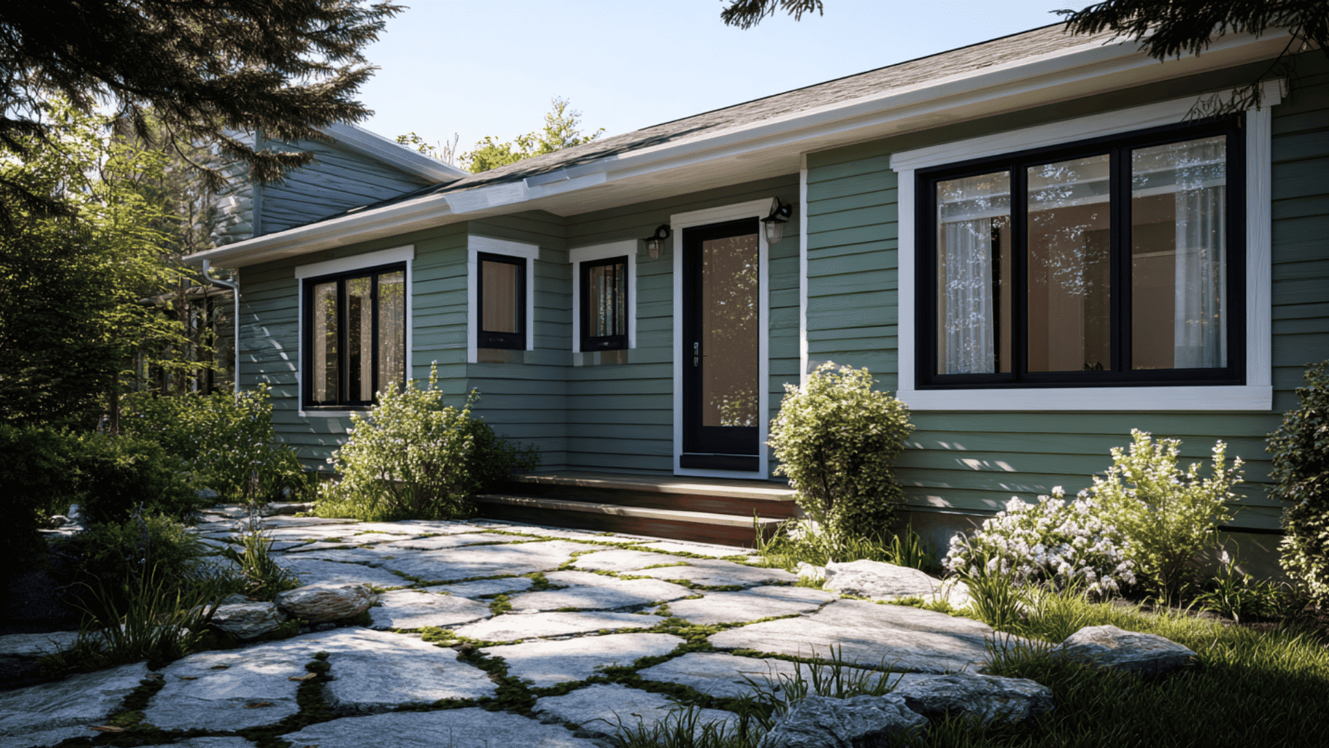
Have you ever wanted a paint color that feels balanced, familiar, and a touch dramatic? Pewter Green SW 6208 by Sherwin-Williams captures that feeling perfectly. This nature-inspired green brings a quiet richness that works effortlessly in both modern and traditional spaces. It feels grounded, welcoming, and just bold enough to stand out without overwhelming the settings. In this blog, you’ll learn what makes Pewter Green so versatile, how it behaves in different lighting, and the best ways to style it in your home. Understanding Pewter Green SW 6208 Pewter Green SW 6208 by Sherwin-Williams is a deep, muted green with subtle gray undertones. It has a cool, earthy look that feels Balanced yet bold, making it a popular choice for both modern and traditional homes. Its Light Reflectance Value (LRV) is 12, meaning it absorbs most light and reads as a darker shade. It works best in rooms with good natural lighting or paired with lighter trim colors to create contrast. This color brings a balanced mood to any space; it feels grounded and natural, like a forest shade softened by mist. Designers love it for creating a cozy, peaceful atmosphere without feeling too dark or heavy. How Pewter Green Looks in Different Spaces Pewter Green works well in almost any part of the home. It adds depth and a touch of nature-inspired warmth. 1. Living Rooms It brings warmth and character to living rooms without feeling heavy. The soft green tone creates a Peaceful backdrop that highlights furniture and décor. Pair it with white trim, warm wood tones, and brass accents for balance. Add light fabrics and soft rugs for a relaxed, cozy feel. 2. Kitchens and Cabinets This color looks beautiful on cabinets and islands. It pairs naturally with gold hardware, white counters, and light wood floors. Use […]

Get the latest home decor tips, DIY ideas, and design inspiration delivered straight to your inbox.