

When you’re thinking about giving your home a refresh, few colors feel as grounded and versatile as Urbane Bronze exterior.
This deep, nature-inspired shade adds warmth, contrast, and class to your home, regardless of where it leans. I’ve seen it instantly elevate exteriors with just the right balance of depth and comfort.
Today, I’ll walk you through everything from how the color behaves in light to the best pairings, finish tips, and style ideas that make it shine.
By the end, you’ll know exactly how to use Urbane Bronze to bring out your home’s best features. Let’s start by understanding what makes this shade so unique.
What is Urbane Bronze (SW 7048)?
Urbane Bronze by Sherwin-Williams is a deep, dark brown-gray shade with a touch of green. It’s often called a “greige,” sitting between gray and beige, with warmth that feels earthy and grounded.
With a Light Reflectance Value (LRV) of 8, it’s a low-reflective color, meaning it absorbs more light than it reflects. In simple terms, Urbane Bronze looks rich and dramatic, especially on exteriors with good natural light.
Sherwin-Williams named it their 2021 Color of the Year for good reason. It gives off a calm, rooted feeling that connects your home to nature.
It has that earthy, grounded vibe that fits right in with today’s modern designs. I’ve seen it look incredible next to wood accents, stone walls, and metal details.
Another reason people love it? It’s low-maintenance. The darker tone hides dust and weather marks better than lighter shades, keeping your home looking clean and polished longer.
Urbane Bronze Paint: Exterior Applications
Urbane Bronze can work beautifully across different parts of your home’s exterior. Let’s look at where it truly shines and how to use it for the best effect.
Siding
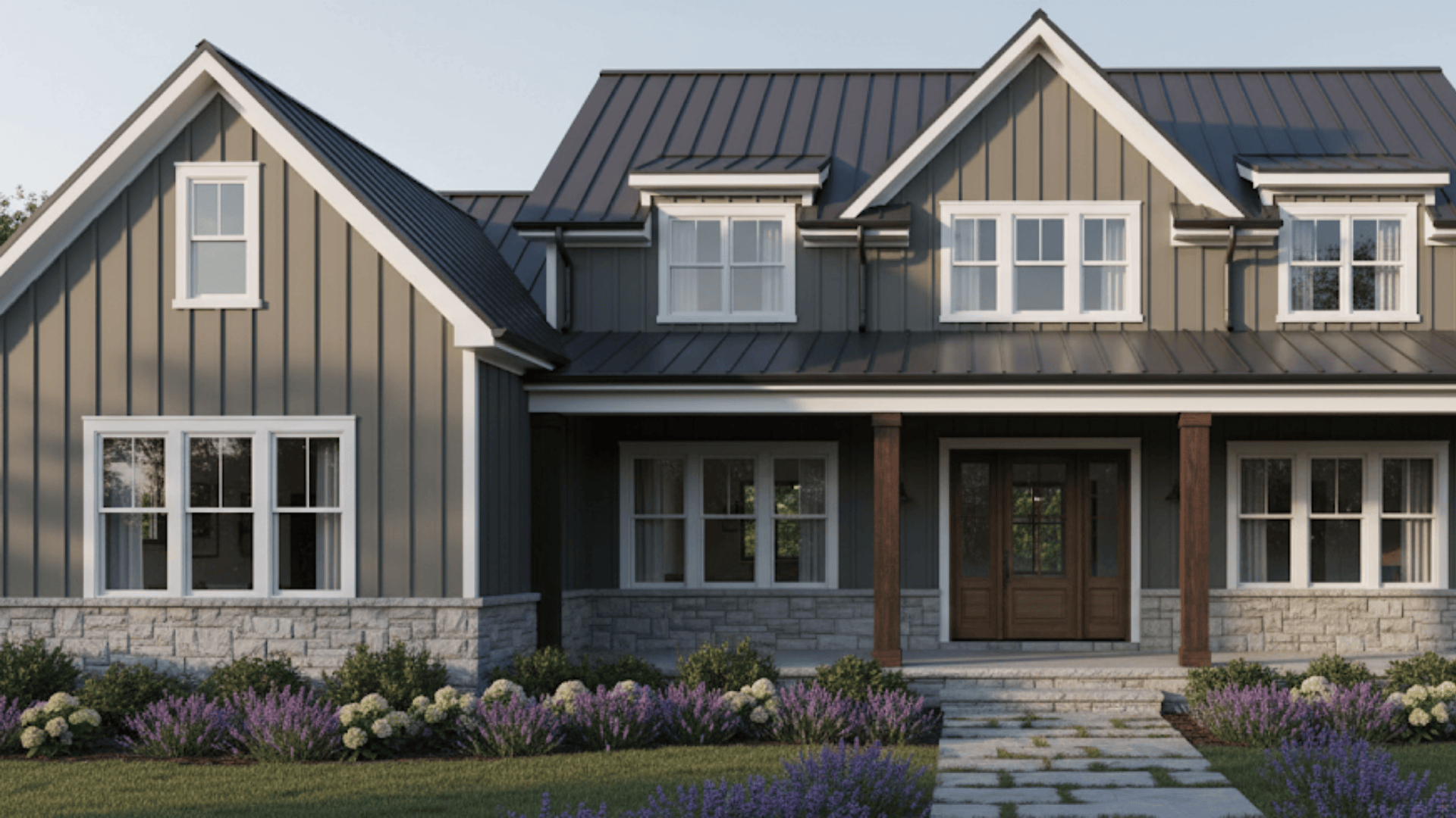
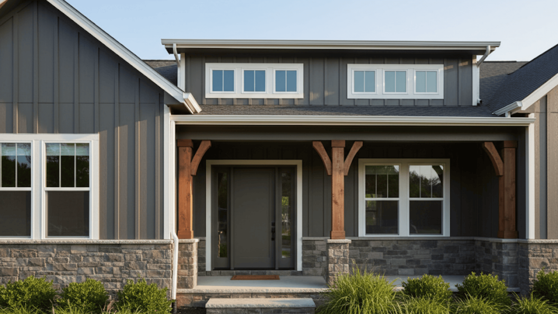
If you use Urbane Bronze as your main siding color, it instantly adds depth and character.
I’ve seen homes turn from plain to modern just by going all-in with this shade. It looks especially sharp against light trim or natural stone accents.
Trim
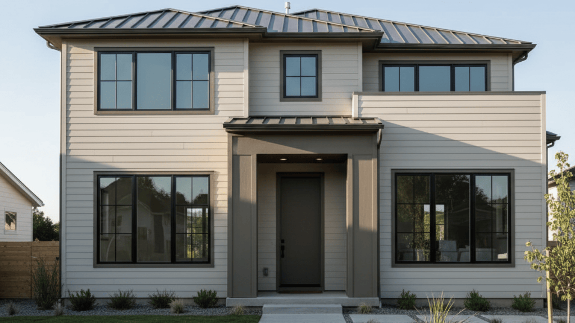
You can use Urbane Bronze as an accent or base, depending on your home’s design. As trim, it outlines windows and doors with warmth and contrast.
When used as the main color with light trim, it feels bold and contemporary without being harsh.
Front Doors
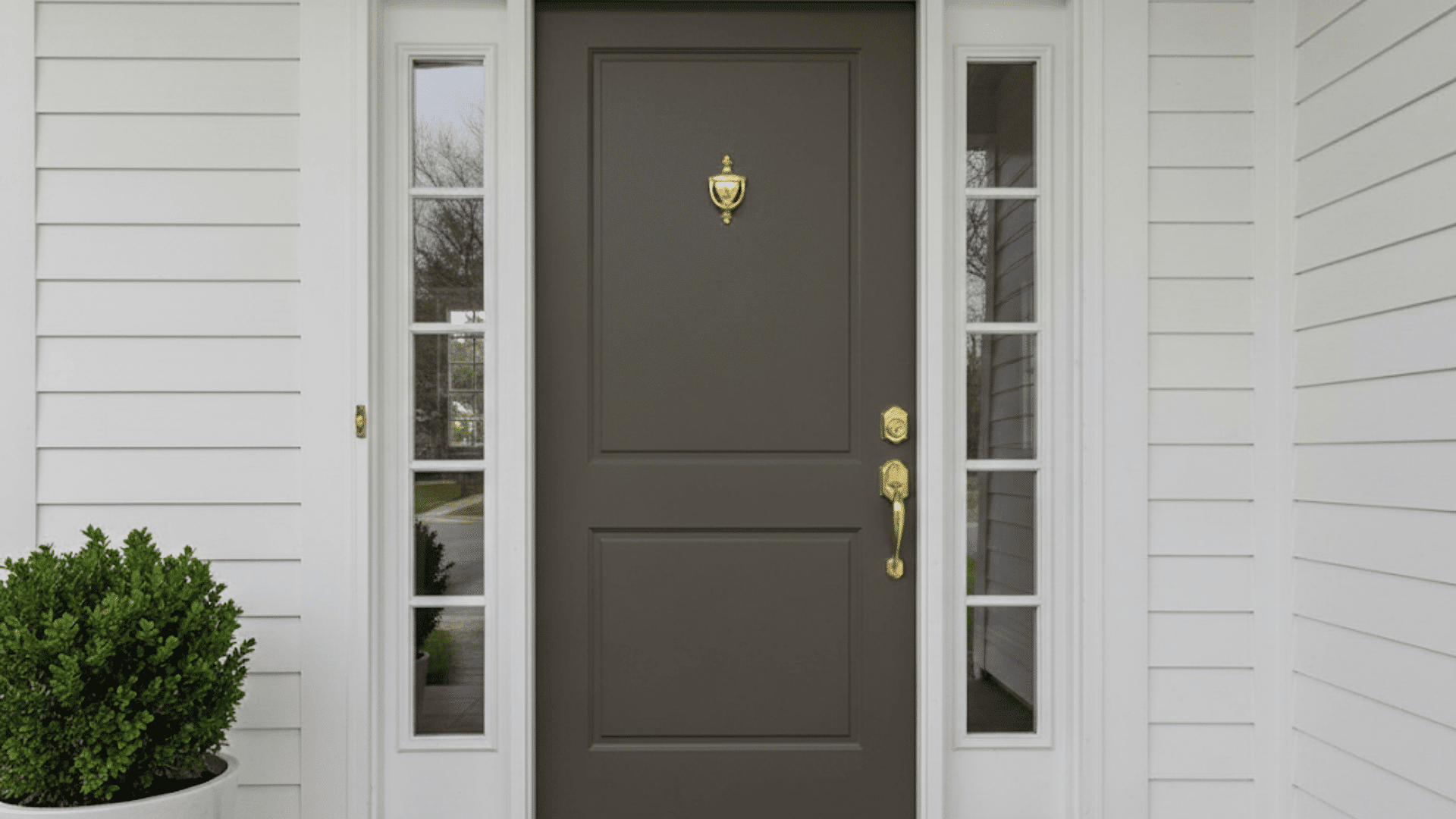
A front door painted in Urbane Bronze makes a strong first impression. It’s dark enough to feel dramatic but warm enough to stay inviting. Pair it with brass or matte black hardware for a polished, upscale look.
Garage Doors and Shutters
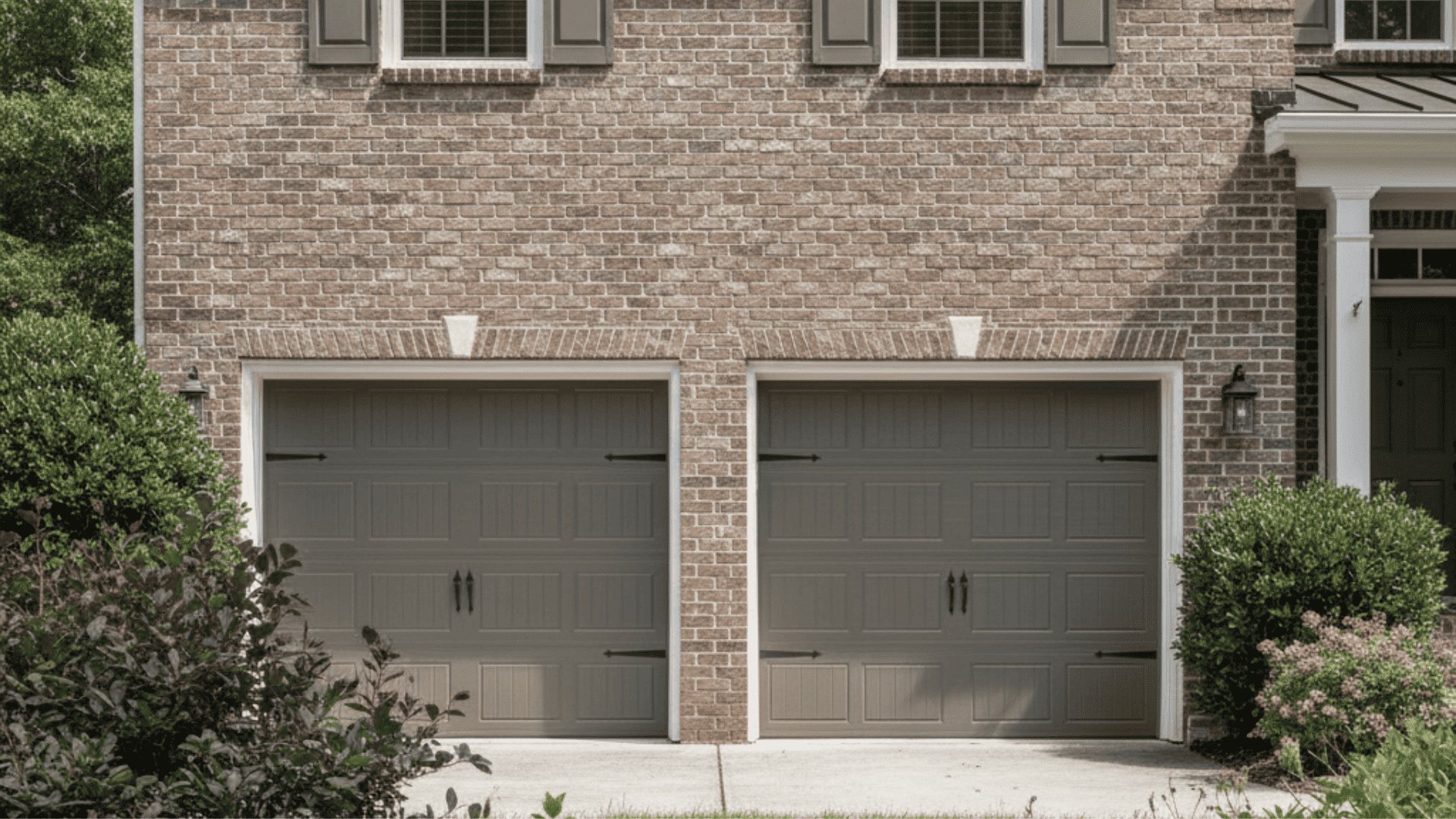
For garage doors and shutters, this color ties your home’s features together. It works well with both brick and wood tones.
Even smaller accents in Urbane Bronze can balance an exterior without overwhelming it.
Outdoor Furniture and Fencing
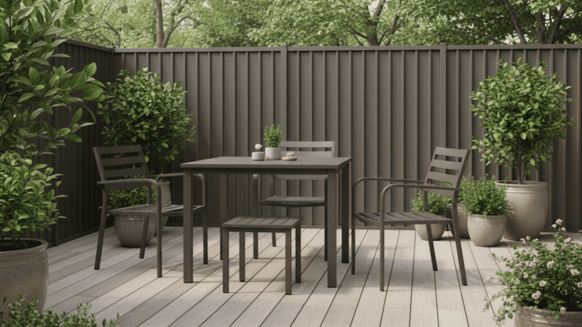
Adding Urbane Bronze to fences, planters, or metal furniture creates a cohesive outdoor look. It blends beautifully with greenery and warm woods, helping your outdoor space feel calm, unified, and natural.
Coordinating & Complementary Colors
Neutrals:Alabaster (SW 7008), Shoji White (SW 7042), and Pure White (SW 7005) bring brightness and contrast. They soften Urbane Bronze’s depth and make exteriors feel lighter and more inviting.
Contrasts:Iron Ore (SW 7069) and Black Fox (SW 7020) add bold definition. These darker tones keep the palette dramatic but still cohesive, perfect for trim or accent areas.
Warm Accents:Copper, Bronze metal, and Natural wood stains (like cedar or walnut) highlight the earthy side of Urbane Bronze. They make the overall look feel grounded and balanced.
Cool Balance:Repose Gray (SW 7015), Dorian Gray (SW 7017), and Pewter Cast (SW 7673) bring a subtle coolness that keeps the palette fresh and modern without feeling flat.
Urbane Bronze vs. Similar Shades
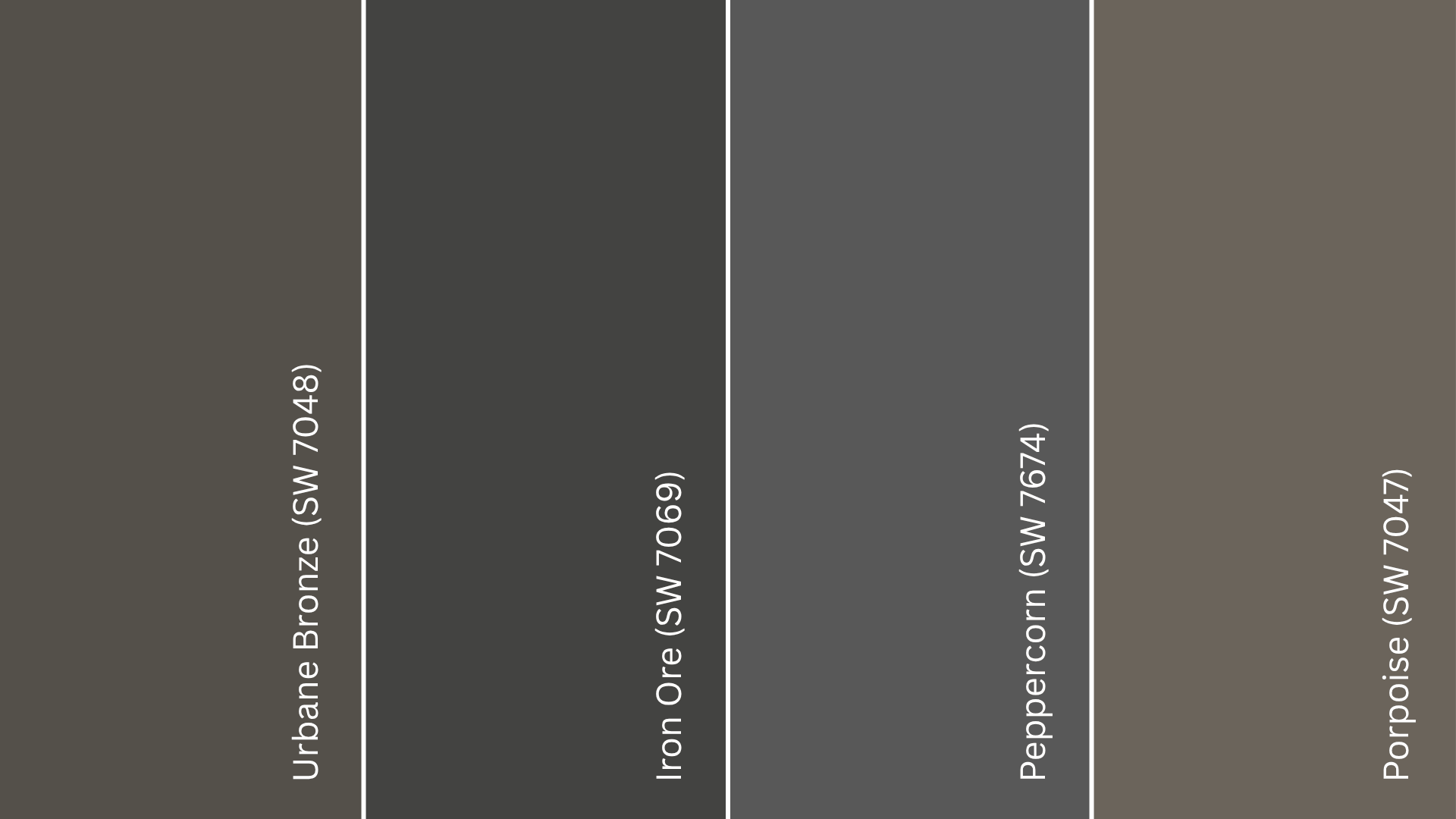
Comparing Urbane Bronze to similar colors helps you see what makes it stand out. Each shade has its own undertone and personality, so the right choice depends on the look you’re after.
Urbane Bronze vs. Iron Ore
Iron Ore (SW 7069) is darker and cooler, leaning more toward true charcoal gray. Urbane Bronze has warmer brown and green undertones that make it feel softer and more organic. If you want depth with a touch of warmth, Urbane Bronze is the better pick.
Urbane Bronze vs. Peppercorn
Peppercorn (SW 7674) sits between gray and black but lacks the earthy richness of Urbane Bronze.
Peppercorn looks more industrial, while Urbane Bronze feels grounded and natural, perfect for exteriors that need warmth without losing sophistication.
Urbane Bronze vs. Porpoise
Porpoise (SW 7047) is lighter and more neutral. It works well when you want a medium-toned option that won’t read as dark.
Urbane Bronze, on the other hand, offers more contrast and mood, especially in bright daylight or when paired with light trim.
LRV Comparison Table
| Color Name | SW Code | Tone | LRV | Best For |
|---|---|---|---|---|
| Urbane Bronze | SW 7048 | Warm dark brown-gray | 8 | Exteriors, accent walls, trim contrast |
| Iron Ore | SW 7069 | Cool charcoal gray | 6 | Modern, high-contrast designs |
| Peppercorn | SW 7674 | Deep cool gray | 10 | Industrial or urban interiors |
| Porpoise | SW 7047 | Medium neutral gray-brown | 13 | Softer, lighter accent areas |
Expert Tips for Exterior Use
Recommended Finishes: Use a satin or low-sheen finish for siding and trim. It reflects just enough light to show off the color’s depth without making it glossy. Avoid flat finishes; they can fade faster and collect dirt.
How Sunlight Affects Tone: Urbane Bronze changes throughout the day. In bright sun, it looks warmer with brown undertones; in shade or cloudy weather, it leans cooler and more gray. Always check it in different lighting before deciding.
Sample Testing Advice: Paint a few large test patches on different sides of your home. Look at them in morning, afternoon, and evening light. I’ve seen this make a big difference in how confident homeowners feel about their color choice.
Maintenance Tips and Durability: The color holds up well outdoors, but regular rinsing helps prevent dust buildup. If you live in a sunny or coastal area, plan for a light touch-up every few years to keep the finish looking even and rich.
Where to Buy Urbane Bronze in the U.S.
If you’re in the U.S., finding Urbane Bronze (SW 7048) is simple. Sherwin-Williams makes it widely available both online and in stores.
- Sherwin-Williams Stores: You can buy quarts, gallons, or sample sizes directly from your local Sherwin-Williams store. Use their online Store Locator to find one near you.
- Online Ordering: Visit sherwin-williams.com to order Urbane Bronze for pickup or home delivery.
- Authorized Retailers: You’ll also find the color available for color-matching at paint retailers like Lowe’s or through sites such as MyPerfectColor, which offer pre-mixed samples and touch-up options.
Tip: Always test a sample before buying full gallons. Lighting can change how dark or warm Urbane Bronze looks on your home.
Urbane Bronze Equivalents in Other Brands
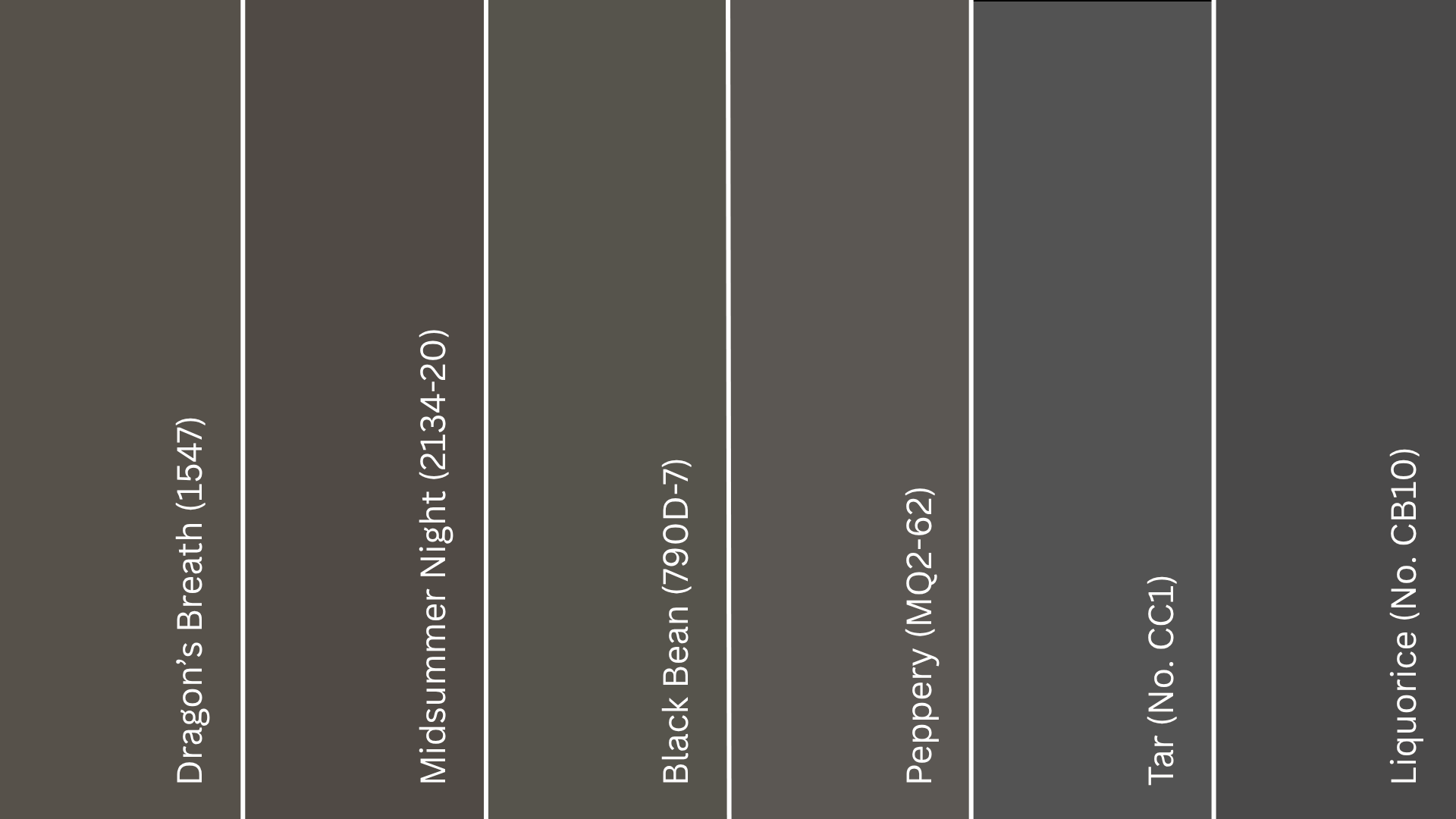
From Benjamin Moore: Shades like Dragon’s Breath (1547) and Midsummer Night (2134-20) both capture Urbane Bronze’s warm gray-brown balance. Dragon’s Breath leans slightly warmer, while Midsummer Night feels a touch moodier and cooler. Both give off that grounded, modern energy that Urbane Bronze is known for.
From Behr:Black Bean (790D-7) offers almost the same depth and warmth, making it a strong alternative for exteriors with wood or stone. Peppery (MQ2-62) is a bit lighter, with a soft gray undertone that feels relaxed and organic, great for homes that get a lot of sunlight.
From Farrow & Ball:Tar (No. CC1) and Liquorice (No. CB10) are close in richness and tone. Tar leans slightly more dramatic with a dark, refined finish, while Liquorice brings a warmer, softer charcoal look that still feels grounded.
Wrapping Up
Choosing Urbane Bronze (SW 7048) is about more than color; it’s about creating a home that feels calm, confident, and connected to nature.
Its rich undertones make it versatile enough for modern, farmhouse, or traditional designs while staying warm and welcoming.
In my experience, it’s a shade that doesn’t fade with trends; it grows with your style and surroundings. If you’re planning to refresh your home’s exterior, start with a sample and see how it transforms in your light.