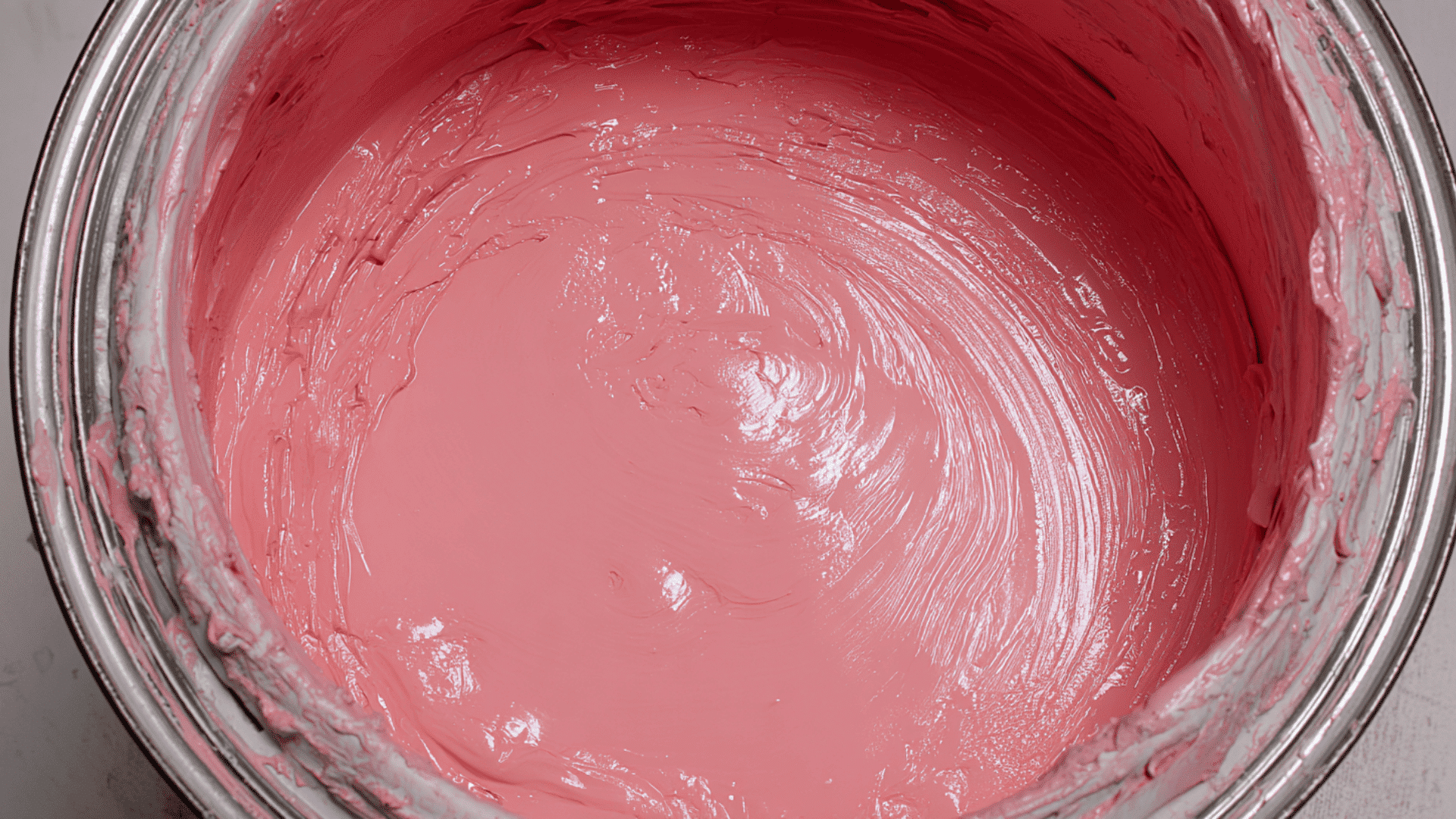
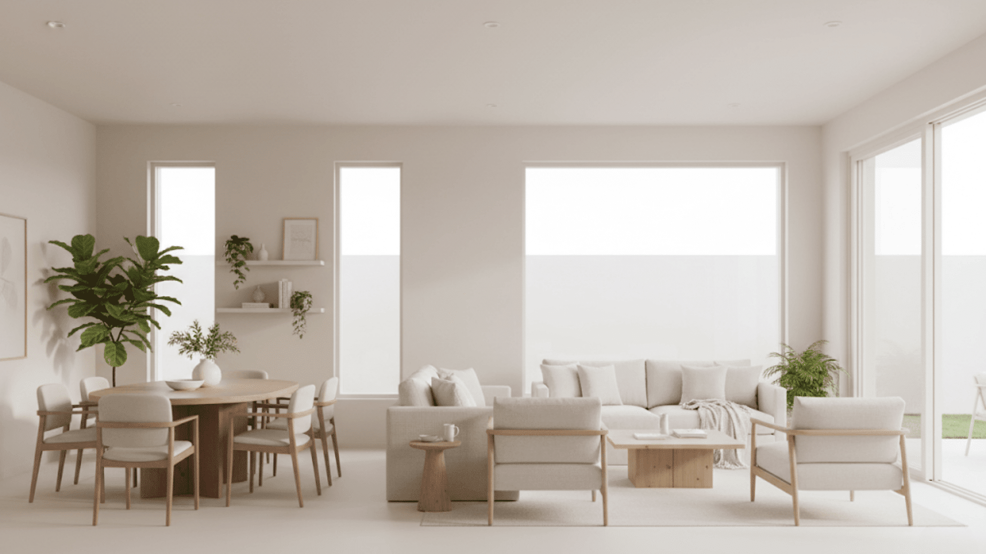




When you first look at Oyster White (SW 7637), it might seem like another off-white, but it’s far from plain. This soft, warm neutral has a quiet versatility that works beautifully in different lighting and design styles.
I’ve seen it create balance in open spaces and add calm to rooms that need a gentle backdrop.
Today, I’ll walk you through how Oyster White looks in real homes, what colors pair best with it, how it compares to other whites, and the finishes that bring out its best side.
Let’s start by understanding why it’s such a favorite for designers and homeowners alike.
What Color is Oyster White?
Oyster White from Sherwin-Williams is an off-white paint that sits between beige and gray. It’s not a bright, stark white; it has a soft, calming warmth that makes spaces feel easy to live in.
With an LRV (Light Reflectance Value) of 72, it reflects a fair amount of light, keeping rooms bright without looking washed out. In my experience, that makes it a great choice if you want something that feels airy but still grounded.
It leans warm, but not too creamy. Depending on your lighting, it can look more beige in the afternoon sun or slightly gray in cooler light. That balance is what makes Oyster White such a flexible neutral for both interiors and exteriors.
Undertones Explained
Oyster White has subtle green-beige undertones that give it a natural, earthy feel. You might not notice the green right away, it’s soft and shows up mainly in certain lights.
As I see it, lighting plays the biggest role in how this color behaves:
- Bright daylight: Looks lighter and slightly warmer, almost creamy beige.
- Artificial light: Can shift toward a muted gray or soft greige.
If you’re testing it at home, I suggest looking at it throughout the day. You’ll see how those undertones move with the light, and that’s what helps you decide if it fits your space.
Oyster White in Different Spaces
Oyster White is one of those colors that works almost anywhere. I’ve seen it fit beautifully in homes with very different styles, from cozy cottages to clean, modern spaces.
Living Room
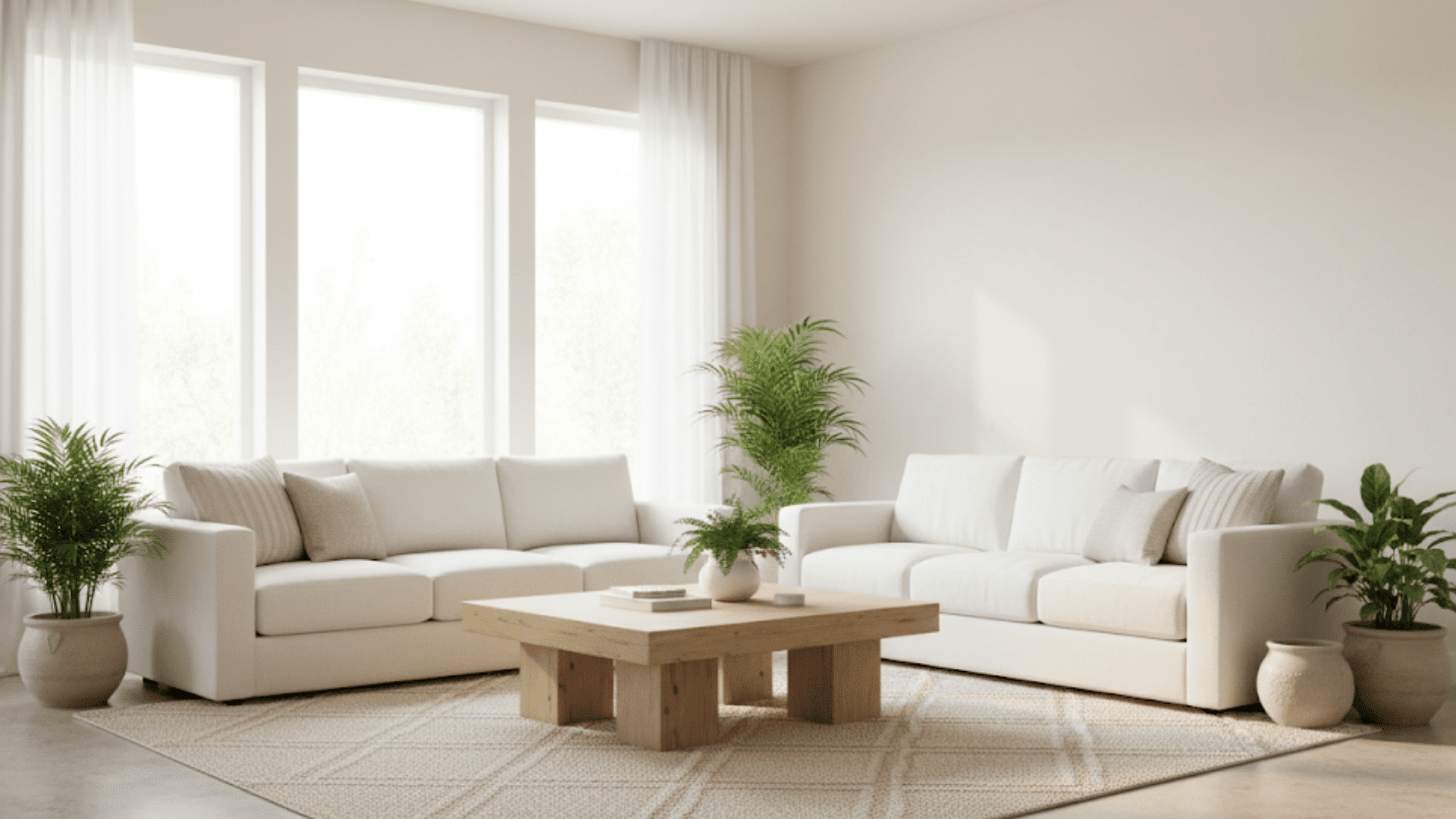
In a living room, Oyster White brings a soft warmth that feels calm and inviting. It reflects natural light nicely during the day and turns slightly warmer at night, creating a relaxing backdrop for everyday life.
Bedroom
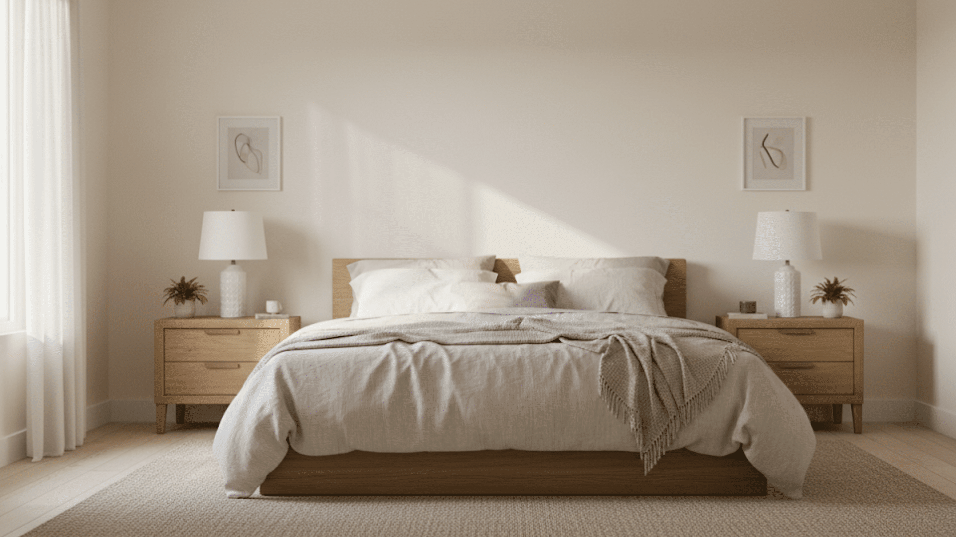
The paint works beautifully in bedrooms because it’s neutral without feeling flat. It gives the space a peaceful, balanced look that pairs well with soft linens, wood furniture, and cozy textures.
Bathroom
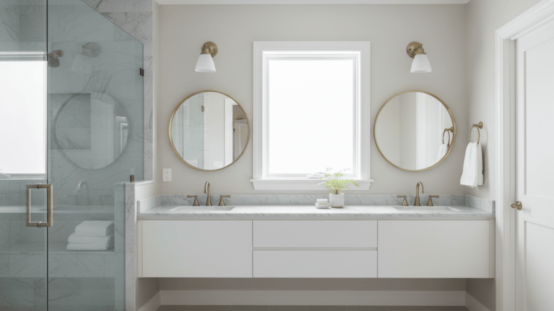
In bathrooms, this color pairs well with crisp white trim and marble surfaces. The soft tone adds a bit of warmth to cool materials, making the space feel clean but not sterile or overly bright.
Kitchen
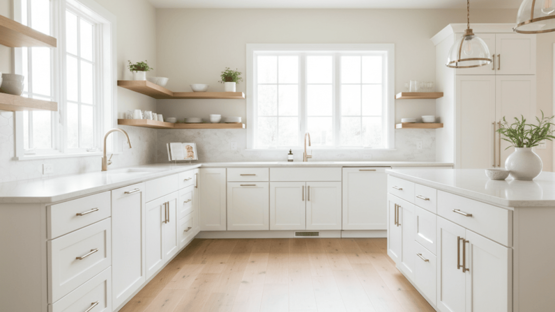
Oyster White looks great with white or off-white cabinets and warm wood accents. It brings out the natural tones in wood floors and open shelving, creating a kitchen that feels both bright and comfortable.
Exterior

For exteriors, I’ve seen Oyster White used on everything from farmhouses to coastal homes. It looks creamy in sunlight but not too yellow, making it a reliable choice for siding, brick, or stucco.
How Lighting Affects It
Lighting plays a big role in how Oyster White looks throughout the day. I’ve seen it shift from warm and creamy to soft gray depending on where the room faces and what kind of light you use.
- North-facing rooms: Natural light from the north is cooler, so Oyster White tends to show more of its gray side. It looks calm and balanced but slightly muted; great if you want a softer, neutral backdrop.
- South-facing rooms: Warm sunlight brings out the beige and creamy undertones. In my experience, this is where Oyster White feels coziest, adding warmth without turning yellow.
- Warm bulbs vs. cool bulbs: Under warm lighting, Oyster White takes on a beige tone that feels inviting. Cool LED light pulls out its gray undertones, giving it a cleaner, more modern appearance.
If you can, test it on different walls before committing. Real-life samples or photos often show how dramatically it shifts in tone between morning and evening light. That’s what can help you decide whether it feels right for your space.
Coordinating & Complementary Colors
Trim Colors: I like Alabaster (SW 7008) for a warm, soft look, while Pure White (SW 7005) gives you a sharper, cleaner edge. If you prefer something gentler, Creamy (SW 7012) blends beautifully without making the trim disappear.
Accent Colors: Accessible Beige (SW 7036) adds just the right warmth for a subtle contrast, and Chatroom (SW 6171) ties in nicely with Oyster White’s green-gray undertone. For a deeper accent, Urbane Bronze (SW 7048) creates a grounded, modern touch that works well on doors or built-ins.
Coordinating Colors: The official Sherwin-Williams pairings include Analytical Gray (SW 7051), a balanced warm gray that adds quiet depth, and Brassy (SW 6410), a muted golden-brown that brings in a natural, earthy richness without feeling heavy.
Exterior or Door Pairings: On exteriors, Gauntlet Gray (SW 7019) looks bold yet classic for doors, while Iron Ore (SW 7069) gives a deep, dramatic contrast that’s great for trim or shutters. If you want something cooler and softer, Tinsmith (SW 7657) balances beautifully against Oyster White siding.
Oyster White vs. Other Popular Whites
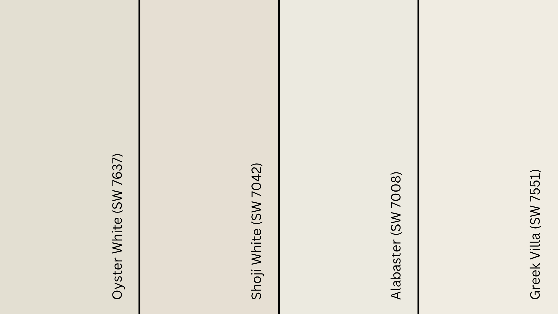
Oyster White sits in that middle space between warm and neutral, but it’s not alone. I’ve compared it with a few Sherwin-Williams favorites that people often consider alongside it.
Oyster White vs. Shoji White
Shoji White (SW 7042) is a bit warmer and creamier than Oyster White. It has stronger beige undertones, which can feel cozier in low light. Oyster White, on the other hand, reads softer and more balanced.
I’d use Shoji White in bedrooms or dining rooms, and Oyster White in brighter spaces like living rooms or exteriors.
Oyster White vs. Alabaster
Alabaster (SW 7008) is lighter and creamier, with a more noticeable yellow undertone. It brightens rooms beautifully but can feel too warm in south-facing light.
Oyster White feels calmer and more neutral, especially in rooms with a lot of natural light. I’ve seen it work better in open layouts where balance matters.
Oyster White vs. Greek Villa
Greek Villa (SW 7551) has a higher LRV and a clean, creamy warmth. It reflects more light, so it looks fresh and airy even in darker rooms. Oyster White leans more grounded, with its gray-beige undertone.
I’d use Greek Villa in small spaces that need brightness, and Oyster White in larger rooms where you want warmth without glare.
LRV Comparison Table
| Color Name | SW Code | Tone | LRV | Best For |
|---|---|---|---|---|
| Oyster White | SW 7637 | Warm neutral (beige-gray) | 72 | Balanced, soft light rooms and exteriors |
| Shoji White | SW 7042 | Warm beige | 74 | Bedrooms, dining rooms, low-light spaces |
| Alabaster | SW 7008 | Creamy warm white | 82 | Bright, airy interiors with natural light |
| Greek Villa | SW 7551 | Soft creamy white | 84 | Smaller or darker rooms needing extra brightness |
Best Finishes for Oyster White
The right finish can make a big difference in how Oyster White looks and lasts. It performs best when you match the sheen to the surface and lighting in the room.
Interior walls – Eggshell or Satin: Both give a smooth, soft look without too much shine. Eggshell works well for most living areas, while satin adds a little extra durability for kitchens, hallways, or bathrooms.
Trim – Semi-Gloss: A semi-gloss finish helps trim stand out against matte walls. It’s also easier to wipe clean, which makes it perfect for doors, baseboards, and window frames.
Exteriors – Flat or Satin: Flat hides surface imperfections and gives a natural look, while satin adds a little sheen and better protection. In my experience, satin is ideal if your home gets a lot of sunlight or moisture.
Where to Buy Oyster White in the U.S.
If you’re in the U.S., finding Oyster White (SW 7637) is easy. Sherwin-Williams makes it widely available both online and in stores, so you can get samples or gallons without any trouble.
- Sherwin-Williams Stores: You can buy quarts, gallons, or sample sizes directly from any Sherwin-Williams location. Use their online Store Locator to find one near you.
- Online Ordering: Visit sherwin-williams.com to order Oyster White for pickup or home delivery. They often list coordinating palettes and finish options, too.
- Authorized Retailers: You’ll also find Oyster White through approved retailers like Lowe’s or MyPerfectColor, where you can get color-matched samples and touch-up paints.
Tip: Always test a sample before buying full gallons. Lighting and surface texture can change how warm or gray Oyster White appears in your space. Seeing it on your own walls helps you pick the right finish and feel for your home.
Oyster White Equivalents in Other Brands

If you like Oyster White but use or prefer another paint brand, here are some close matches to consider. These aren’t exact, but they’re good alternatives.
From Benjamin Moore: Gray Mist (OC-30), a similar warm greige tone that aligns closely with Oyster White’s balance of beige and gray. Oyster (2115-70), a bit lighter and creamier than Oyster White, but still in the same neutral family.
From Behr: Echo Valley (ECC-25-2), a warm neutral match that keeps a soft, light feel similar to Oyster White. Campfire Ash (N320-1), slightly deeper, but with comparable warmth and undertone to Oyster White
Tip: Even small differences in undertone or formulation can show up on your walls. I always recommend painting a 2-foot square sample on each wall and observing it at different times of day before buying full cans.
Wrapping Up
Oyster White (SW 7637) is one of those colors that quietly improves a space without trying too hard. Its balance of warmth and softness makes it work in almost any setting.
I’ve seen it tie together open layouts beautifully, bringing calm to bright rooms and character to shaded corners. If you want a neutral that feels natural but never flat, this shade is worth testing in your own lighting.
Pick up a sample or order a peel-and-stick swatch today, and see how Oyster White looks in your home before choosing your perfect finish.