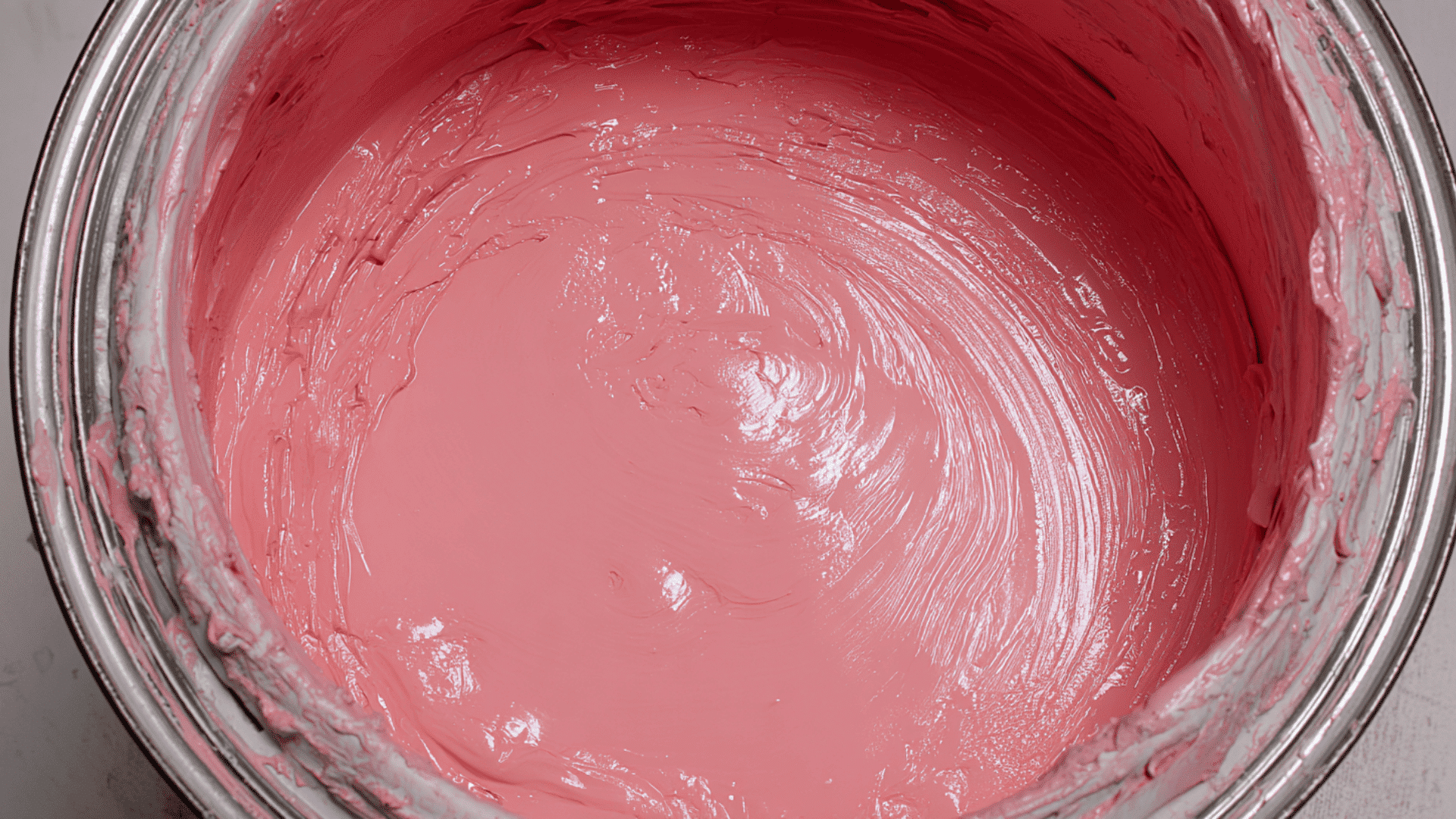


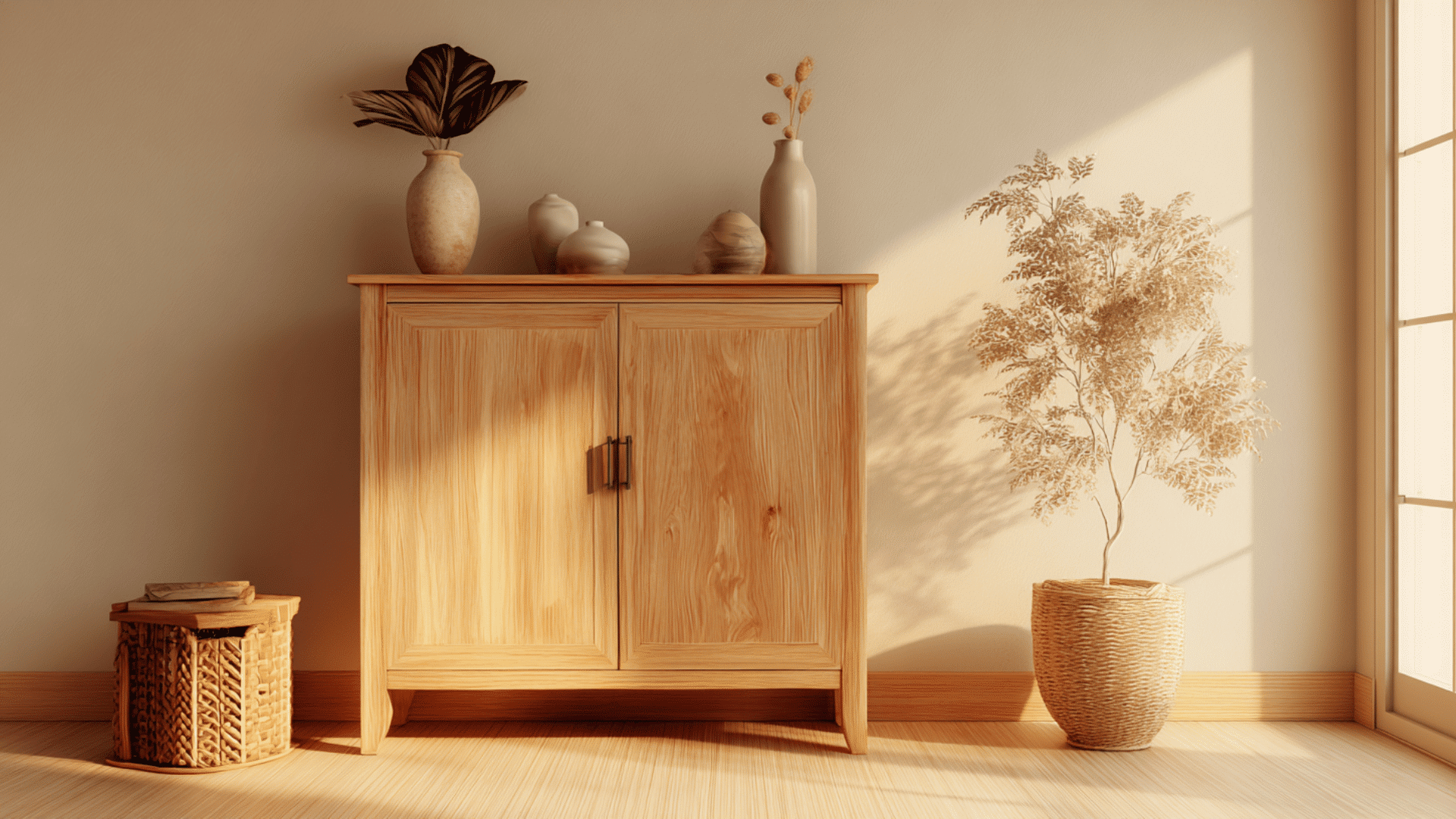
Have you ever wanted a paint color that feels balanced, familiar, and a touch dramatic? Pewter Green SW 6208 by Sherwin-Williams captures that feeling perfectly.
This nature-inspired green brings a quiet richness that works effortlessly in both modern and traditional spaces. It feels grounded, welcoming, and just bold enough to stand out without overwhelming the settings.
In this blog, you’ll learn what makes Pewter Green so versatile, how it behaves in different lighting, and the best ways to style it in your home.
Understanding Pewter Green SW 6208
Pewter Green SW 6208 by Sherwin-Williams is a deep, muted green with subtle gray undertones. It has a cool, earthy look that feels Balanced yet bold, making it a popular choice for both modern and traditional homes.
Its Light Reflectance Value (LRV) is 12, meaning it absorbs most light and reads as a darker shade. It works best in rooms with good natural lighting or paired with lighter trim colors to create contrast.
This color brings a balanced mood to any space; it feels grounded and natural, like a forest shade softened by mist. Designers love it for creating a cozy, peaceful atmosphere without feeling too dark or heavy.
How Pewter Green Looks in Different Spaces
Pewter Green works well in almost any part of the home. It adds depth and a touch of nature-inspired warmth.
1. Living Rooms
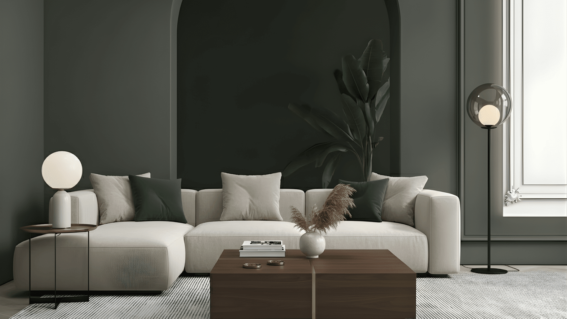
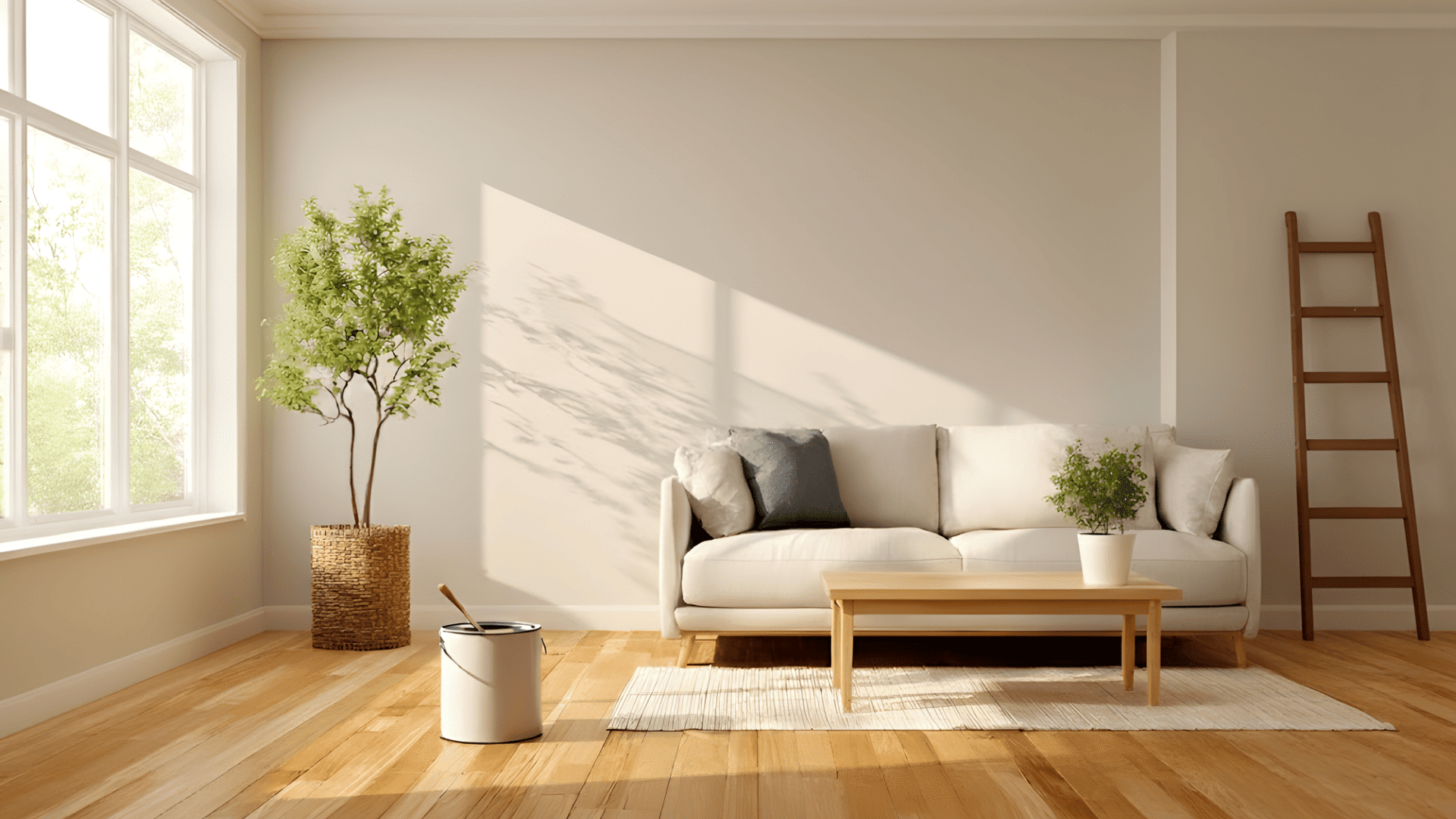
It brings warmth and character to living rooms without feeling heavy. The soft green tone creates a Peaceful backdrop that highlights furniture and décor.
Pair it with white trim, warm wood tones, and brass accents for balance. Add light fabrics and soft rugs for a relaxed, cozy feel.
2. Kitchens and Cabinets
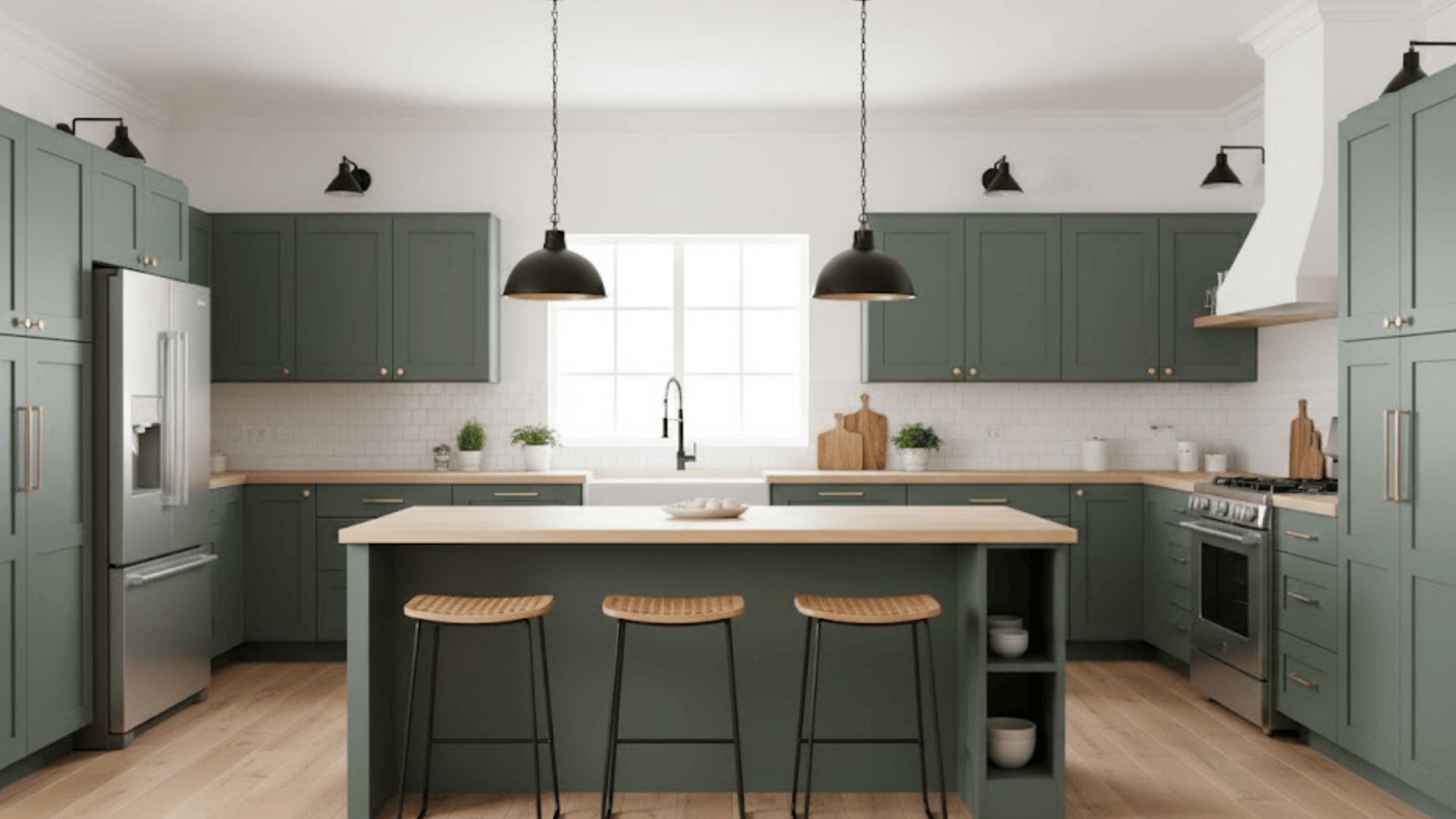
This color looks beautiful on cabinets and islands. It pairs naturally with gold hardware, white counters, and light wood floors.
Use a satin or semi-gloss finish for durability and subtle shine. A matte finish gives a softer, rustic style. The contrast creates a clean, Familiar look.
3. Bedrooms
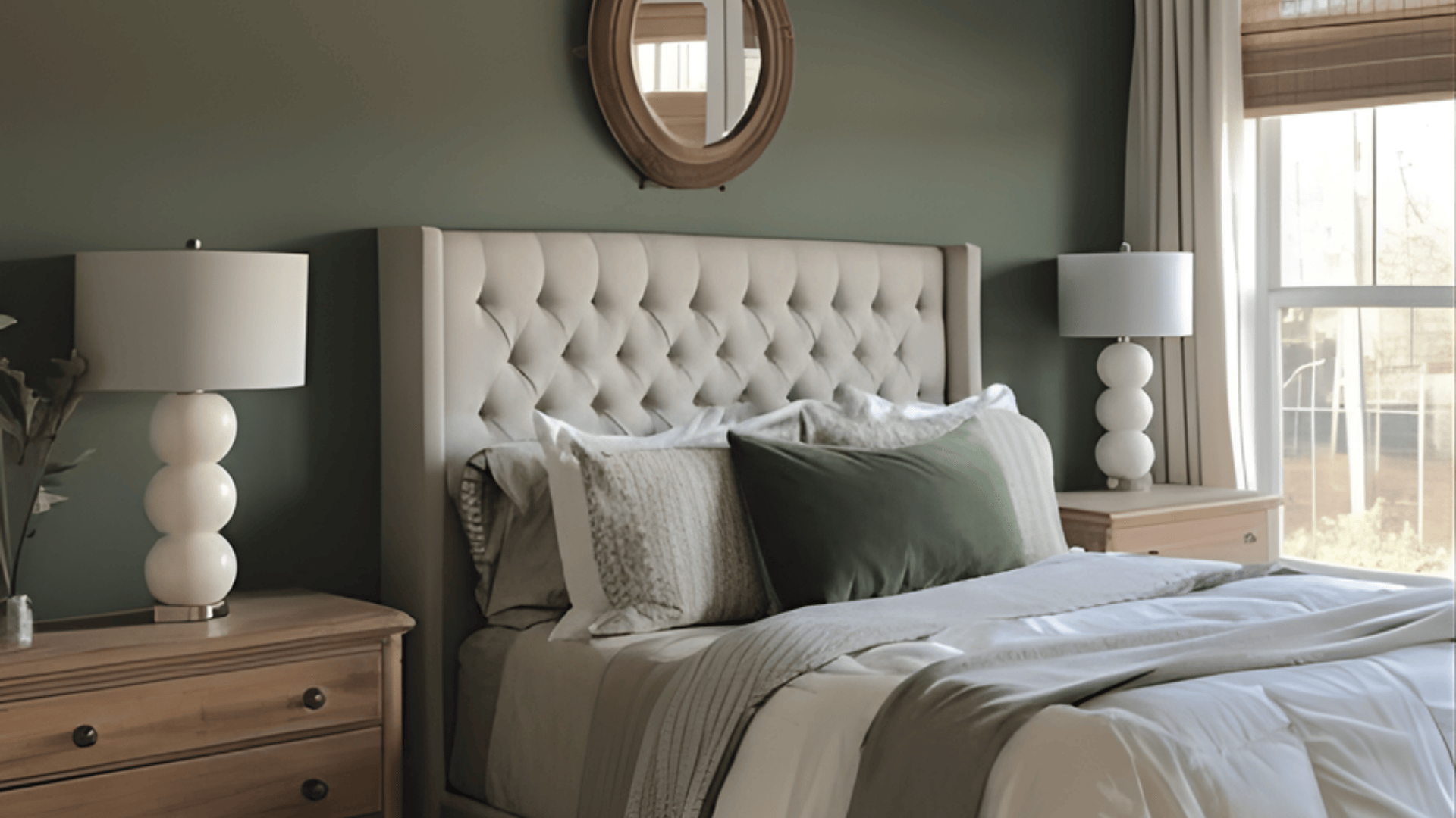
Pewter Green creates a peaceful retreat in bedrooms. Its cool tone helps the space feel restful and grounded.
Combine it with soft neutrals and natural fabrics like linen or cotton. Add warm metals for contrast and comfort.
4. Exteriors and Front Doors
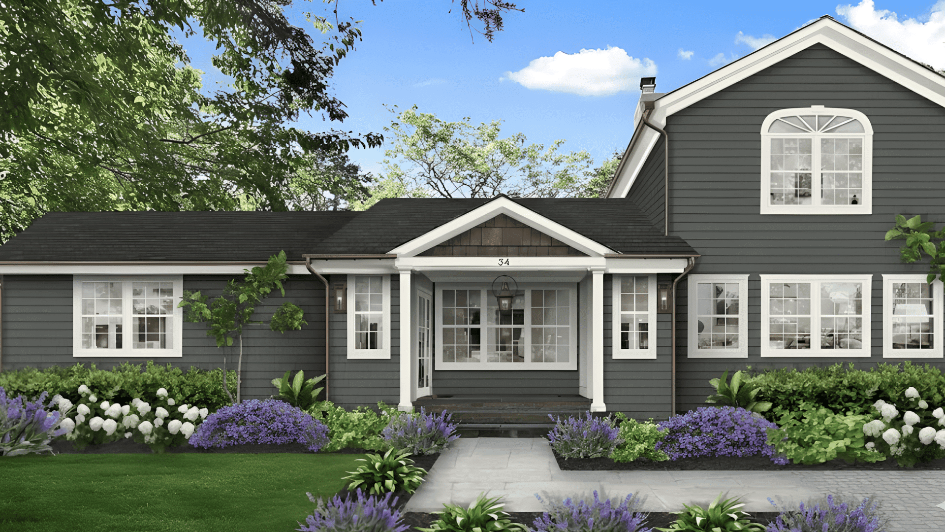
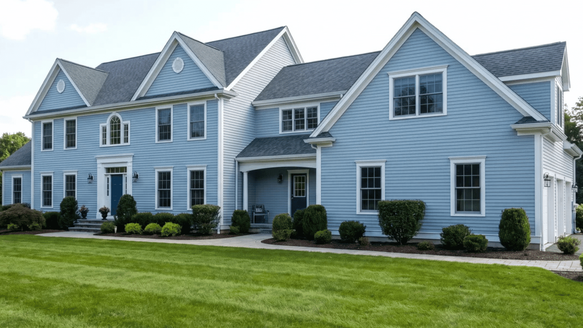
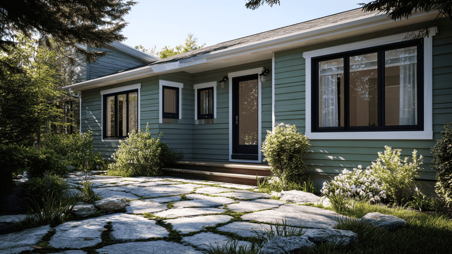
Outside, Pewter Green adds curb appeal and blends with natural surroundings. It looks Familiar under any light.
It contrasts nicely with white trim, black windows, or natural stone details. Because of its depth, it holds up well under sunlight and adds a welcoming charm to front doors, siding, or shutters.
Coordinating & Complementary Colors
Neutrals:Shoji White (SW 7042), Alabaster (SW 7008), and Greek Villa (SW 7551) brighten Pewter Green and soften its depth. These warm whites create a clean backdrop that keeps the color balanced and inviting.
Contrasts:Iron Ore (SW 7069) and Tricorn Black (SW 6258) add bold definition and drama. They make great options for doors, trim, or accent walls when paired with Pewter Green’s moody tone.
Warm Accents: Brass, Copper, and Natural Wood Stains (like oak, walnut, or pine) highlight Pewter Green’s earthy undertones. These materials bring warmth and balance to its cool, muted base.
Cool Balance:Silvermist (SW 7621), Sea Salt (SW 6204), and Evergreen Fog (SW 9130) add gentle contrast while staying within the same natural color family. They help create a layered, Peaceful look that feels cohesive throughout the home.
Pewter Green vs. Other Sherwin-Williams Greens
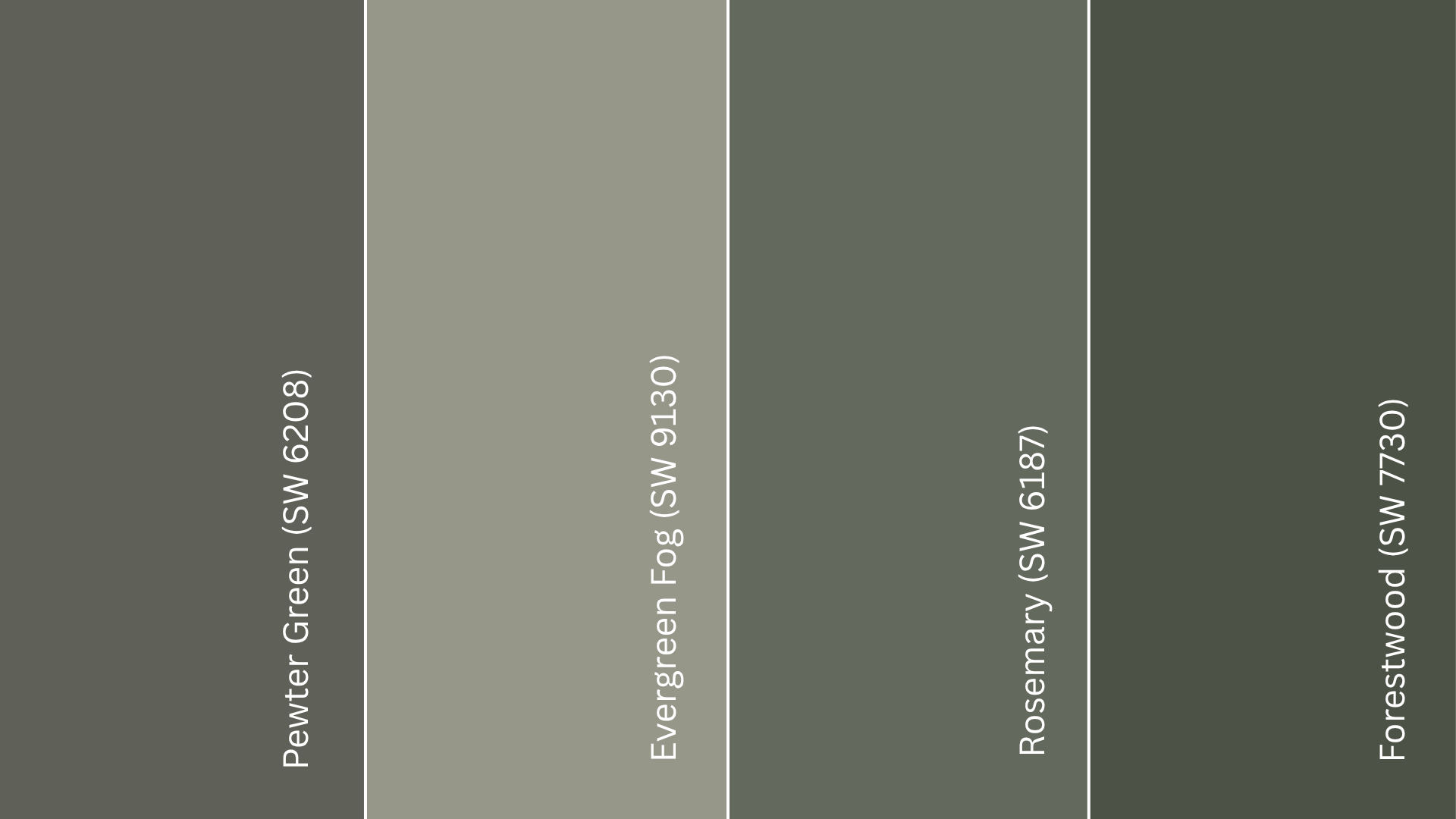
Several Sherwin-Williams greens share a similar earthy feel, but each one brings a different mood. Knowing how they differ helps you choose the right shade for your space.
Evergreen Fog vs. Pewter Green
Evergreen Fog (SW 9130) is lighter, softer, and more neutral than Pewter Green. It has stronger gray undertones, giving it a misty, relaxed vibe that works well in airy spaces. Pewter Green is deeper and moodier, with a cooler, richer tone.
Rosemary vs. Pewter Green
Rosemary (SW 6187) leans warmer, with more olive undertones. It feels organic and pairs beautifully with natural materials like rattan, beige, and warm wood. Pewter Green, in contrast, stays cooler and more balanced.
Forestwood vs. Pewter Green
Forestwood (SW 7730) is slightly darker and earthier than Pewter Green, with a stronger brown undertone that gives it a rich, organic depth.
Pewter Green, on the other hand, has cooler gray undertones, creating a more refined and modern look that works beautifully in contemporary spaces.
Tips for Styling Pewter Green
Recommended Finishes: Use a satin or eggshell finish for walls and semi-gloss for cabinets or trim. These finishes reflect just enough light to show the color’s depth without adding glare. They can fade faster and are harder to clean.
How Lighting Changes Its Look: Pewter Green shifts slightly with light. In bright natural light, it shows more green and feels airy. In dim or artificial lighting, it leans cooler with stronger gray tones. Always check it under different light sources before painting.
Sample Testing Advice: Paint a few large swatches on different walls and observe them throughout the day. Morning light brings out its green base, while evening tones reveal its gray depth. Testing helps you see how it truly behaves in your home.
Styling and Texture Tips: Pair Pewter Green with warm woods, brass, and linen fabrics to keep it cozy. Use artwork or decor in cream, gold, or natural textures to balance the cool undertones and maintain warmth in the room.
Where to Buy Pewter Green in the U.S.
If you’re in the U.S., finding Pewter Green (SW 6208) is simple. Sherwin-Williams offers it both online and in stores.
- Sherwin-Williams Stores: Buy quarts, gallons, or sample sizes directly from your local Sherwin-Williams. Use their Store Locator to find one near you.
- Online Ordering: Visit sherwin-williams.com to order Pewter Green for pickup or delivery. You can also browse coordinating colors and finishes.
- Authorized Retailers: Available through color-matching services at Lowe’s or specialty sites like MyPerfectColor, which offer pre-mixed samples and touch-up kits.
Tip: Always test a sample first; lighting can make Pewter Green appear cooler or warmer depending on your space.
Pewter Green Equivalents in Other Brands
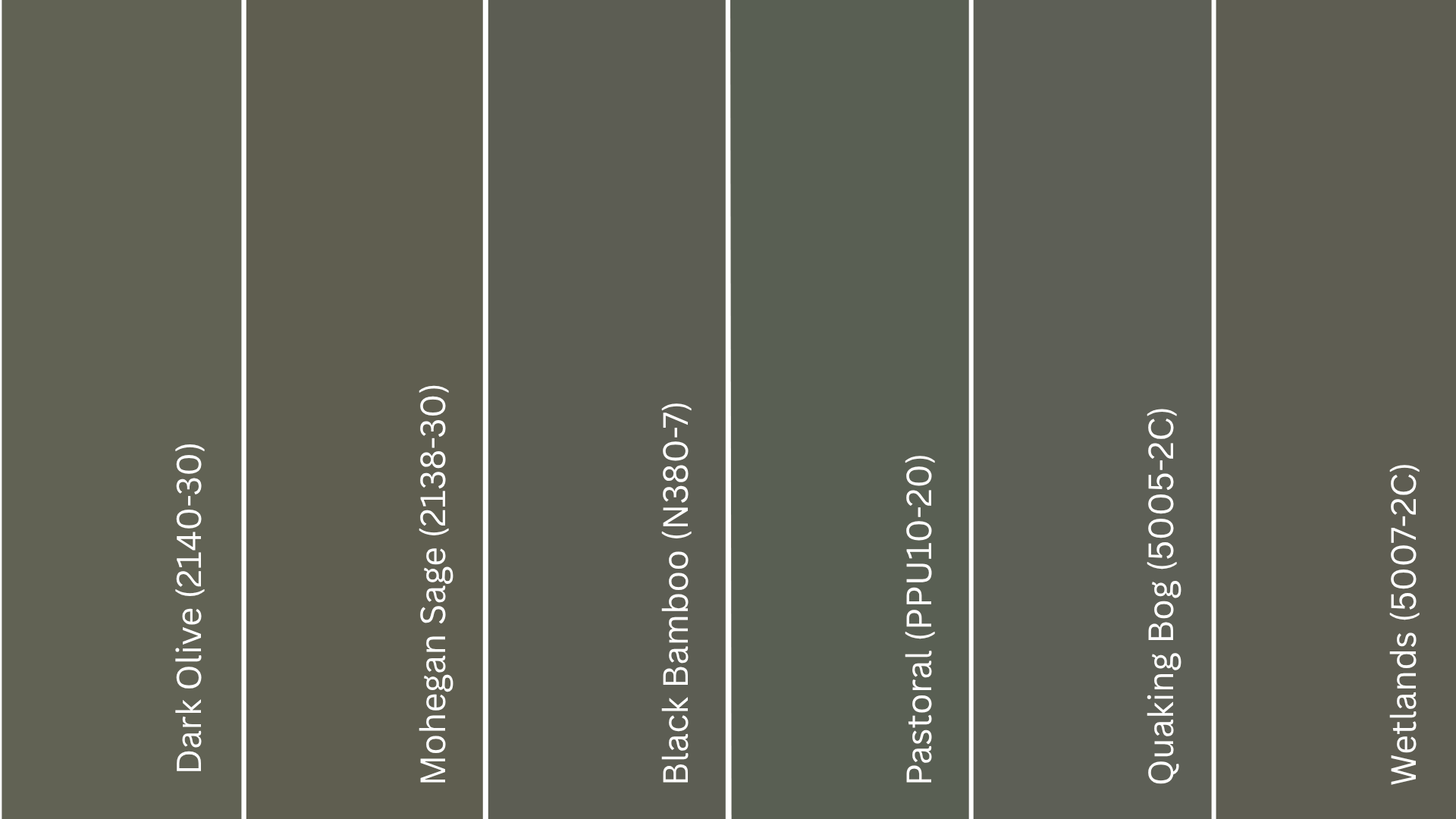
From Benjamin Moore: Shades like Dark Olive (2140-30) is a deep, earthy green with muted undertones that feels grounded and steady, whereas Mohegan Sage (2138-30) is a soft, natural green with a smoky tone that creates a subtle atmosphere in rooms needing gentle depth.
From Behr: Black Bamboo (N380-7) is a rich, shadowy green with a cool undertone that adds moodiness and quiet elegance to traditional spaces, and Pastoral (PPU10-20) is an earthy green with warm, natural softness, bringing a peaceful, organic feel.
From Valspar: Quaking Bog (5005-2C) is a muted, slightly gray-green shade that feels steady and natural, offering a backdrop for balanced and understated spaces, and Wetlands (5007-2C) is a warm, neutral-leaning green with subtle depth that provides a grounded, comfortable feel.
Conclusion
Pewter Green SW 6208 has a brings personality without overwhelming a space. It’s the kind of shade that feels steady and blends easily with modern, rustic, or traditional decor.
The color’s depth makes it an excellent choice for anyone who wants to add subtle drama while keeping a natural, grounded look. I like how it works as both a main color and an accent. It always feels balanced and inviting.
If you’re thinking about updating your home, explore Pewter Green in person at a Sherwin-Williams store or order a sample online to see how beautifully it changes your space.