


Color drenching is one of those design ideas that can change the entire mood of a room using just one color.
I love how a single shade can shift the atmosphere so effortlessly. It gives a room a completely new energy without needing complicated design steps.
Today, through this blog, I will let you know what makes this trend so famous.
If you’re excited about trying something bold without overthinking it, this guide will help you find color drenching with confidence and maybe even inspire your next makeover.
What is Color Drenching?
Color drenching is a painting style where you use one main color across the whole room—walls, ceiling, trim, doors, and sometimes furniture. This creates a smooth, unified look that feels calm and wrapped in color.
It can be done in two ways: monochrome, where everything is the exact same color, or tone-on-tone, where you use softer or deeper shades of the same color.
Why it matters in design:
- Creates a soft, unified space with fewer visual breaks.
- Highlights architectural details by focusing on shape, not contrast.
- Adds drama without clutter.
- Works with any style, from modern to cottage to maximalist.
This is why color drenching has become such a standout design trend
Color Drenching Ideas for Every Room
Color drenching can change the mood of a space fast, and the color you choose sets the tone. These ideas give you different ways to use one shade across walls, ceilings, trim, and doors.
1. Moody Navy Bedroom
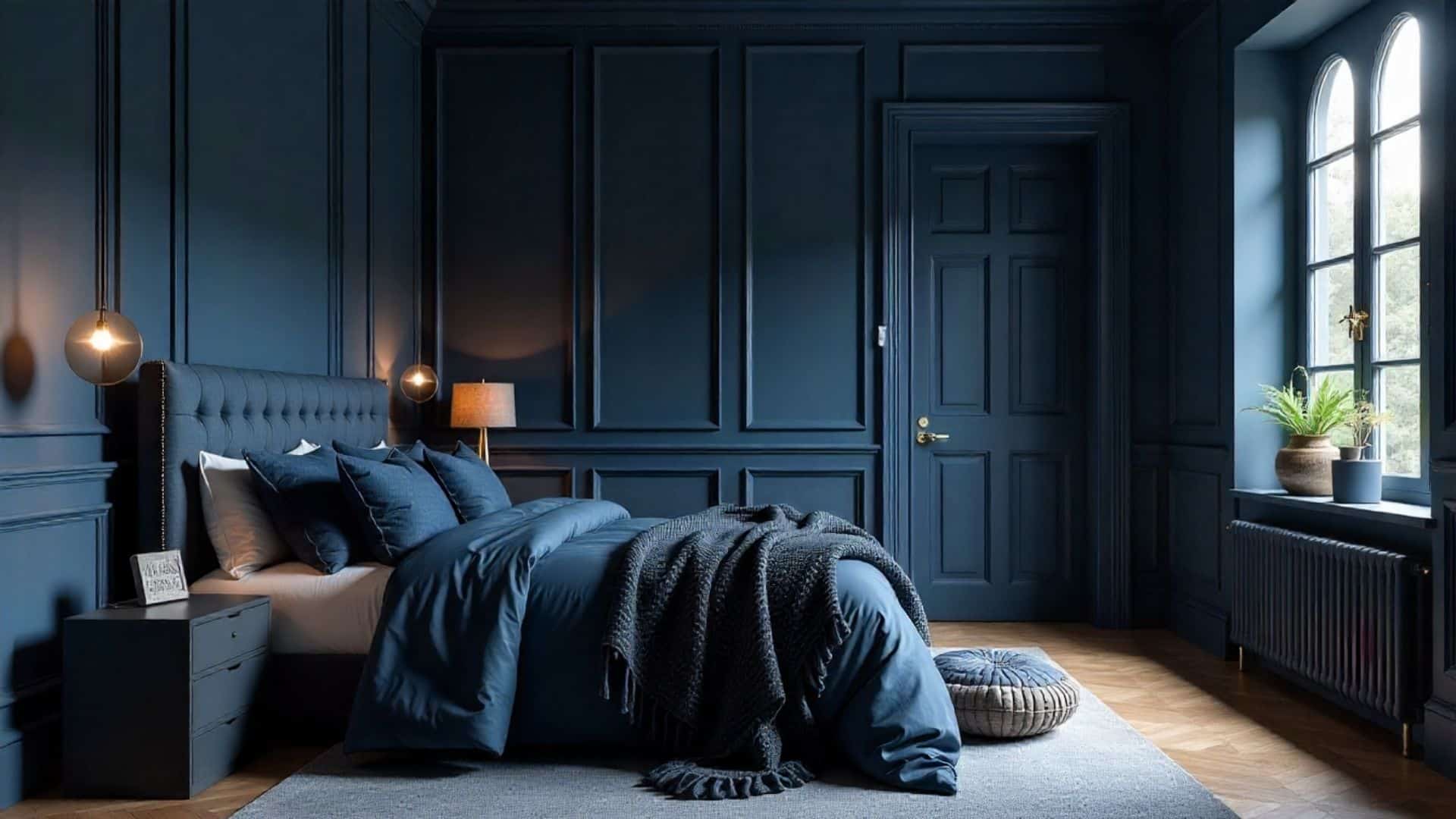
A navy-drenched bedroom creates a deep, calm atmosphere that helps you unwind at the end of the day. The dark tone wraps the room in a cocoon-like feel that works well with soft bedding and warm lighting.
Navy also hides shadows, which makes the space look smooth and even, giving the whole room a clean and relaxing finish.
2. Warm Taupe Living Room
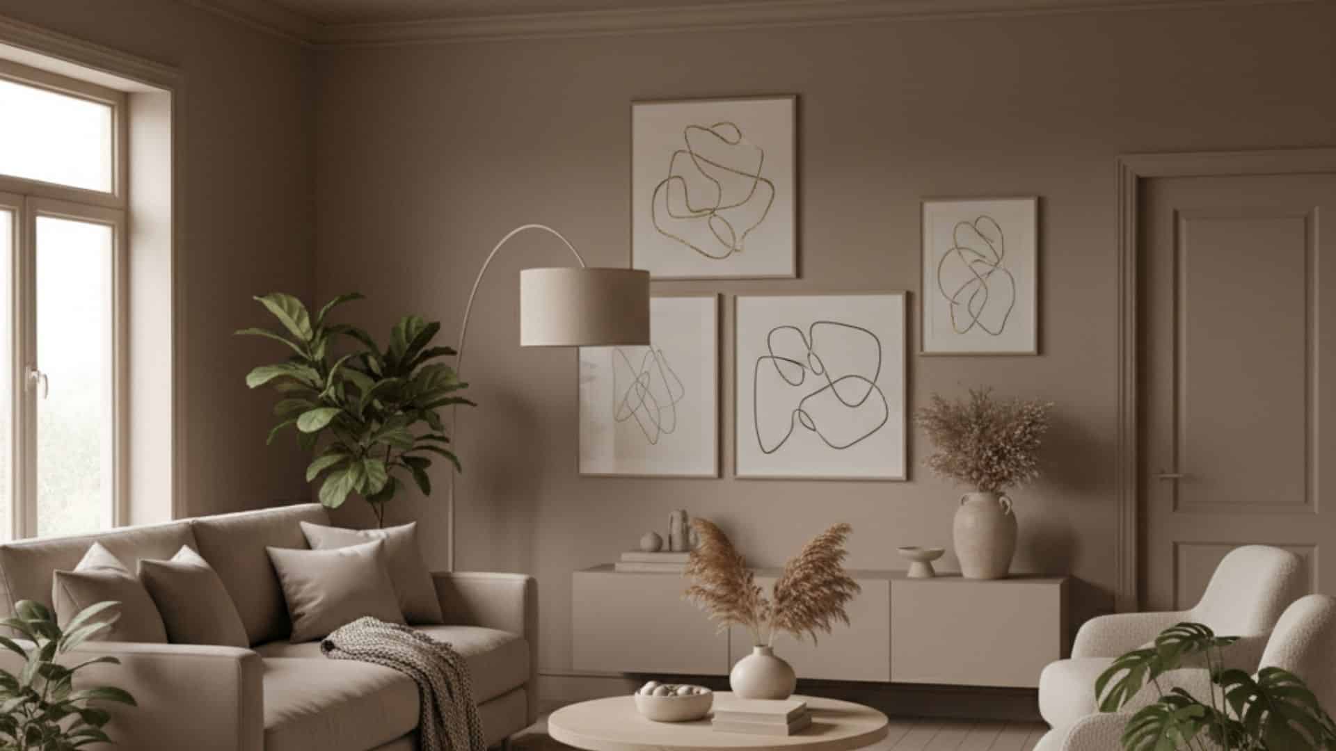
Warm taupe gives the entire living room a soft, grounded feel. It creates an easy backdrop for furniture, plants, and artwork without stealing attention.
When used on walls, ceilings, and trim, taupe makes the space feel warm and balanced, especially in rooms with natural light or neutral decor.
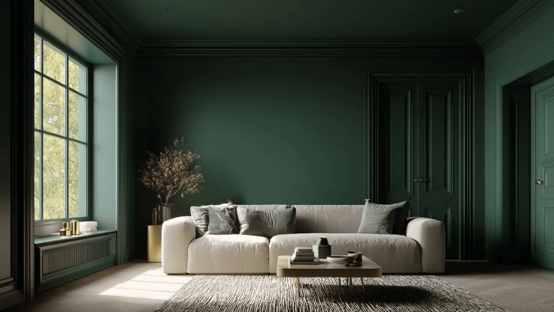
3. Forest Green Library
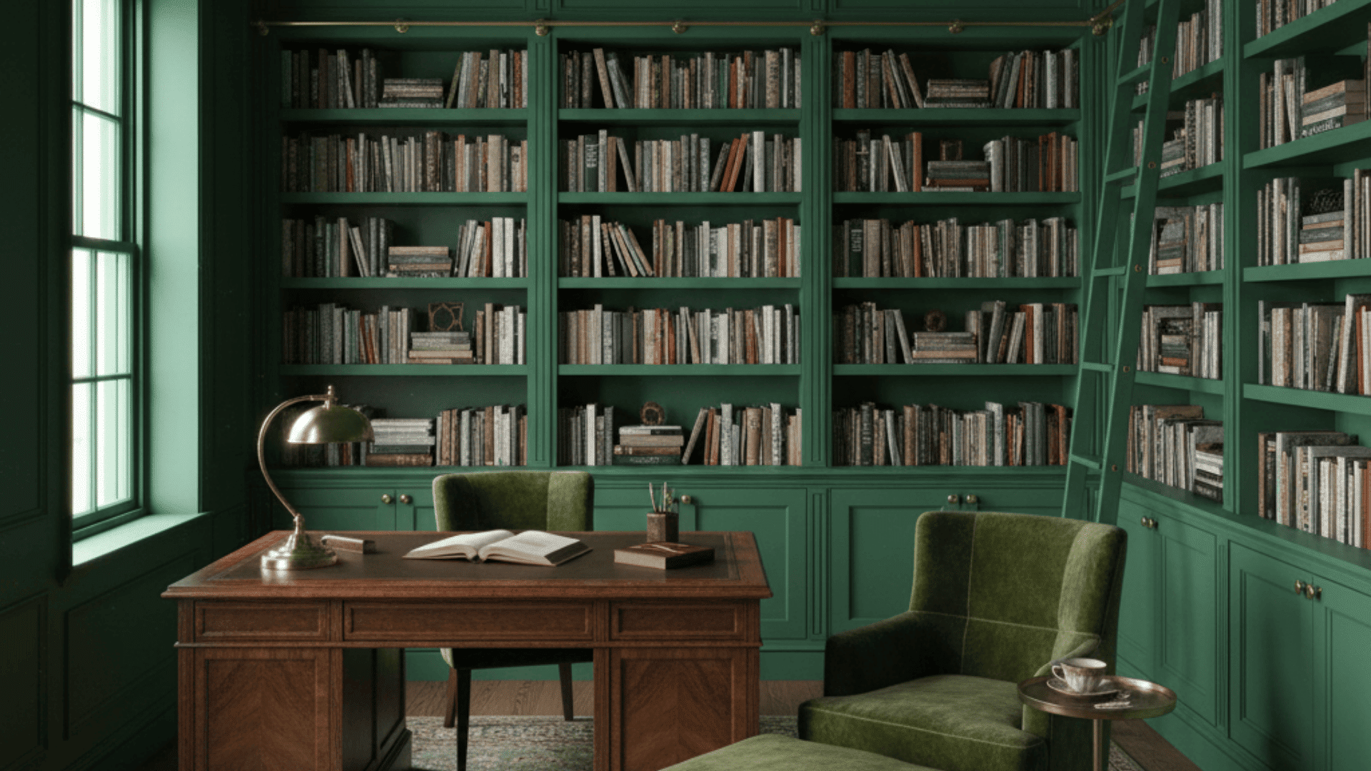
Forest green adds depth and richness to a reading room or library. When used on built-ins, molding, and walls, it creates a classic, collected look.
The color gives the room a quiet, tucked-away feeling that works well with dark wood, brass accents, or vintage furniture. It’s a timeless choice for cozy corners.
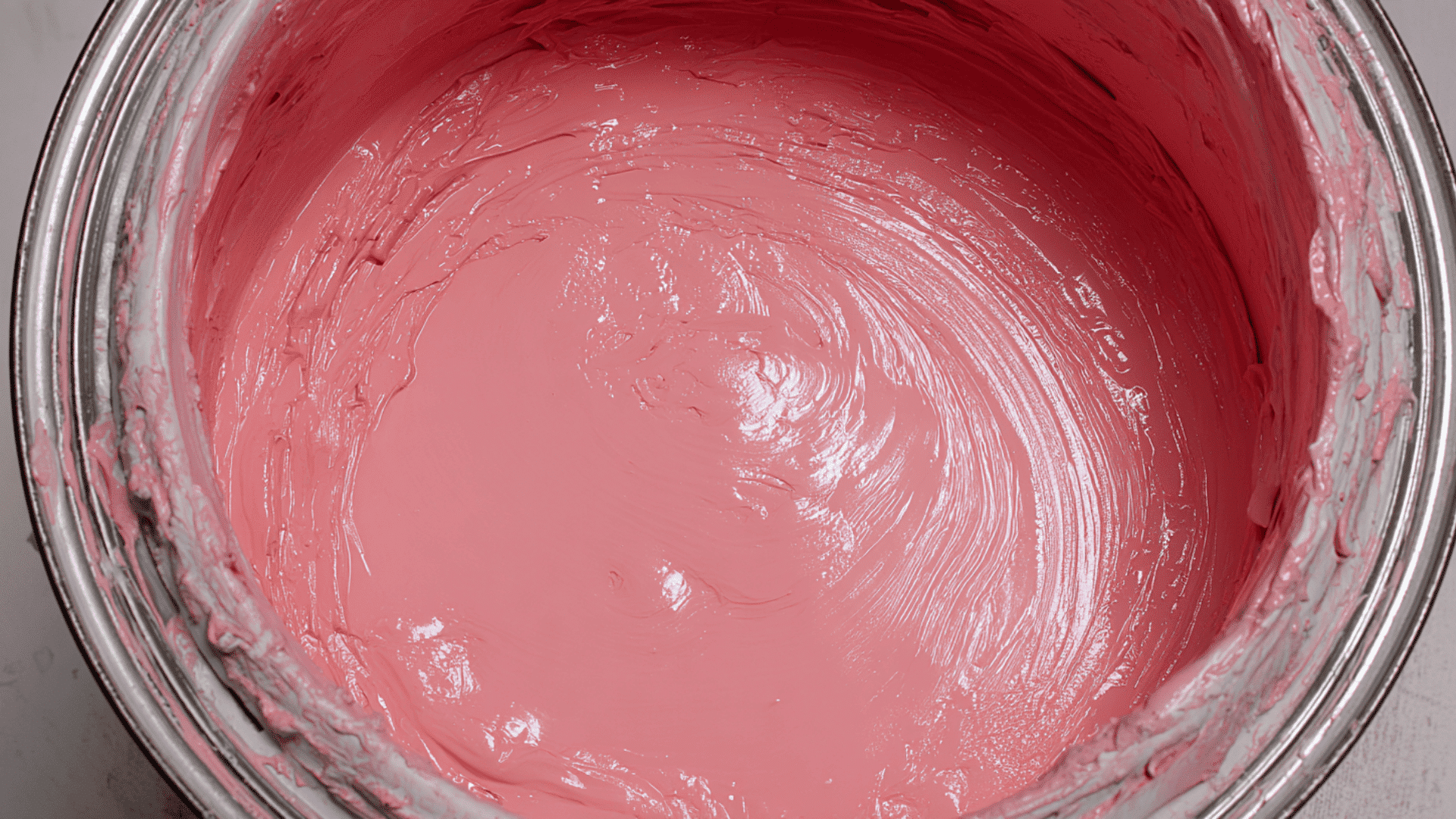
4. Dusty Rose Reading Nook
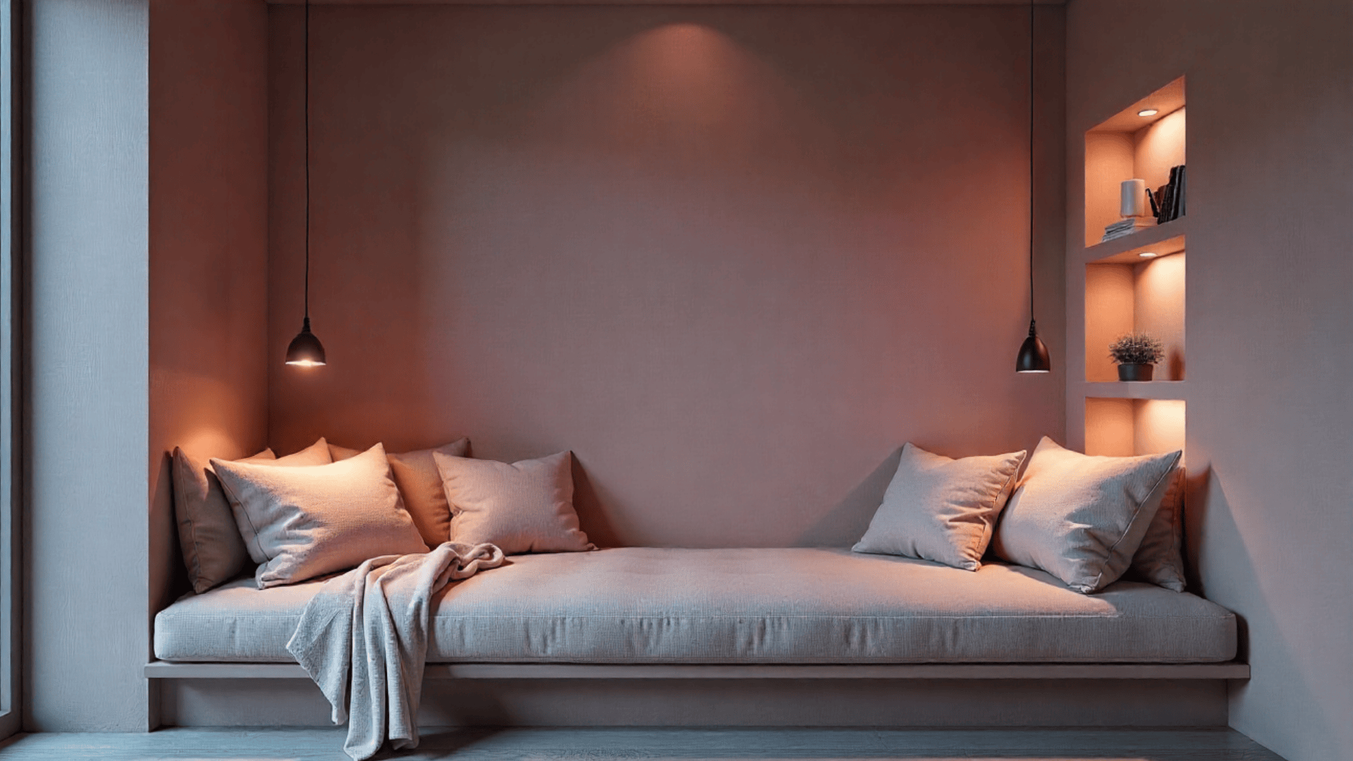
Dusty rose brings warmth and softness to a small reading space. This gentle shade creates a relaxed, comfortable mood that feels inviting.
When the whole nook is drenched in the same color, it becomes a peaceful retreat that pairs well with soft blankets, textured pillows, and warm lighting.
5. Charcoal Gray Dining Room
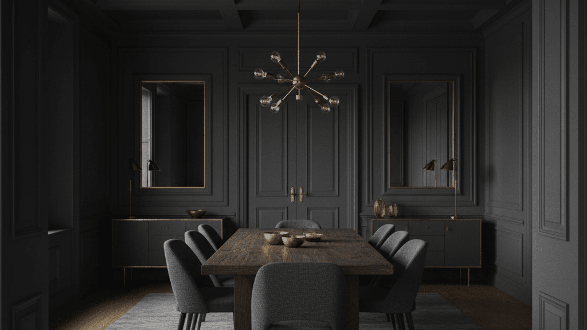
Charcoal gray makes a dining room feel modern and dramatic. The deep shade wraps the room in a bold look that still feels elegant and clean.
Painted on every surface, charcoal creates a warm, intimate atmosphere that works well for evening dinners and adds contrast to metallic or wood finishes.
6. Soft Beige Hallway
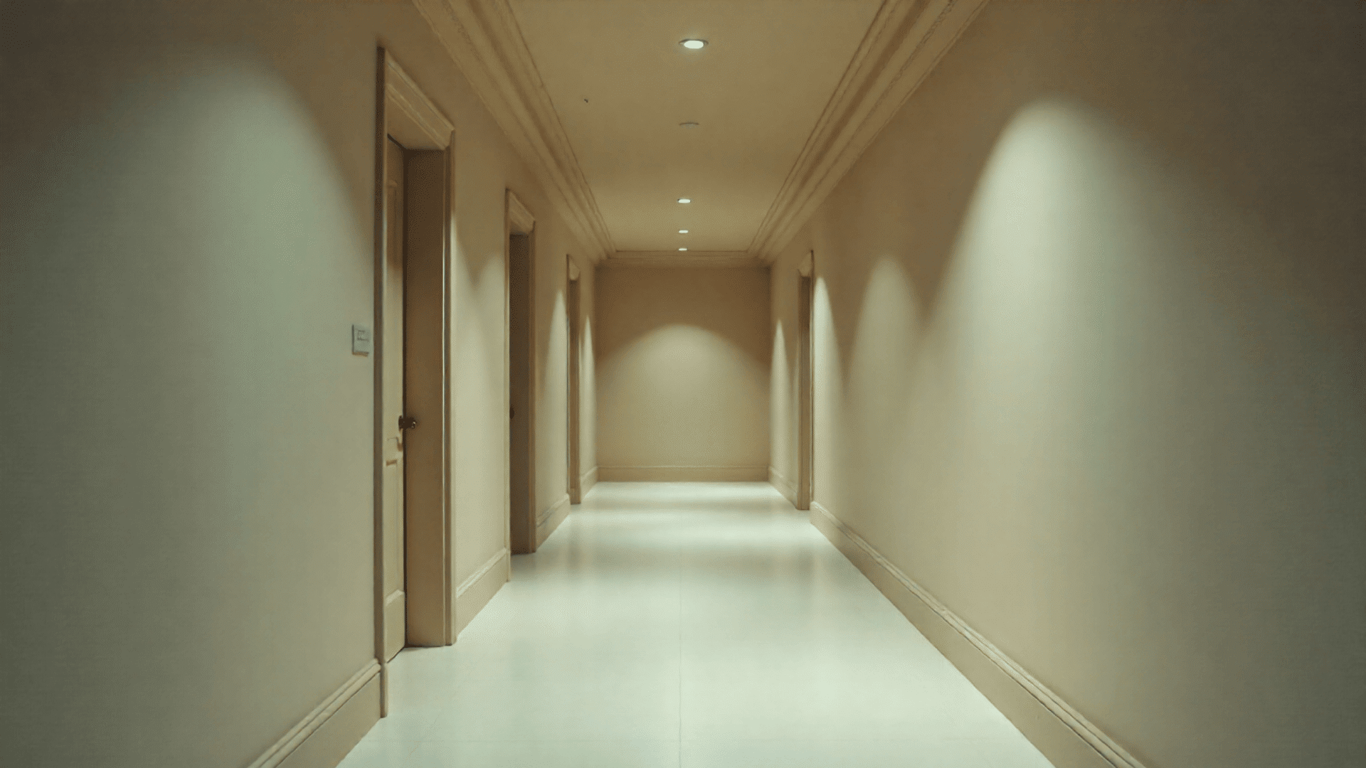
Soft beige brightens up a hallway while keeping it calm and simple. Drenching the walls, trim, and ceiling in the same shade creates a smooth, seamless path from room to room.
The color makes the space feel open and tidy, especially in narrow areas that need light and softness without added clutter.
7. Olive Green Kitchen Nook
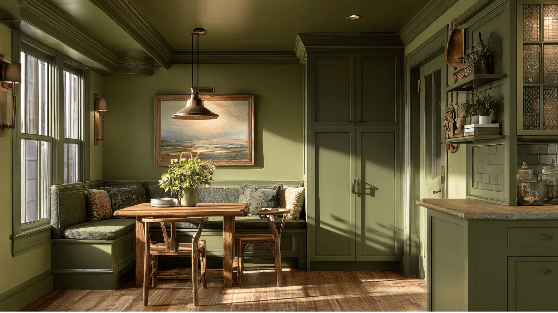
Olive green adds warmth and character to a small kitchen corner. The color feels earthy and grounded, making the nook a welcoming spot for coffee or breakfast.
When used on walls, cabinetry, and trim, it adds depth without overwhelming the space. It pairs well with natural wood and simple decor.
8. Midnight Blue Bathroom
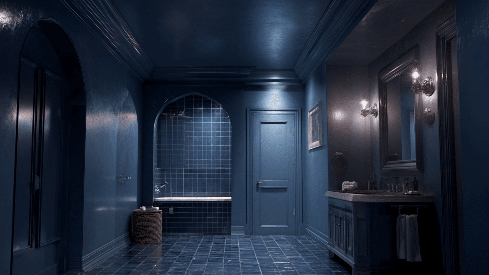
Midnight blue creates a spa-like, moody feeling in a bathroom. Painting everything in the same deep shade makes the room feel peaceful and private.
It hides sharp lines and brings a soft glow when paired with warm lighting. This color works especially well in smaller bathrooms that benefit from a calm, cocooned mood.
9. Terracotta Entryway
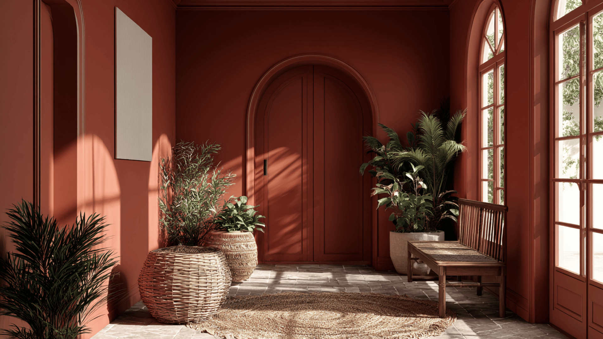
Terracotta brings warmth and energy to an entryway, making a strong first impression. The earthy color works beautifully on walls and trim, adding depth without feeling too bold.
When drenched across the whole space, terracotta creates a welcoming, grounded look that pairs well with plants, woven textures, and wood accents.
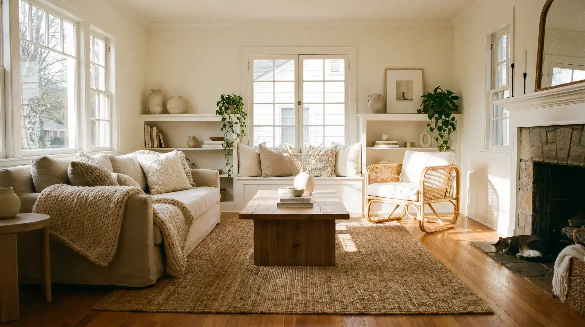
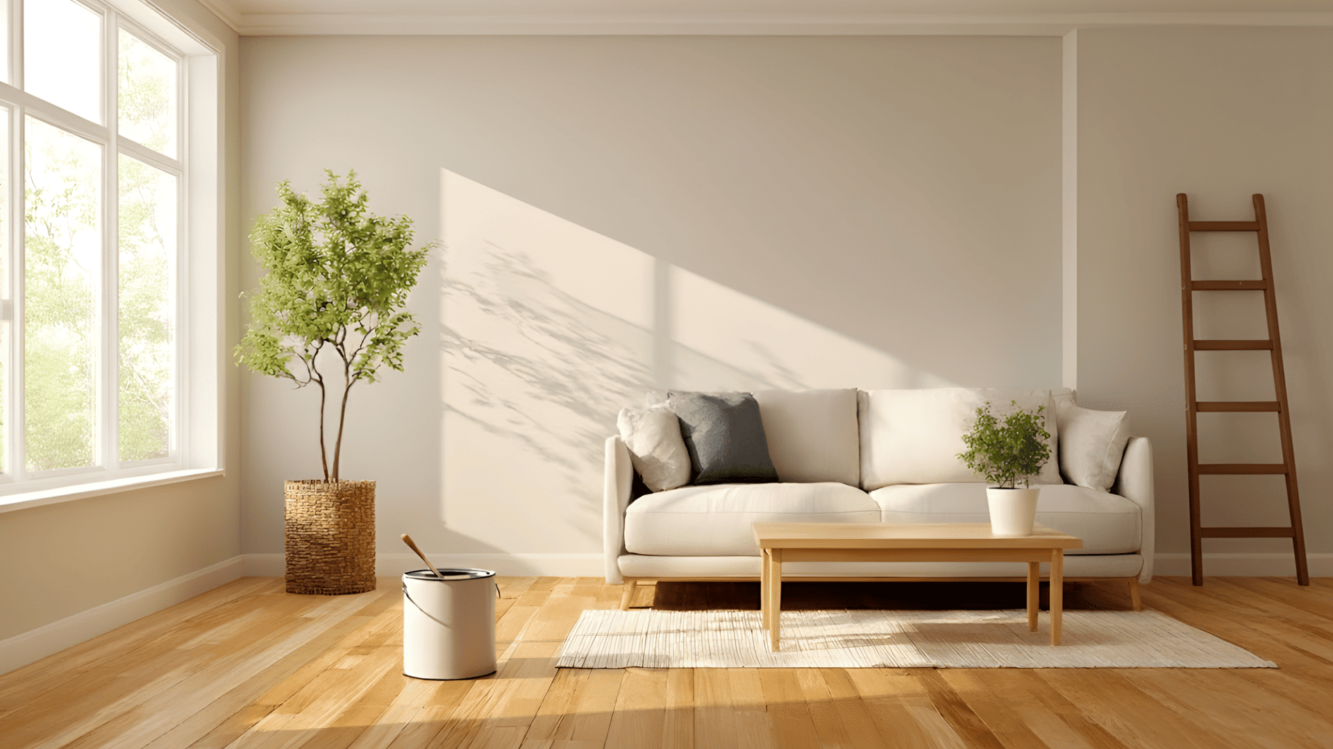
10. Creamy White Minimalist Room
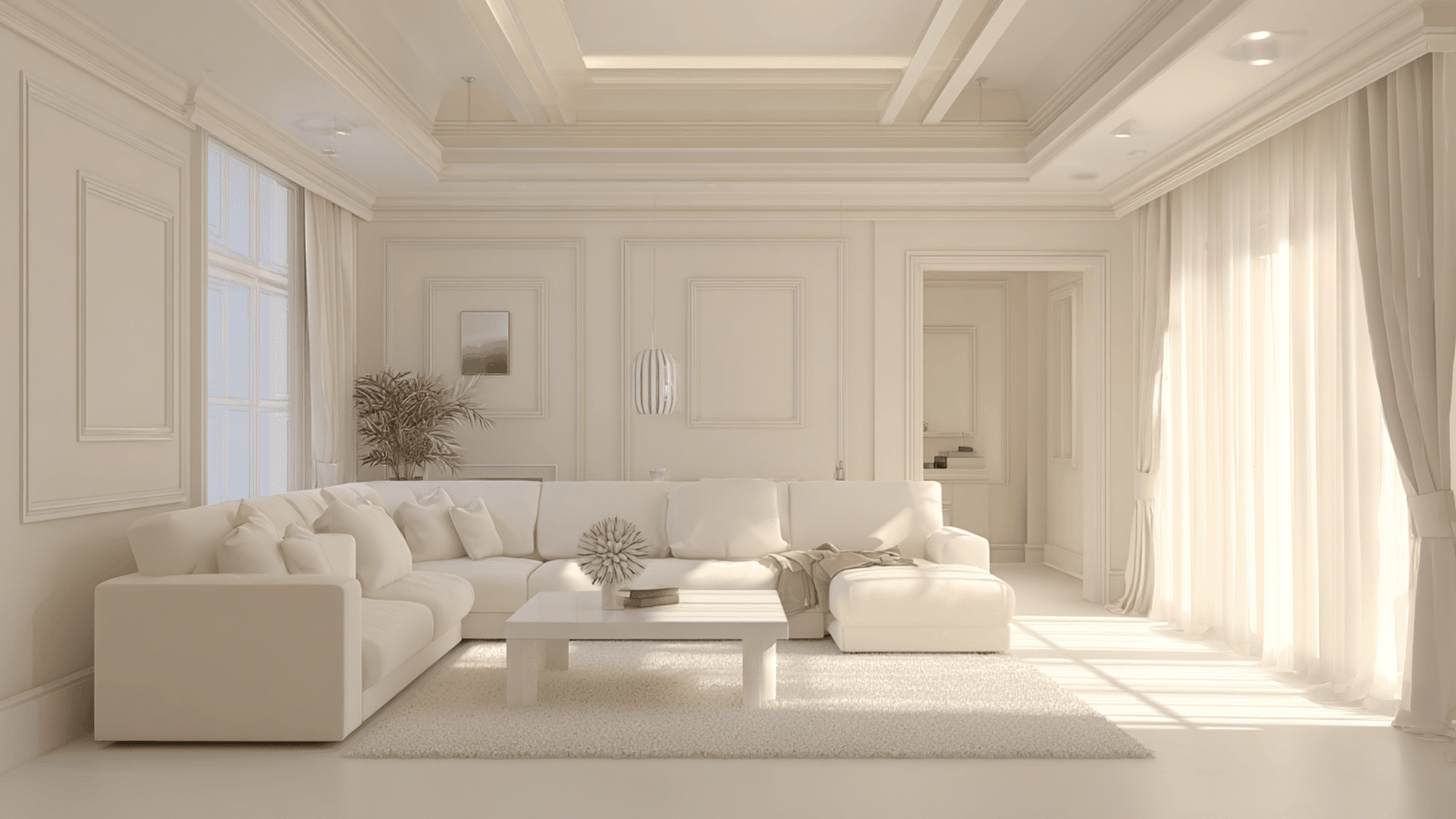
A creamy white drench keeps a room bright while still creating a unified, minimalist look. The softness of this shade adds warmth that flat white can’t provide.
When used on walls, ceilings, and trim, the space feels clean and open. It’s a great base for light wood furniture and subtle textures.
11. Muted Sage Home Office
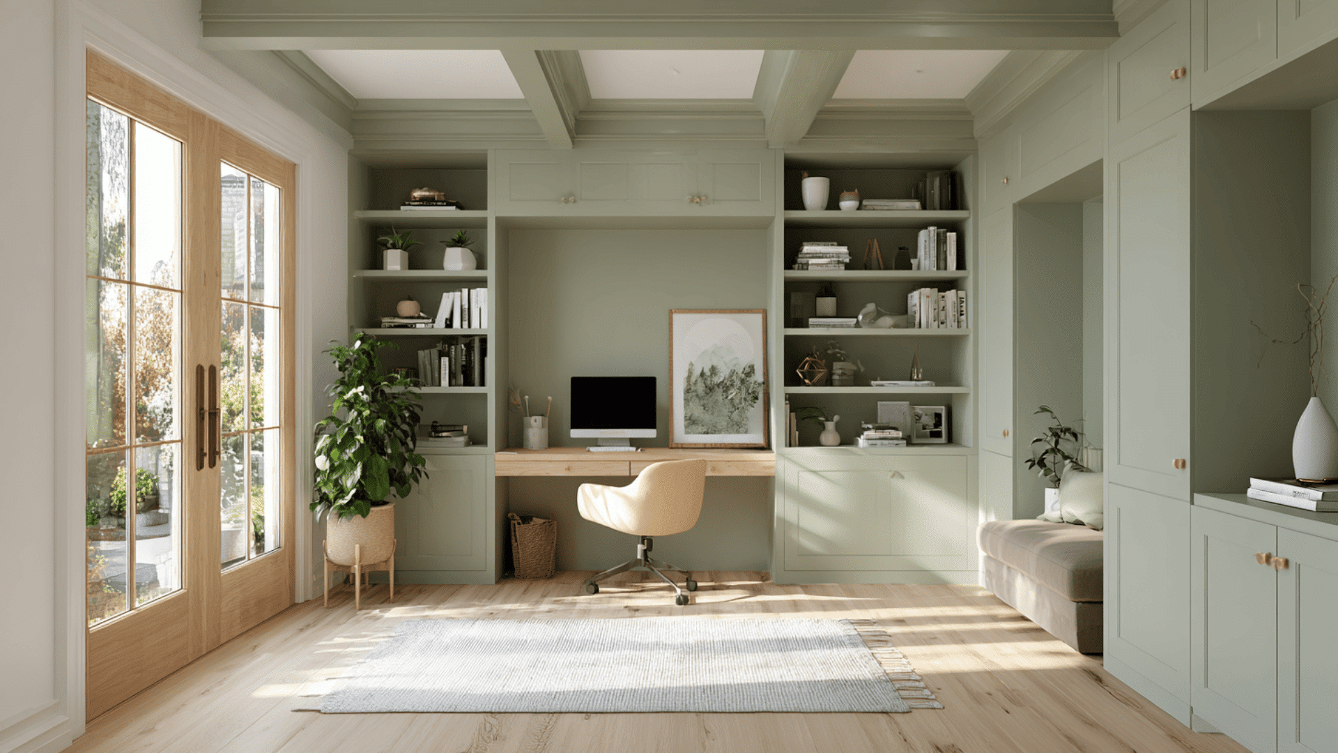
Muted sage creates a calm, focused feel in a home office. The soft green reduces visual noise, helping you stay relaxed while working.
Drenching the entire room in sage makes the space feel organized and grounded. It pairs well with light wood, simple decor, and warm desk lighting for a productive atmosphere.
12. Mustard Yellow Accent Room
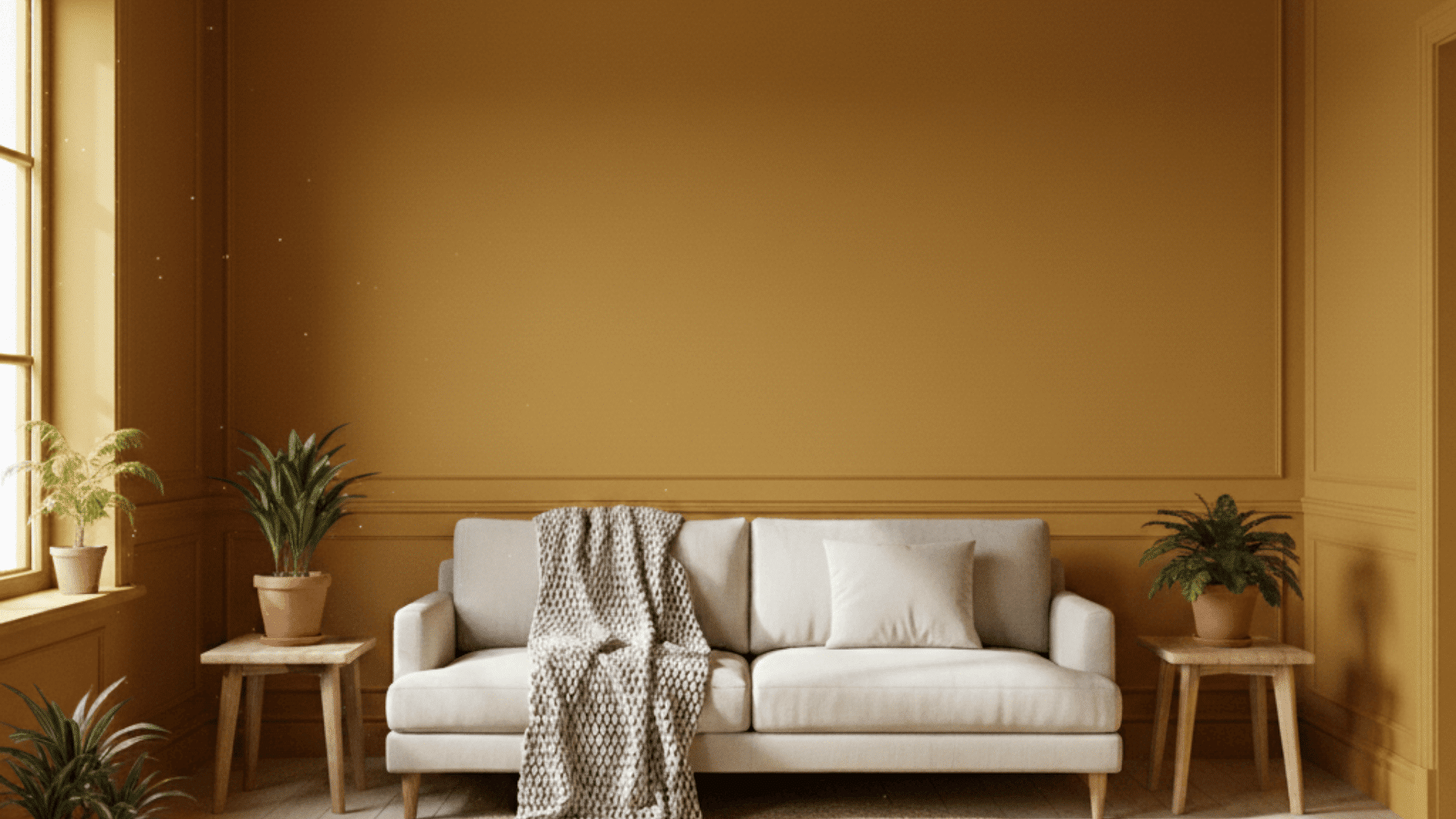
Mustard yellow brings energy and warmth to a small room or creative space. When used everywhere, it creates a happy, inviting mood without feeling too bright.
The earthy undertone keeps the color grounded. It works well with simple decor and natural textures, making the space feel uplifting and full of personality.
13. Slate Blue Guest Room
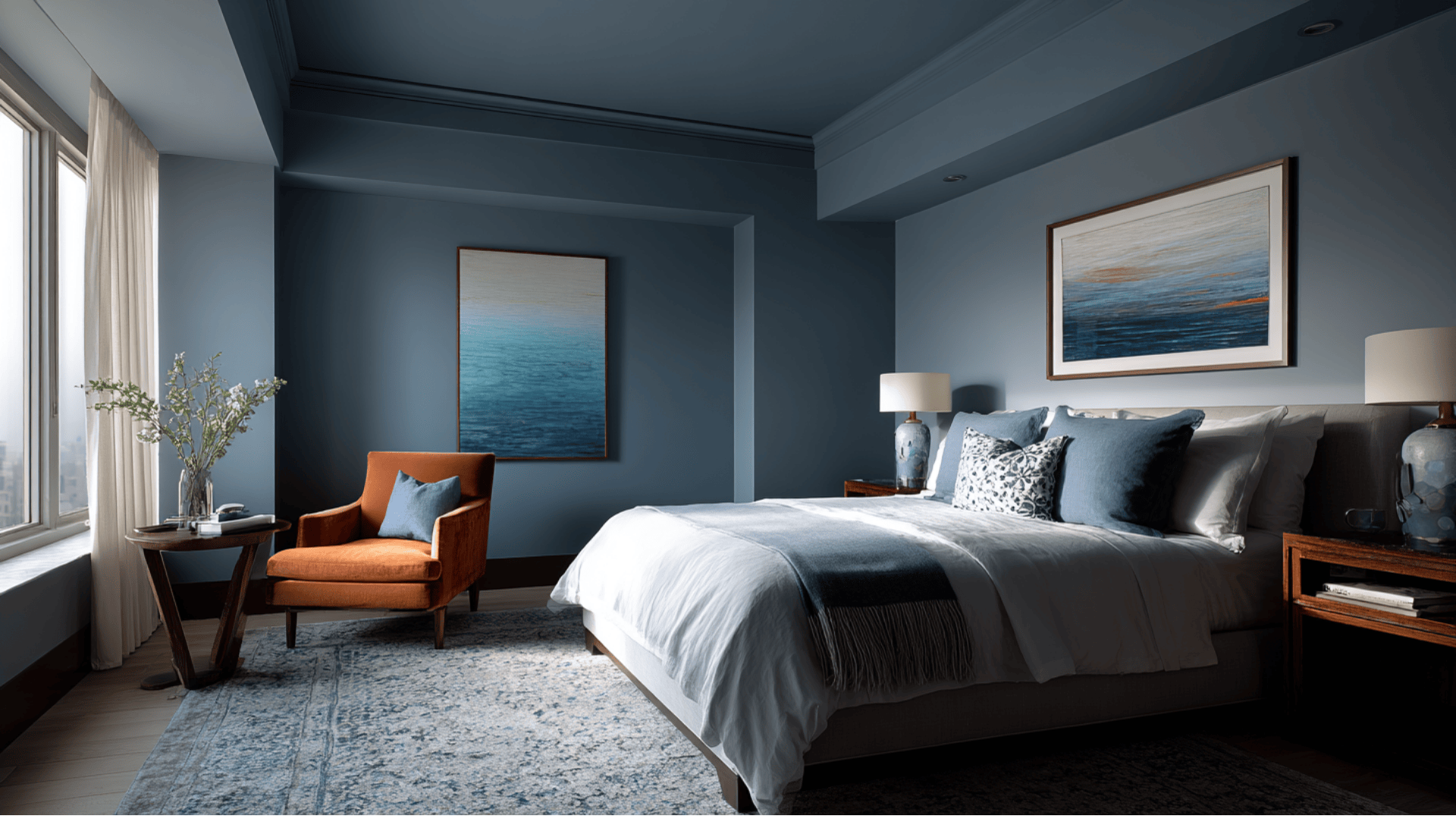
Slate blue helps a guest room feel calm, cool, and restful. The color has a soft, muted quality that works well across all surfaces.
It creates a clean, hotel-like feel that’s easy to decorate around. Paired with warm bedding or natural wood, the room feels balanced and comfortable for visitors.
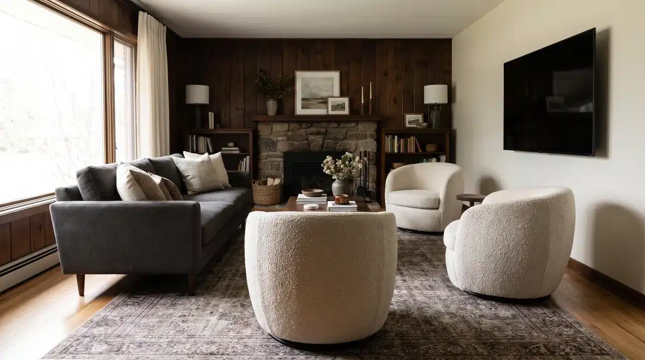
14. Chocolate Brown Den
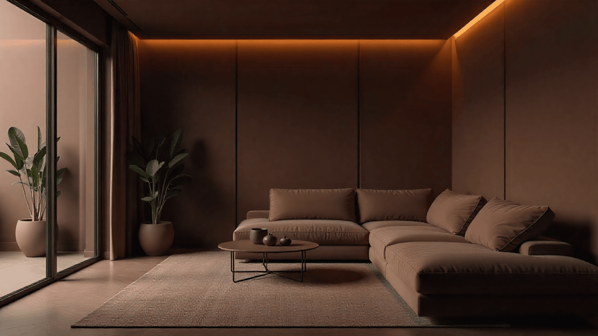
Chocolate brown adds depth and warmth to a den or lounge area. When every surface is drenched in this shade, the room feels safe, grounded, and private.
It’s ideal for movie nights or quiet evenings. The rich brown complements brass accents, leather furniture, or soft throw blankets.
15. Burnt Orange Fireplace Wall

Burnt orange creates a striking look when used around a fireplace. Drenching the whole wall, trim, and surrounding ceiling beam area makes the color feel full and intentional.
The warm tone draws attention to the fireplace and adds energy to the room. It pairs nicely with earthy decor and simple furniture.
16. Soft Lavender Closet Room

Soft lavender brings a gentle, dreamy feeling to a dressing room or walk-in closet. The color adds just enough personality without overwhelming the space.
Drenching everything in lavender makes the room feel airy and sweet. It pairs beautifully with gold hardware, light wood, or pastel accessories.
17. Olive-Bronze Mudroom
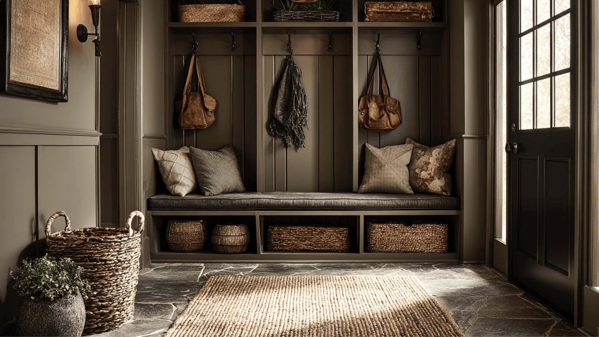
An olive-bronze shade gives a mudroom a durable and stylish look. The earthy color hides scuffs and marks while still feeling warm.
When used across all surfaces, it creates a clean, uniform entry area. It pairs well with simple storage, hooks, and baskets, making the space functional and inviting.
18. Muted Black Powder Room
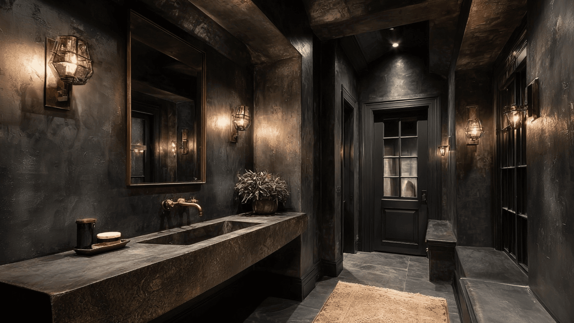
Muted black creates instant drama in a powder room. It feels bold without being harsh, especially when used across the entire space.
This shade makes the room feel modern and sophisticated. Warm lighting and metallic fixtures add contrast and prevent the space from looking too dark or flat.
19. Warm Greige Bedroom
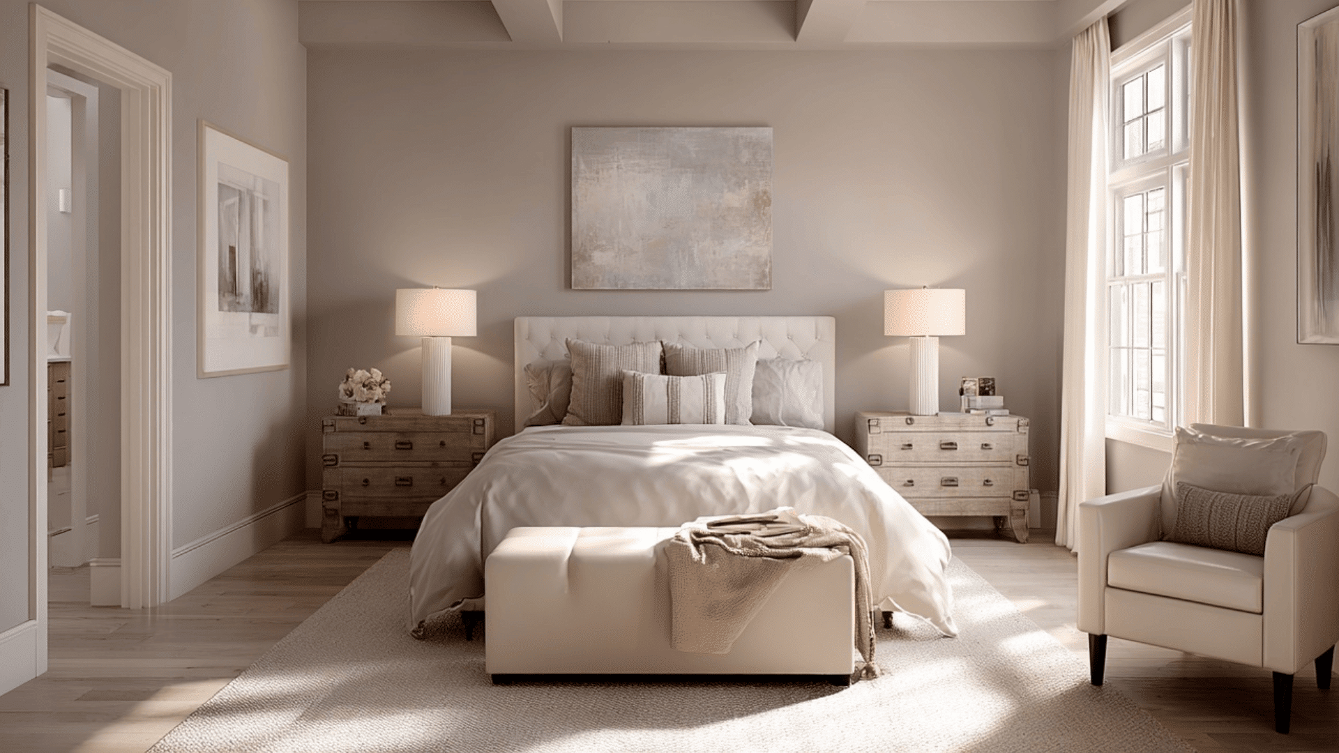
Warm greige combines gray and beige to create a soft, modern bedroom. The shade feels calm and easy to live with, making it ideal for sleep spaces.
When used across all surfaces, it gives the room a smooth, balanced look. It works well with neutral bedding, simple art, and warm wood textures.
20. Deep Plum Lounge
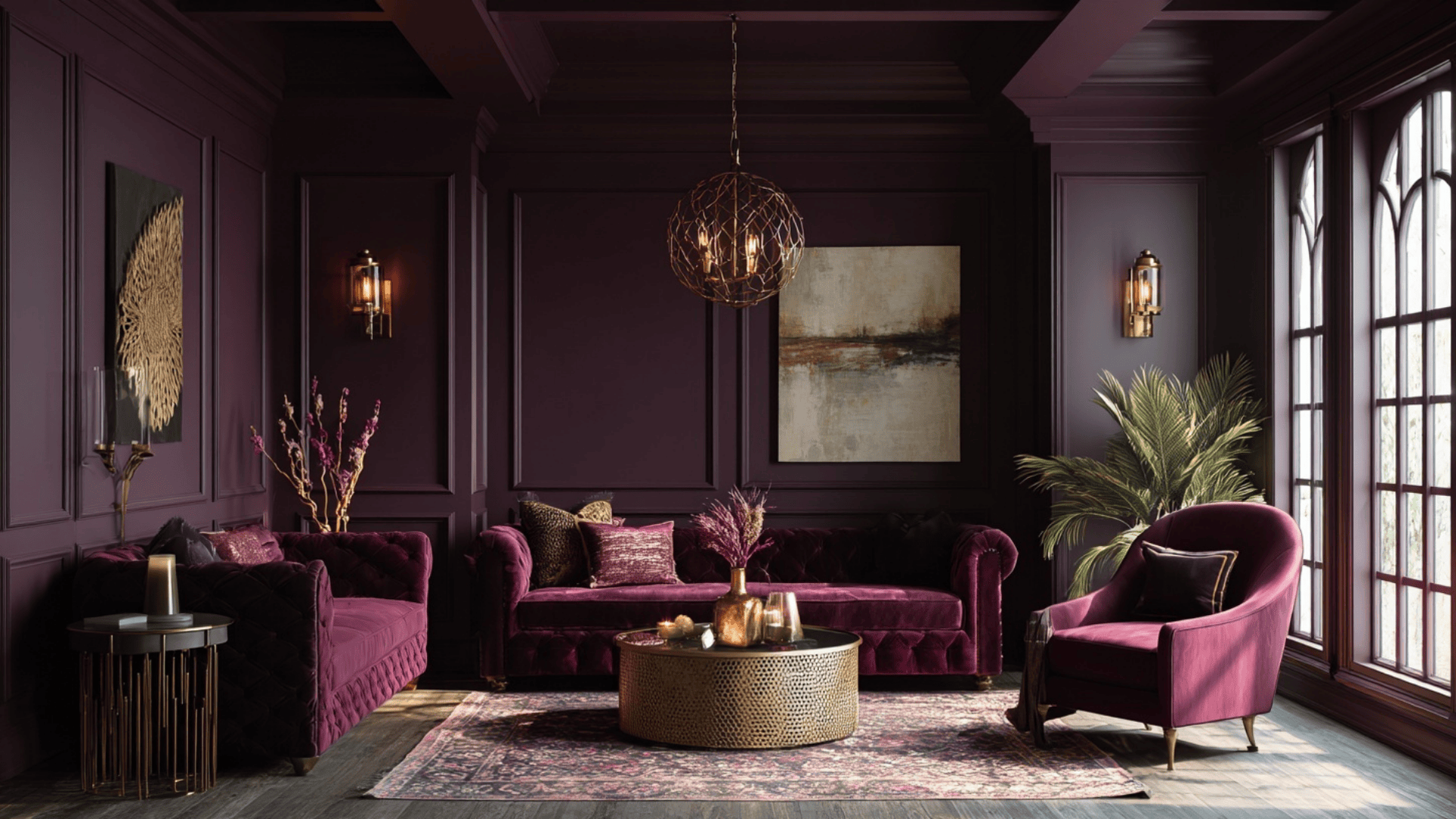
Deep plum brings a rich, luxurious feel to a lounge or sitting room. The color wraps the space in a warm, moody atmosphere that feels relaxing.
When drenched across walls and trim, it creates a bold yet elegant look. Pair it with brass accents or velvet textures for an elevated finish.
21. Pale Mint Studio Space
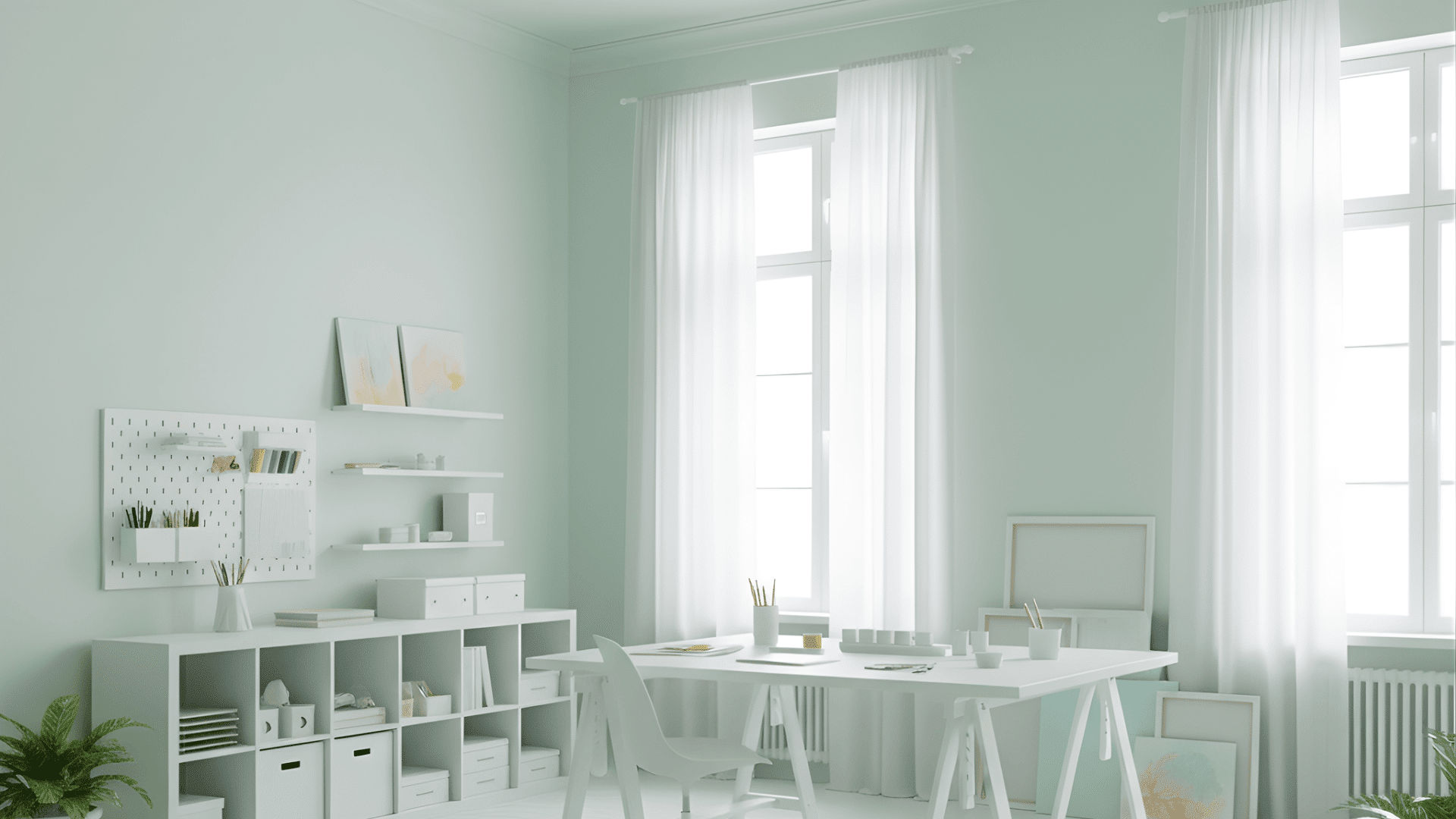
Pale mint adds a fresh, airy feel to a creative studio or craft room. The soft color helps the space feel bright without being overwhelming.
When used everywhere, it creates a light, uplifting atmosphere that sparks creativity. It pairs well with white furniture and simple storage.
Quick Guide to Color Drench a Room
Color drenching looks bold, but the process is simple when you follow a few clear steps. This guide gives you an easy way to start without getting overwhelmed.
- Choose your color: Pick one shade that matches the mood you want. Test it on the wall to see how it looks in your lighting before you commit.
- Pick your finish: Use a matte finish for the ceiling and a slightly smoother finish for walls and trim. This keeps the room from looking flat while still feeling cohesive.
- Prep the surfaces: Wipe down the walls, patch small holes, and make sure everything is clean. A little prep helps the final look turn out even.
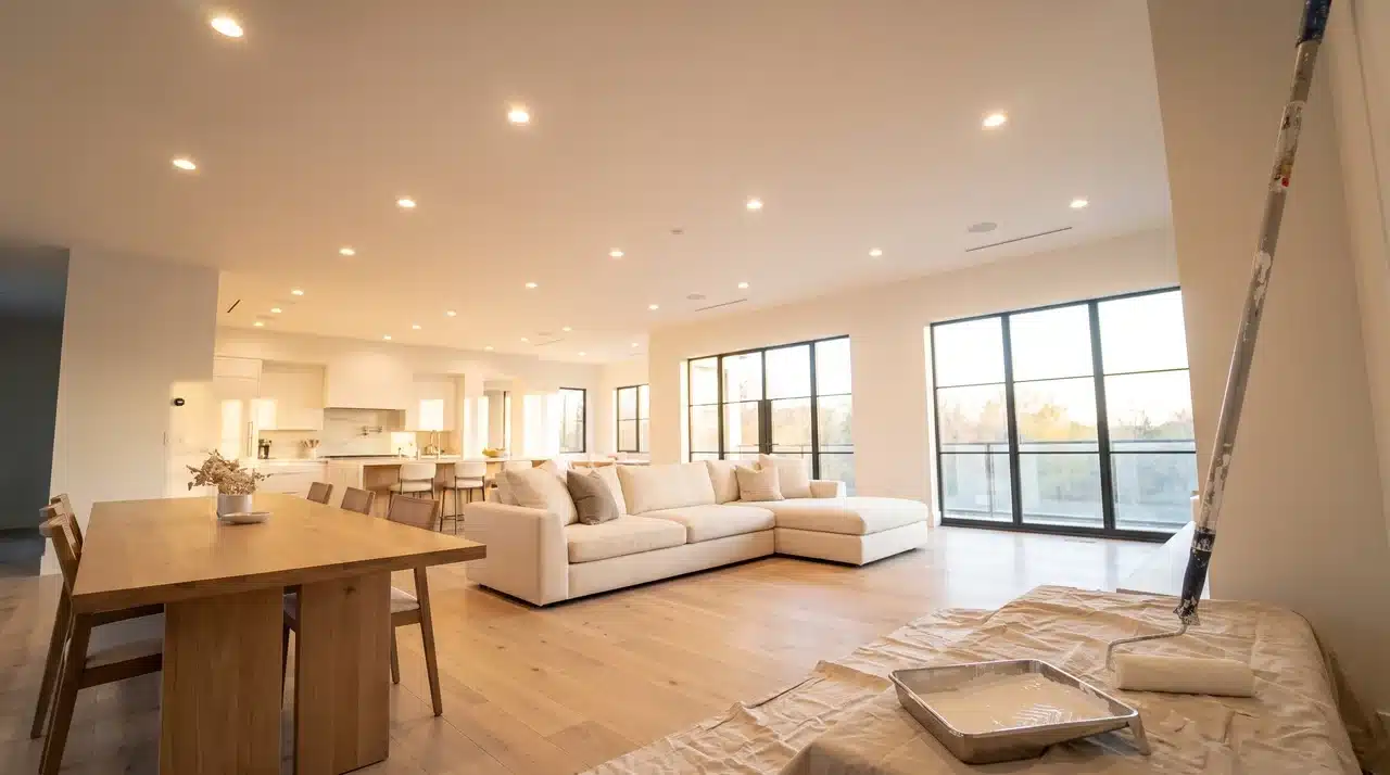
- Start with the ceiling: Paint the ceiling first so drips don’t fall onto fresh walls. This gives you a cleaner finish and makes the next steps easier.
- Paint the walls next: Cover the walls in smooth, even strokes. This sets the base for the whole look and creates that wrapped-in-color effect.
- Finish with trim and doors: Use the same color on trim, doors, and frames to keep everything seamless. This step ties the whole room together.
- Add matching decor: Bring in rugs, pillows, or lights in similar tones. This keeps the look unified without feeling empty.
These simple steps help you create a color-drenched room that feels clean, calm, and intentional without adding extra work.
Color Drenching vs. Double Drenching
Color drenching uses one main color across the whole room, while double drenching uses two related shades for extra depth.
| Feature | Color Drenching | Double Drenching |
|---|---|---|
| Number of Colors | One single color on every surface. | Two related shades are used together. |
| Overall Look | Smooth, unified, and seamless. | Layered, deeper, and more dimensional. |
| Best Room Types | Small rooms, bedrooms, hallways, cozy spaces. | Larger rooms that need visual depth. |
| Design Impact | Creates a bold, calm, all-over effect. | Adds subtle variation without losing cohesion. |
| Examples | Navy everywhere, forest green everywhere, soft beige, dusty rose. | Navy walls + lighter blue ceiling; forest green walls + olive trim; charcoal walls + warm taupe trim. |
This layout helps you compare both styles quickly so you can choose the approach that fits your room and design goals.
Budget & Paint Calculator Guide
Color drenching uses more paint because you’re covering the walls, ceiling, trim, and doors in one shade.
A medium-sized room is usually around 12×12 ft, which adds up to roughly 350–400 sq ft of paintable surface. For this size, you’ll typically need 2–3 gallons for the walls and 1 gallon for the ceiling and trim, especially if you’re doing two coats.
DIY costs usually range from $150–$300 for paint and basic supplies, depending on the paint quality and tools you choose.
Hiring a professional is more expensive, usually $2–$6 per sq ft, plus extra for trim and doors, but it provides a smoother and more consistent finish.
Conclusion
Color drenching opens up a fresh way to shape the mood of any room with confidence. It lets you play with color in a bold but simple way, giving your space a look that feels intentional and full of personality.
Whether you love soft neutrals or deep, dramatic shades, this style makes it easy to create a room that truly reflects you.
The best part is that you don’t need complicated design skills to make it work, just the right color and a clear vision.
If you’re ready to try something new, start using color drenching in your next project and see how one shade can completely change your home. Give it a try today.