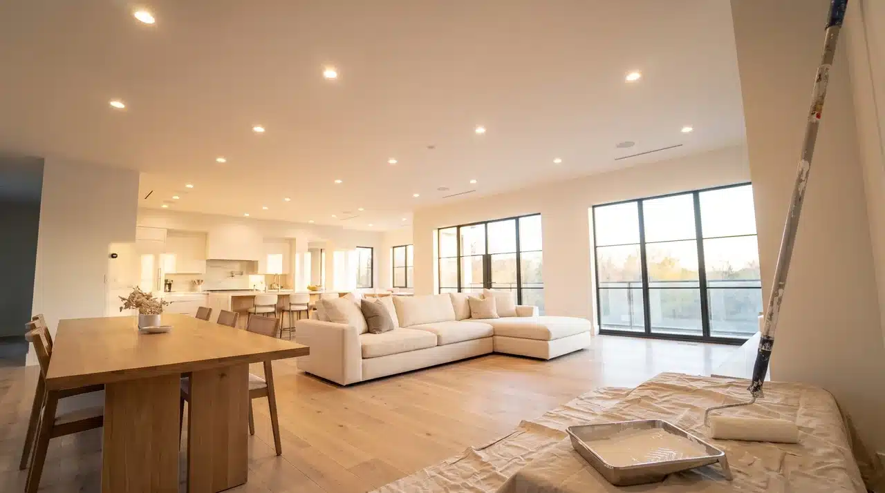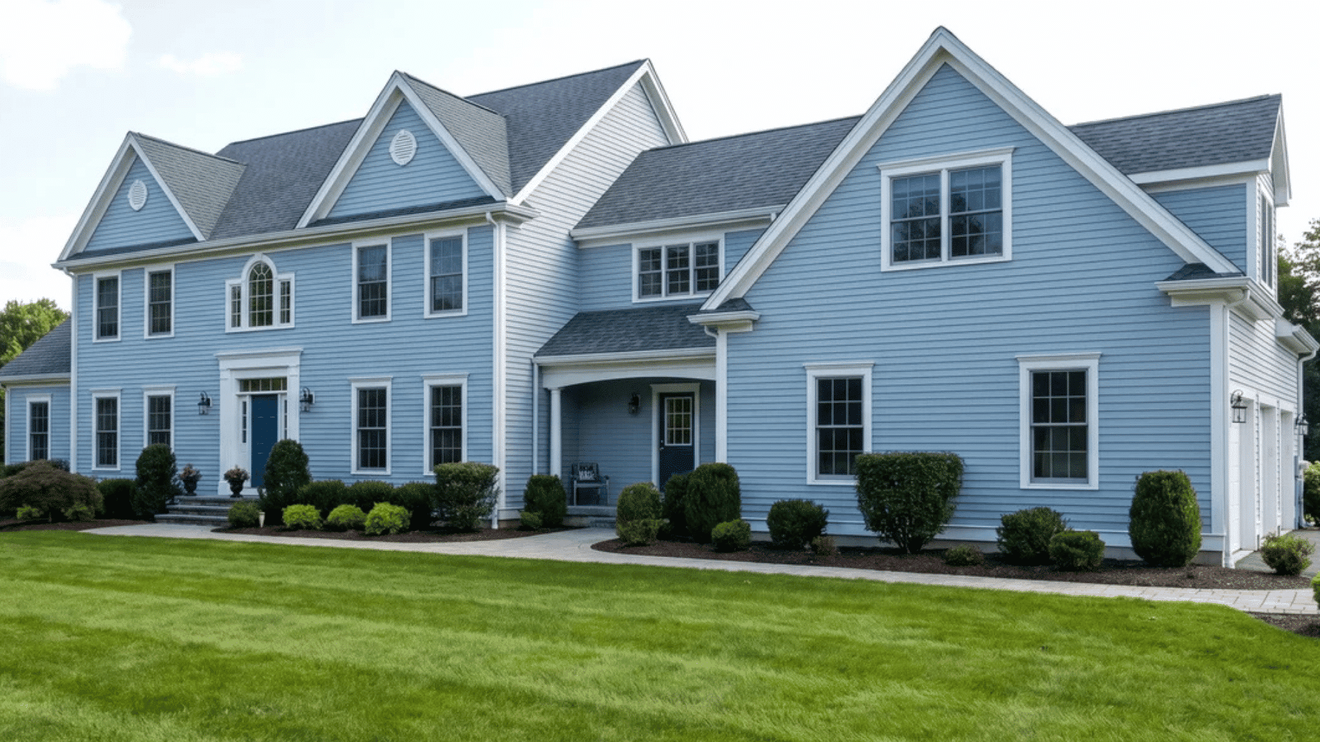


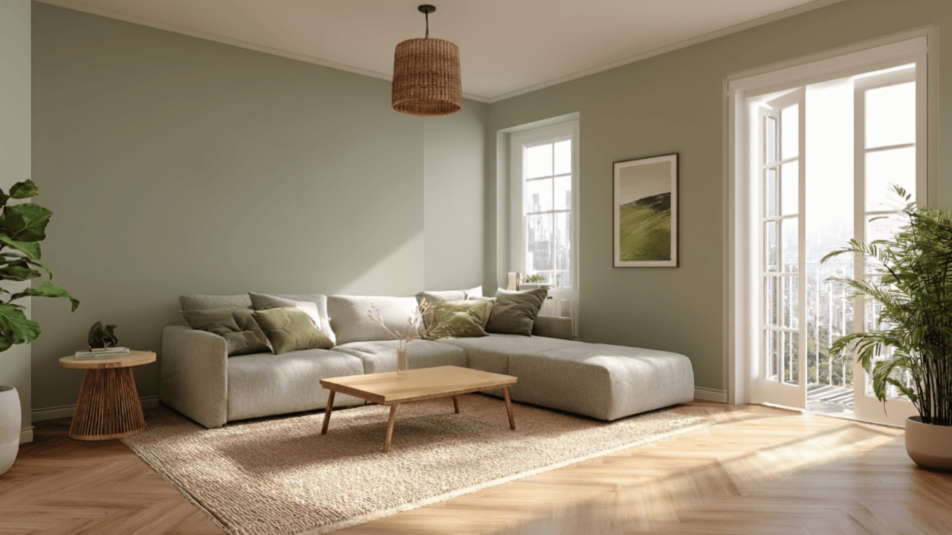
Choosing the right paint style can completely change how a room feels, and one trend that keeps showing up is painting walls and trim the same color.
I’ve tried this look in a few spaces, and the difference surprised me. It creates a smooth, calm backdrop that feels more modern without trying too hard.
In this blog, I’ll walk you through when this style works, when it doesn’t, and how to choose the right colors and sheens.
If you’ve ever thought about whether one-color rooms actually look good in real life, this guide will help you decide with confidence.
Why Painting Walls and Trim the Same Color is Popular
Painting your walls and trim the same color is part of a trend called color drenching, where one shade covers the whole room. This creates a clean, connected look that feels simple and modern.
Designers like it because it removes sharp lines and helps the space feel more balanced.
Using one color can also change how you see the room. It can make ceilings look higher, walls seem longer, and small spaces feel more open.
The look hides small flaws, highlights furniture, and works well in tight rooms. But it can also feel flat, hide details, and be harder to change later.
When Color Drenching Works and When It Doesn’t
This style can work well in many homes, but it isn’t the best choice for every room. Here’s a quick way to see if painting your walls and trim the same color suits your space:
| When This Look Works | When You Want Something Else |
|---|---|
| You want a modern, minimalist look | You have ornate trim you want to highlight |
| Your room is small | You prefer traditional or contrasting décor |
| Your trim is simple | Your room lacks natural light |
| You love bold colors or moody vibes | You want strong visual separation |
If your room fits more points on the left, this style will likely feel smooth and natural. If the right column applies, contrasting trim may give the room better balance.
Best Color Choices for a Seamless, Stylish Look
Choosing the right color has a big impact on how your room feels. Each shade brings a different mood, so it helps to understand what works well and where.
1. Light Neutrals (Most Popular)
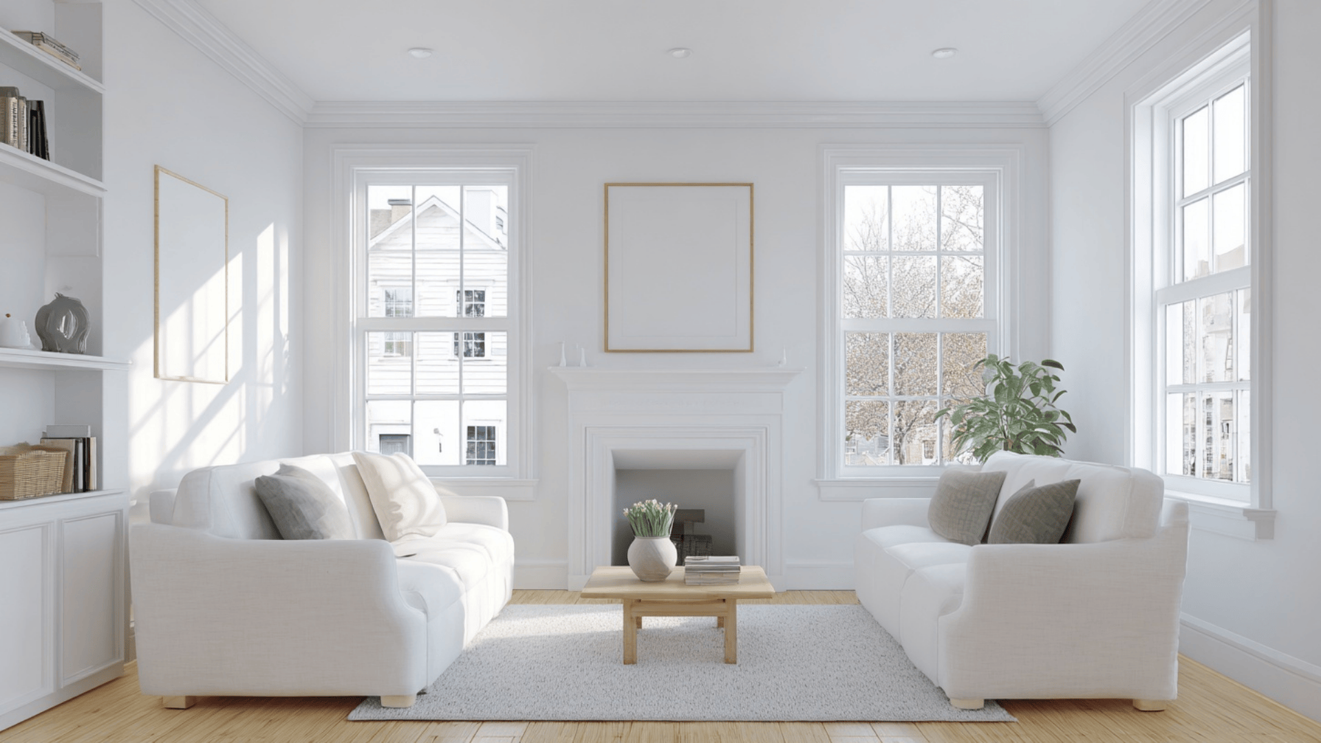
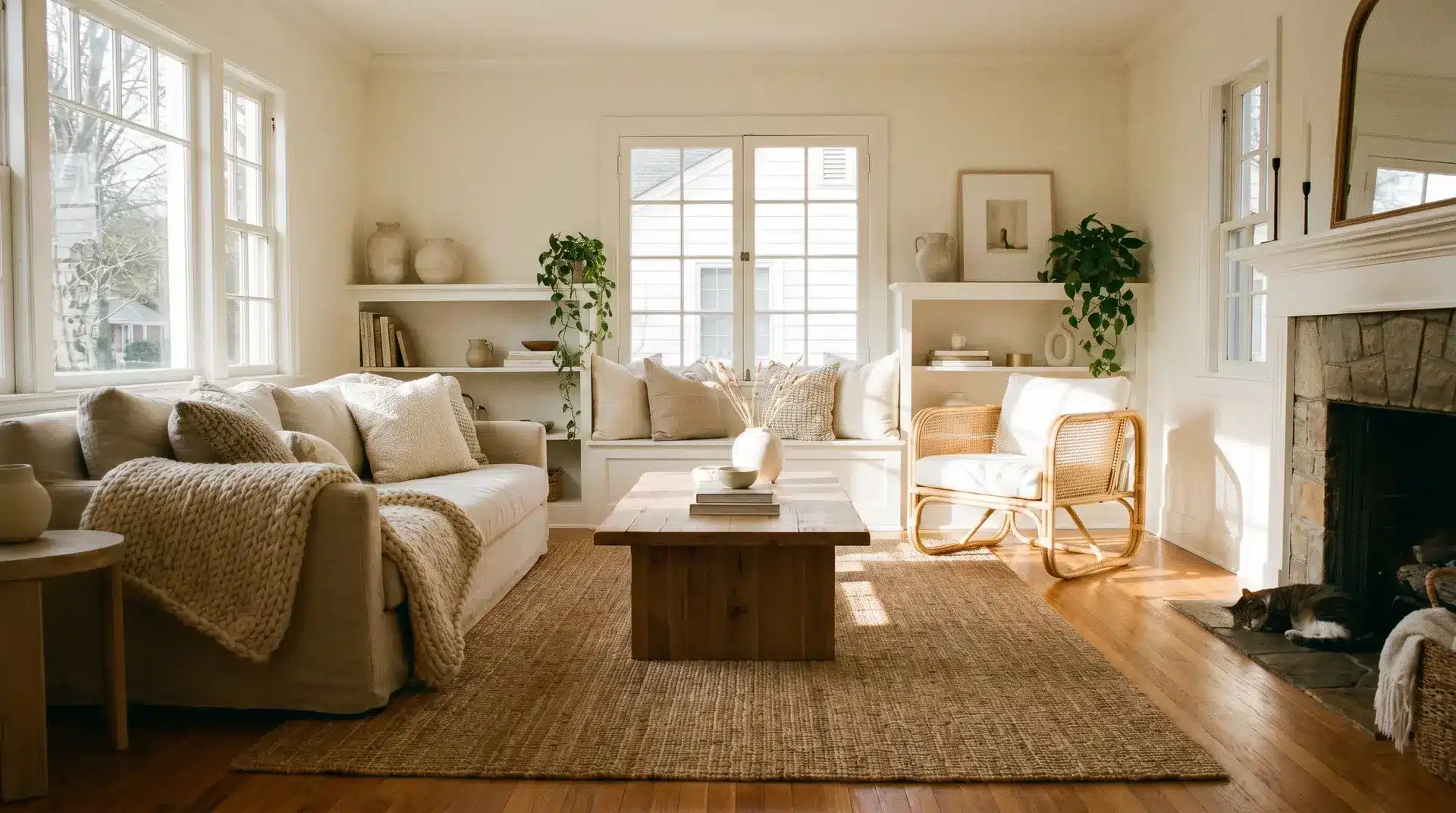
Light neutrals are the easiest and most popular choice because they create a soft, calm look that works in almost any home.
These shades brighten a room and help it feel open and clean. They work well in living rooms, bedrooms, and hallways, especially when you want a peaceful space that doesn’t feel too busy or heavy.
- Great picks: Sherwin-Williams Alabaster, Benjamin Moore White Dove, and Sherwin-Williams Pure White
- Where it works best: Living rooms, bedrooms, and hallways.
2. Dark & Moody Colors
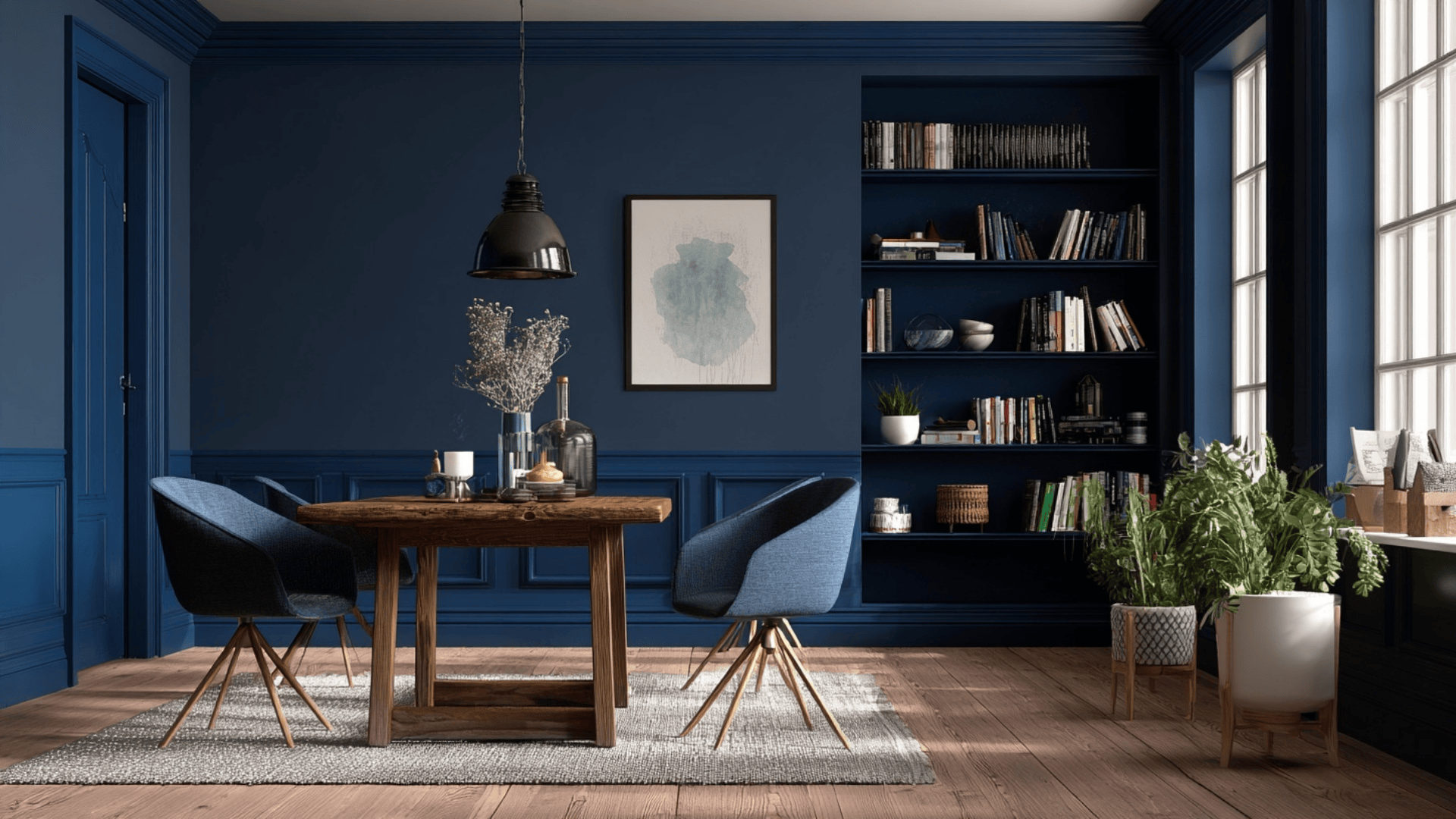
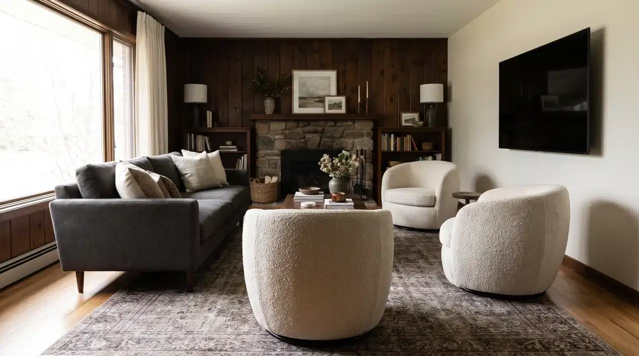
Dark and moody colors add depth and a rich, cozy feel to a room. These shades work best when you want a warm, dramatic setting that feels inviting.
They shine in offices, dining rooms, and media rooms, where low light and deeper tones create the right mood. These colors can make the space feel intentional and stylish.
- Great picks: Benjamin Moore Hale Navy, Sherwin-Williams Iron Ore, and Benjamin Moore Kendall Charcoal
- Where it shines: Offices, dining rooms, and media rooms.
3. Bold Colors
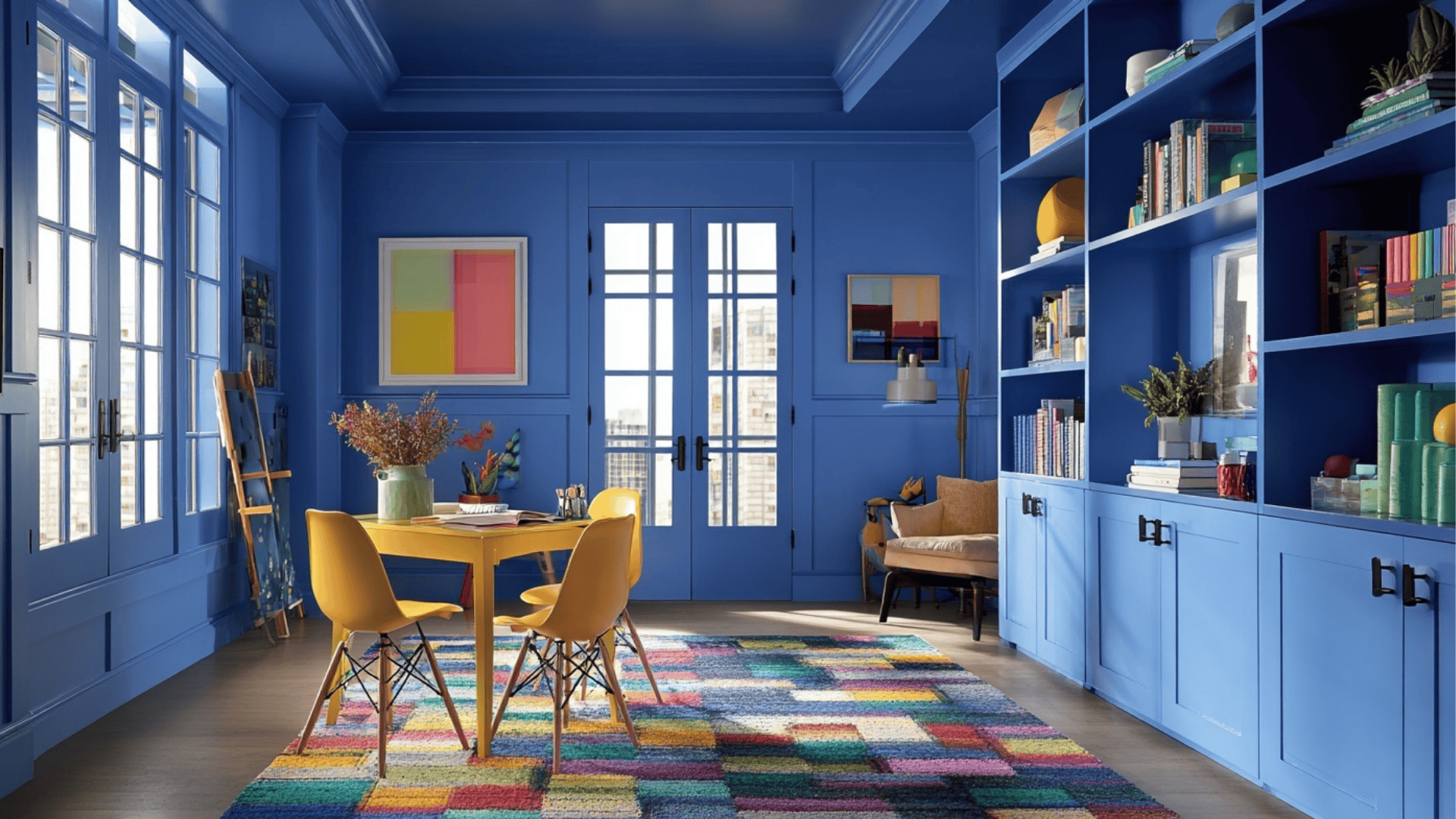
Bold colors bring life and personality into a room. They’re great when you want a fun, expressive space with lots of energy.
These shades work well in creative rooms, kids’ spaces, or areas where you want a strong visual impact. Bold tones help the walls and trim mix together in a playful way that feels fresh and memorable
- Great picks: Sherwin-Williams Coral Clay, Benjamin Moore Aegean Teal, and Sherwin-Williams Ripe Olive
- Where it works: Kids’ rooms, creative spaces, accent rooms.
Paint Finish Guide: Walls vs. Trim
The sheen you choose changes how the color looks and how the room feels. Picking the right finish for each surface helps create balance, depth, and a clean, polished look.
Walls: Matte or Eggshell
- Gives a soft, smooth finish.
- Helps hide small flaws or bumps.
- Creates an even, calm look across large surfaces.
- Works well in living rooms, bedrooms, and hallways.
- Not as easy to clean as shinier finishes.
Trim: Satin or Semi-Gloss
- Adds a gentle shine that makes edges stand out.
- Easy to wipe and clean, great for doors and baseboards.
- Creates a subtle contrast without changing the color.
- Makes the room feel more finished and defined.
- Can show imperfections more easily.
Using a slightly shinier finish on the trim helps the room feel balanced and prevents the color from looking flat. It gives the edges just enough definition while keeping the overall look seamless.
Best Rooms for a One-Color Look
This style won’t suit every space, but some rooms benefit from it more than others. Using one color on both the walls and trim can change how a room feels, helping it look cleaner, larger, or more connected.
1. Small Rooms
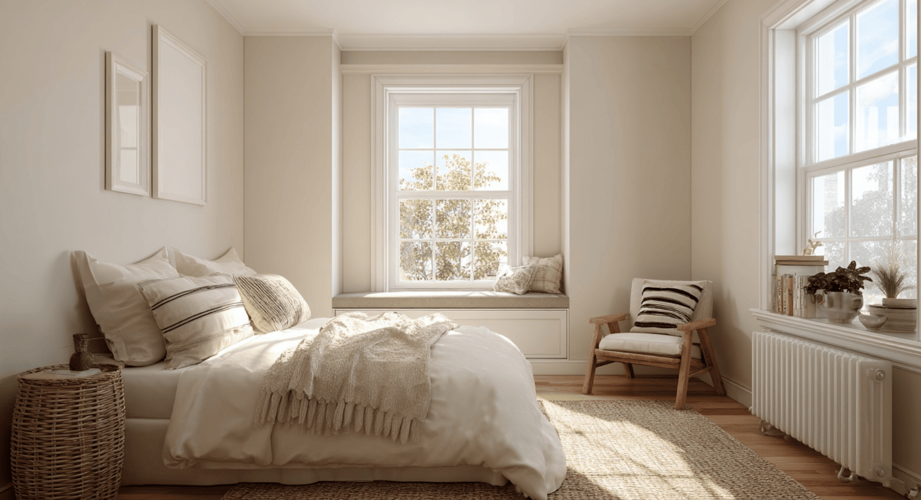
A single-color look helps small rooms feel more open by removing sharp edges and breaks. When the walls and trim mix together, the eye moves around the room without stopping at contrasting lines.
This makes the space feel larger, calmer, and less boxed in, especially in tight bedrooms, offices, or small living areas.
2. Powder Rooms

Powder rooms are ideal for bold or moody colors, and using the same shade on the trim helps the space feel more intentional.
This style gives the room a cozy, dramatic look without overwhelming it. Because powder rooms are small and self-contained, the one-color approach makes them feel polished and well-designed.
3. Bedrooms
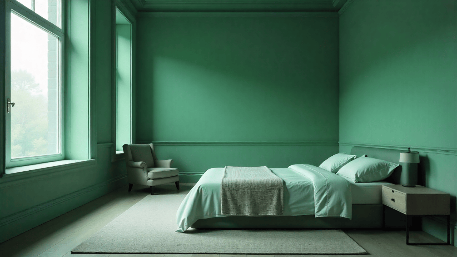
Bedrooms benefit from soft, even color flow. Using the same shade on the walls and trim creates a calm, relaxing feel that makes the room more peaceful.
This approach removes visual clutter and helps the space look simple and clean. It works especially well with light neutrals, soft greens, and muted blues.
4. Hallways
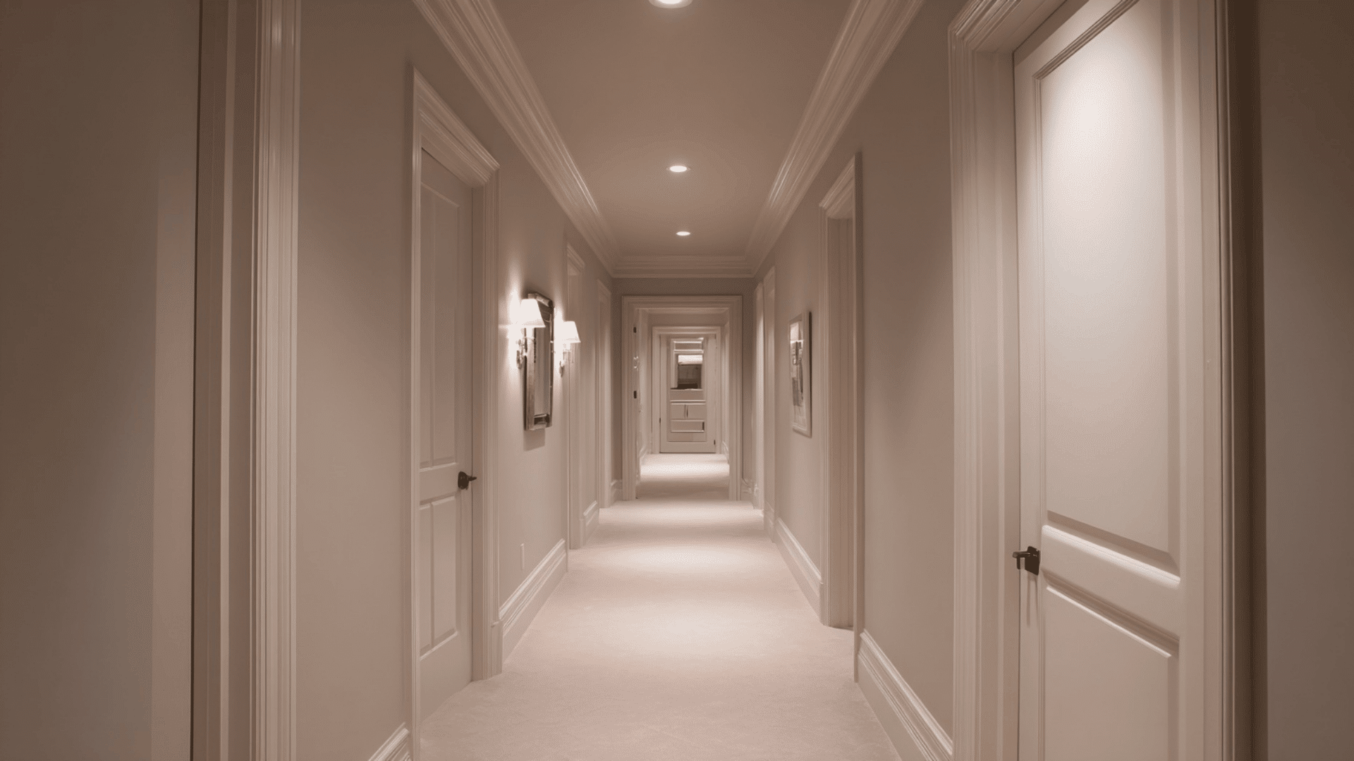
Hallways often feel narrow or broken up by doors and trim. Using one color smooths out these lines and helps the space look more open and connected.
It creates a continuous flow that makes the hallway feel longer and less crowded. This is especially helpful in older homes or homes with small, tight hallways.
5. Historic Homes
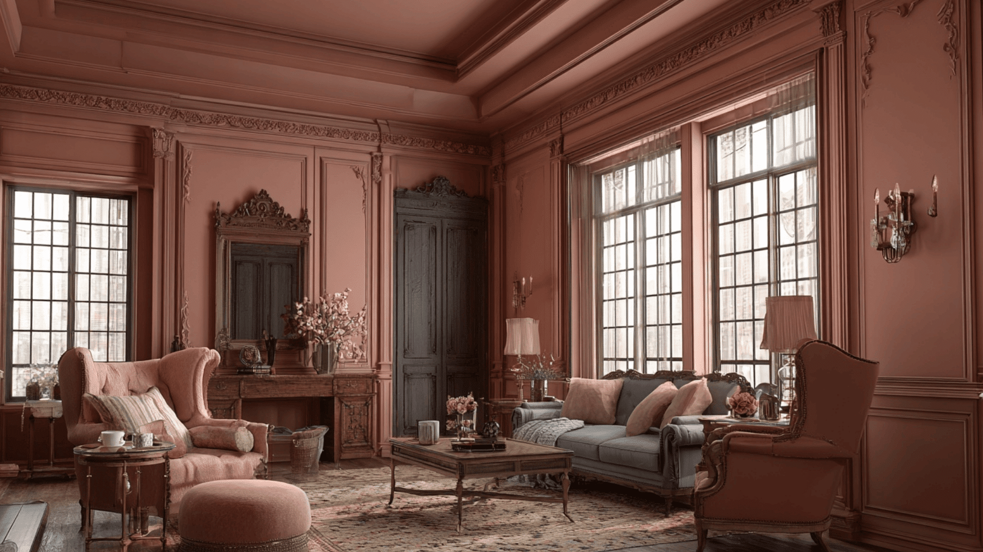
Historic homes often have detailed trim that can feel heavy or busy when painted bright white. Using a single color softens these lines and gives the space a balanced, classic look.
This approach highlights the character of the home without making the trim stand out too sharply, keeping the room warm and cohesive.
6. Rentals
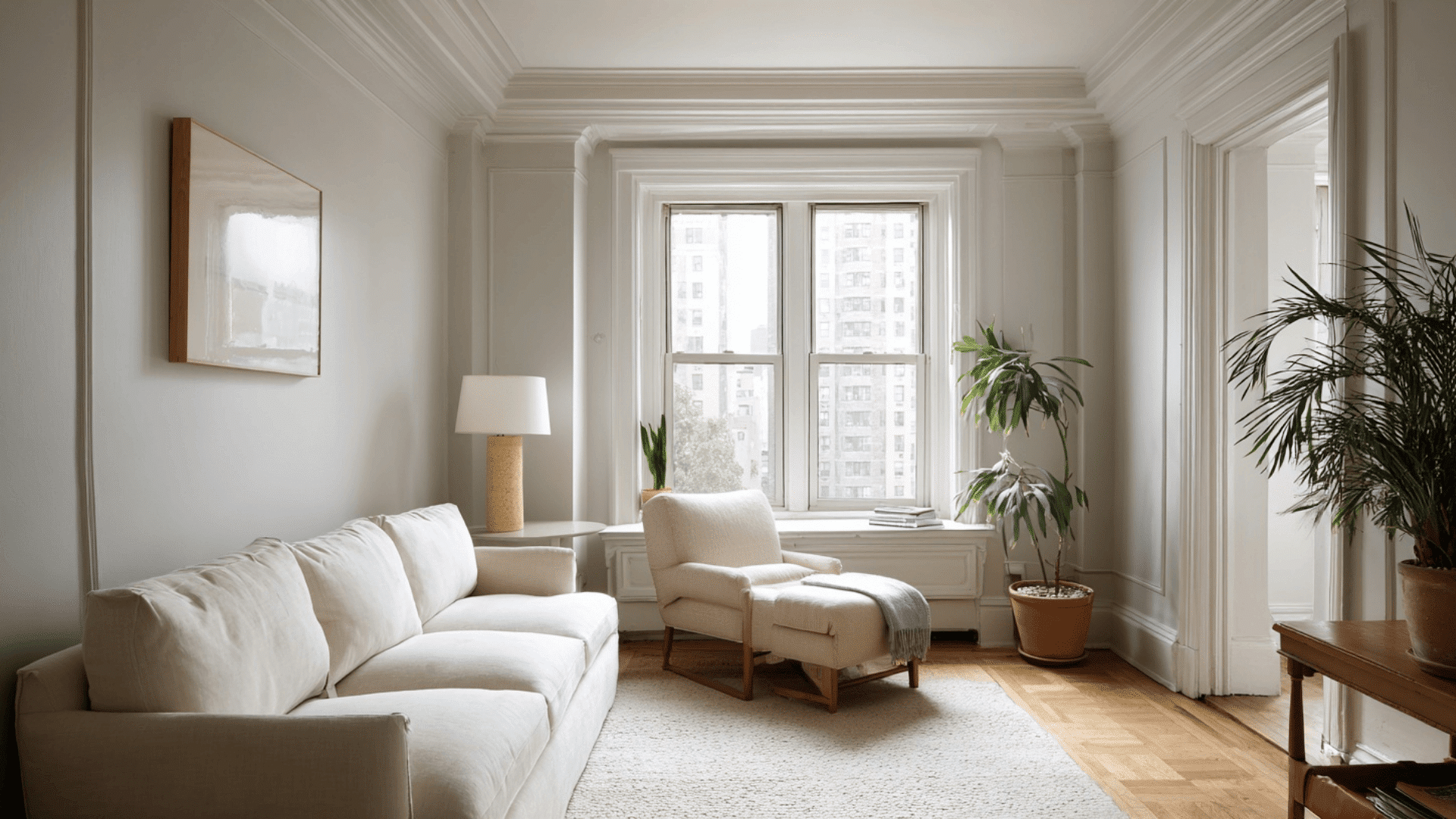
In rentals, matching the trim and walls is a simple way to refresh a room without major changes. One color makes the space feel cleaner, newer, and more modern.
It works with different décor styles and helps create a streamlined look, which is useful when you can’t make structural updates or replace old trim.
Community Insights
Here are real takes from designers and homeowners on using the same color for walls and trim:
According to Jessica Godsey of Oak | Grain Refinishing:
“I used this technique … and the more we painted, … we knew we couldn’t get enough of it. … the result was perfection: a super-comfy, nook-like enclosure.”
From a Reddit user in the r/paint thread:
“99% of painters think that Trim = White and that’s wrong. Tried matching my door, wall & trim – the room now feels deeper and cleaner.”
Expert commentary in Southern Living:
“Painting the trim and the walls the same color visually adds height to a space and elevates the design.” – Mark Williams & Niki Papadopoulos.
Common Mistakes To Avoid
It’s easy to make small mistakes that change how the color looks in your space. Here are the most common issues to watch for so your walls and trim combine smoothly:
- Using the wrong sheen: The wrong finish can make the room look flat or highlight flaws. Use matte or eggshell on walls and satin or semi-gloss on trim for the best balance.
- Ignoring undertones: Even slight undertone differences can make the walls and trim clash. Always match warm with warm and cool with cool.
- Forgetting lighting: Natural and artificial light can shift how a color looks throughout the day. Test your paint in different lighting before committing.
- Painting ceilings bright white with bold walls: A bright white ceiling can look harsh against deep or bold wall colors. This creates a sharp break instead of a smooth, mixed look.
Paying attention to these small details will help your walls, trim, and ceiling mix smoothly and give your room the clean, polished look you want.
Conclusion
Painting walls and trim the same color can transform a room in a simple, stylish way. This approach creates a smooth backdrop that helps the space feel more modern and pulled together.
With the right colors and sheen, the look can bring balance, calmness, and a touch of sophistication to any room. It’s also a great way to highlight your décor without adding visual clutter.
As you plan your next project, find a few shades, test them in your lighting, and see how the room responds. Start your makeover today.