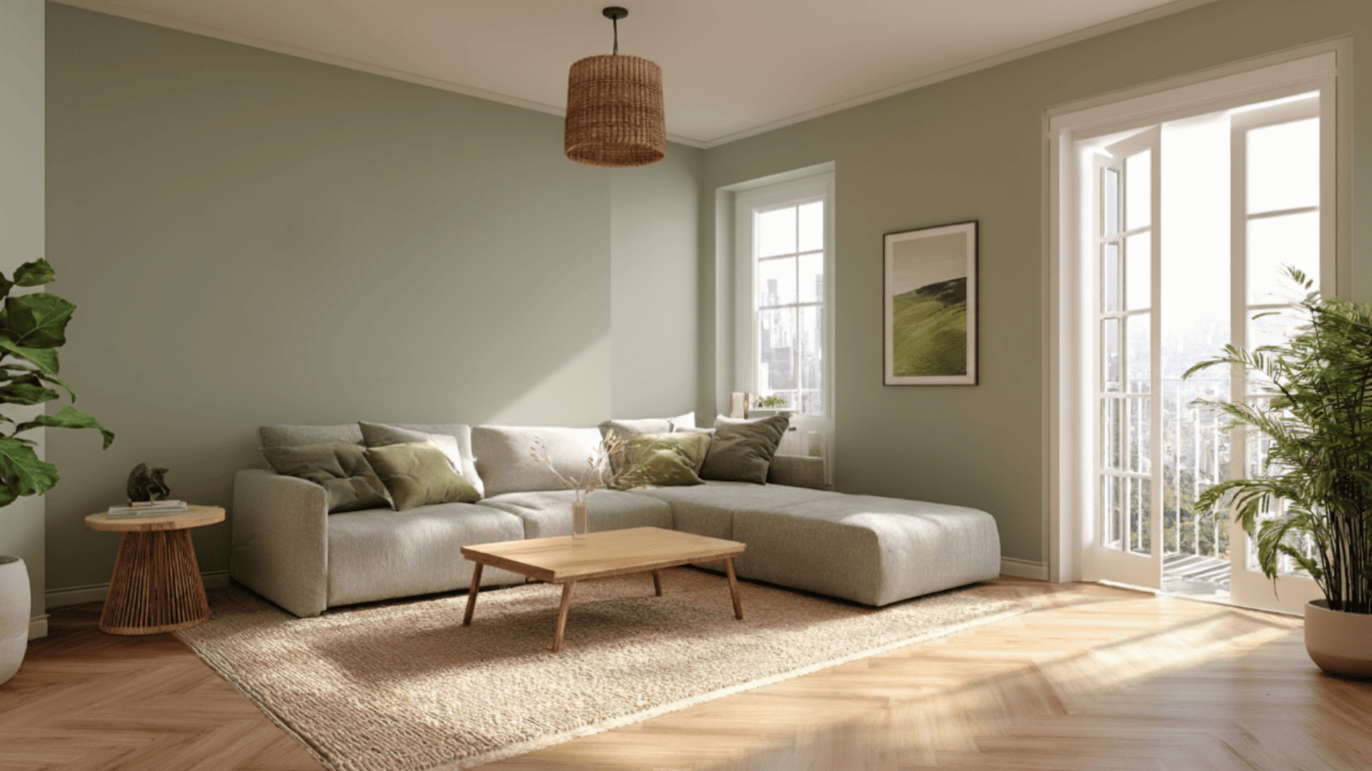


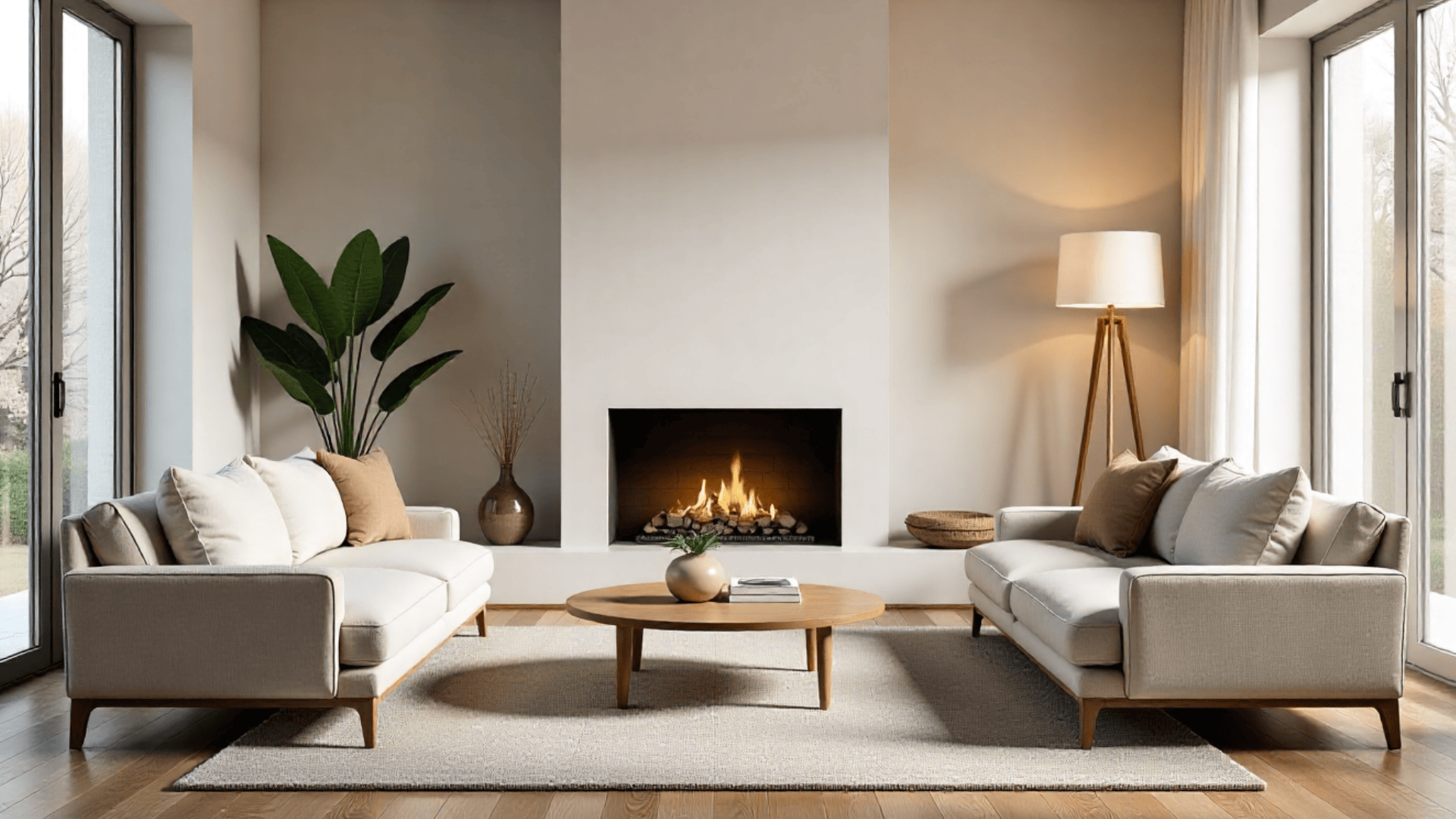
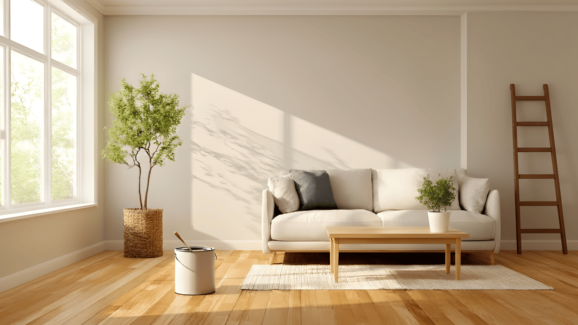
Sage is one of those colors people often hear about but can’t fully picture, and most people get confused.
If you’ve ever asked yourself what color is sage or why it shows up everywhere in design, you’re in the right place.
Sage has a calm, gentle look that makes it easy to use, but there’s a lot more to it than just being a soft green.
Today, in this blog, I’ll walk you through its shades, how it behaves in different spaces, and the colors that pair beautifully with it.
What Color is Sage?
Sage is a soft and muted color that feels natural and easy on the eyes. It mixes with green and gray in a way that makes it calm, subtle, and very versatile.
Sage is a green-gray color with an earthy and gentle feel. It looks soft, dusty, and slightly faded, like dried sage leaves. It’s not bright or bold. Instead, it gives off a calm and quiet look.
Saga has a few common variations, like classic saga, light saga, and deep saga. Each shade has its color value.
These values can shift slightly depending on the shade or brand, but they give a clear idea of how sage looks in different tones.
Sage feels calming because it reminds us of nature. Green connects to plants and quiet outdoor spaces, while gray softens the color and makes it gentle.
This mix keeps sage from looking too bright or too intense. It stays neutral, grounded, and easy to live with, which is why people love using it in rooms where they want peace and balance.
Sage Color Variations
The color sage has many shades that range from light and airy to deep and earthy.
1. Light Sage

Light sage is a pale green with soft gray undertones. It feels bright, clean, and gentle, which makes it look peaceful in almost any space.
This shade works well when you want color that still feels soft and slightly neutral, without being too bold or strong.
Best Uses: Small rooms, calm bedrooms, and minimal, airy spaces.
2. Classic Sage

Classic sage is the true green-gray mix most people think of when they hear “sage.” It looks natural, balanced, and earthy without feeling dull.
This shade combines easily with many styles and works well in both warm and cool color palettes, making it one of the most versatile sage tones.
Best Uses: Living rooms, kitchens, and cozy, warm homes.
3. Silver Sage

Silver sage leans more toward gray, giving it a cool and misty look. It feels crisp and smooth and adds a fresh, modern vibe.
Because it carries a stronger gray tone, it pairs well with cool neutrals and makes a space feel clean without looking cold or harsh.
Best Uses: Bedrooms, spa-like spaces, and cool-toned rooms.
4. Deep Sage

Deep sage is a darker, richer shade with olive or blue undertones. It feels bold but still soft because of the muted gray base.
This shade adds depth and warmth to a room and is perfect when you want color that makes a statement without feeling too heavy or dramatic.
Best Uses: Accent walls, moody bedrooms, and reading corners.
5. Sage Gray

Sage gray has more gray than green, giving it a calm and quiet look. It feels gentle and neutral, almost like a softer take on gray paint.
This shade is perfect when you want something subtle that still has a touch of color, especially in bright spaces or modern homes.
Best Uses: Hallways, entryways, and light-filled rooms.
6. Sage Blue

Sage blue mixes green, gray, and a hint of blue for a cool and breezy look. It feels calm and coastal, making a space feel relaxed and refreshing.
This shade works well when you want a gentle color that leans cooler without becoming too blue or too green.
Best Uses: Bathrooms, coastal themes, and calm workspaces.
Each shade has its own undertone and mood, so the best choice depends on the room’s light, style, and the feeling you want to create.
Warm vs. Cool Sage: Key Differences
Users often get confused about whether sage is warm or cool, because the color can shift depending on its undertones.
| Feature | Warm Sage | Cool Sage |
|---|---|---|
| Main Undertone | Olive or brown | Blue or gray |
| O.verall Look | Cozy, earthy, soft | Fresh, crisp, airy |
| Room Feel | Warm and inviting | Cool and calm |
| Best Light | Low or warm lighting | Bright or cool lighting |
| Pairs Well With | Beige, cream, wood, terracotta | White, silver, charcoal, navy |
| Good For | Bedrooms, living rooms, rustic spaces | Bathrooms, offices, modern rooms |
Warm sage brings comfort, while cool sage feels fresh and clean. Choosing between them depends on your lighting and the mood you want in your space.
What Colors Go With Sage?
Sage works well with many colors because it’s soft, calm, and flexible. The right match can make a room feel warm, cool, modern, or cozy, depending on the look you want.
1. Neutrals that Pair Well
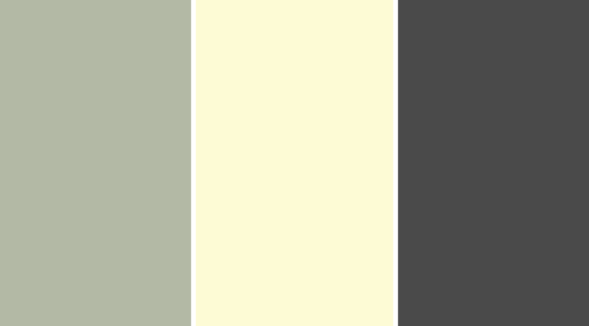
Neutrals help sage look clean and balanced by keeping the palette soft and simple. White adds a crisp and fresh feel, while cream brings warmth and smoothness.
Beige creates an earthy base that mixes naturally with sage, and charcoal adds bold contrast without feeling harsh.
Palette Examples: Sage + Cream + Charcoal and Sage + White + Beige
2. Warm Pairings

Warm colors bring out the earthy side of sage and make a room feel cozy and inviting. Terracotta adds a rustic vibe that feels grounded and warm.
Mustard brings energy and brightness without overpowering the palette. Wood tones add natural warmth that mixes beautifully with sage’s soft green-gray base.
Palette Examples: Sage + Terracotta + Cream and Sage + Wood + Mustard
3. Cool Pairings

Cool colors highlight the calm and airy feel of sage, making the space look fresh and modern. Navy adds sharp contrast and creates a polished look.
Dusty blue adds softness and a breezy feel. Slate offers a smooth, modern touch that pairs well with sage’s muted tone.
Palette Examples: Sage + Navy + White and Sage + Dusty Blue + Gray
4. Accent Color Ideas

Accent colors add style and contrast that make sage look more polished and complete. Gold brings a warm, elegant shimmer that pairs well with muted greens.
Brass adds a rich, vintage feel that deepens the palette. Black creates crisp contrast and gives the space a clean, modern edge.
Palette Examples: Sage + Gold + White and Sage + Black + Cream.
Best Sage Paint Colors by Brand
Different paint brands offer their own version of sage, each with a unique mix of green, gray, and earthy undertones.
Sherwin-Williams
Sherwin-Williams offers warm and grounded sage shades that work well in both modern and classic homes. Their colors feel soft, natural, and very livable.
- Clary Sage: Warm, earthy, and cozy
- Evergreen Fog: Cool, modern, and rich
- Sensible Hue: Light, balanced, and airy
Behr
Behr’s sage tones lean fresh and clean, making them great for bright spaces or simple, modern rooms. These shades are easy to pair with white, gray, and wood.
- Sage Green: Calm and timeless
- In the Moment: Cool, coastal, and relaxed
- Nature’s Gift: Earthy with soft depth
Benjamin Moore
Benjamin Moore offers smooth and versatile sage colors that work well in many rooms. These shades bring a soft, elegant look without feeling too bold.
- Saybrook Sage: Warm, natural, and welcoming
- Soft Fern: Light, gentle, and airy
- October Mist: Cool, muted, and modern
Farrow & Ball
Farrow & Ball creates refined sage shades with a classic and luxurious feel. Their tones shift beautifully with natural light, adding depth to any room.
- Mizzle: Cool, misty, and clean
- French Gray: Muted, elegant green-gray
- Cromarty: Fresh, soft, and coastal
Tips for Choosing the Right Sage Color
Choosing the right shade of sage depends on your lighting, style, and the mood you want in your space. Here are simple tips to help you pick the perfect one.
- Check your lighting first: Cool, dim rooms make sage look grayer. Warm, sunny rooms bring out more green. Match the undertone to the light.
- Decide if you want warm or cool sage: Warm sage feels earthy and cozy. Cool sage feels fresh and clean.
- Test samples on the wall: Paint small swatches and look at them during morning, afternoon, and evening light.
- Match sage with your decor: Warm woods, beige, and cream pair well with warm sage. White, gray, and navy pair better with cool sage.
- Pick lighter or deeper sage based on room size and mood: Light sage keeps small rooms bright and open, while deeper sage adds richness and calm to larger spaces.
Conclusion
Sage is a color that brings softness and balance to any space, no matter how you choose to use it.
Now that you understand what color is sage and how it behaves in different settings, you can pick the shade that fits your style with confidence.
Whether you want something light and airy or deeper and richer, sage offers plenty of room to create a calm, welcoming look.
Trust your lighting, test a few tones, and let the color guide the mood you want. Use this blog to compare shades easily and choose the sage color that fits your home best.